Brand
Interior
Digital
Projects
Studio
Contact
Brand
Interior
Digital
Projects
Studio
Contact
Our Latest Projects
All
Brand
Interior
Digital
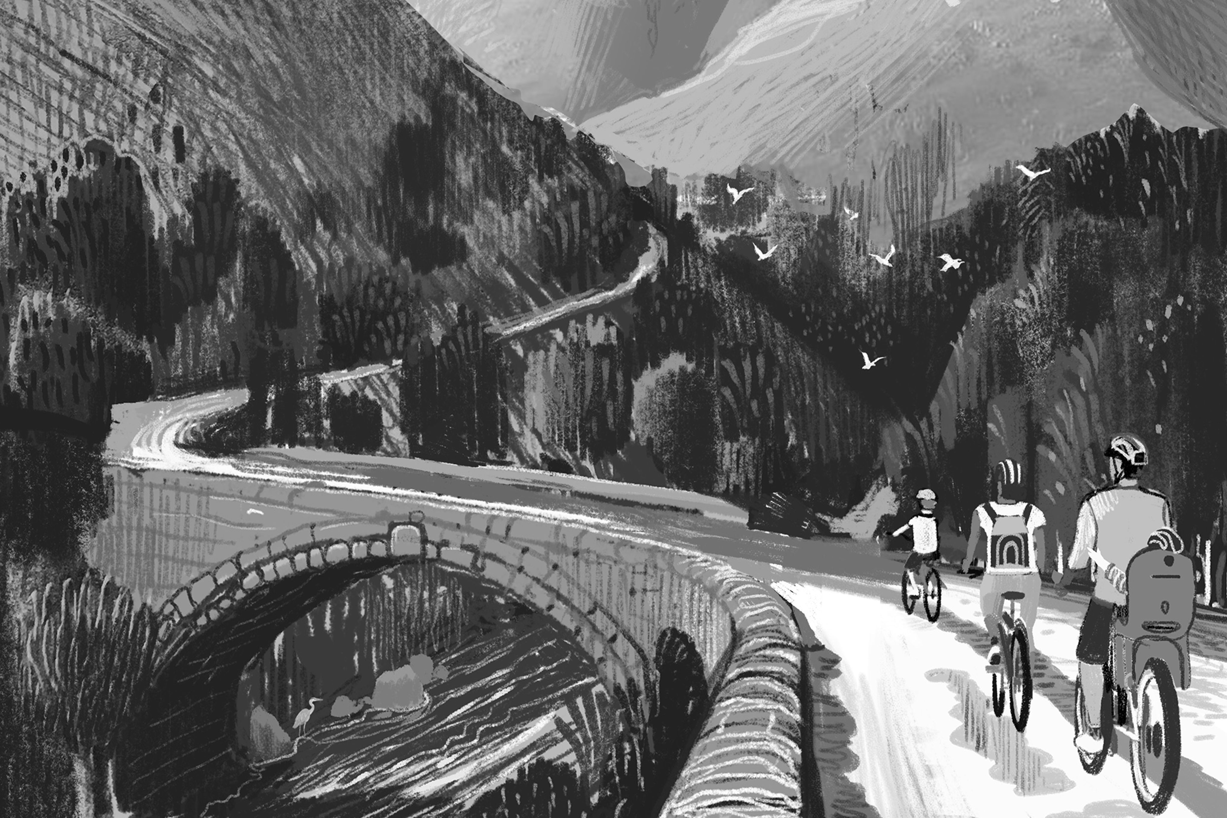
Devonshire Group
Product packaging that tells an authentic story, celebrates heritage and raises revenue
Brand
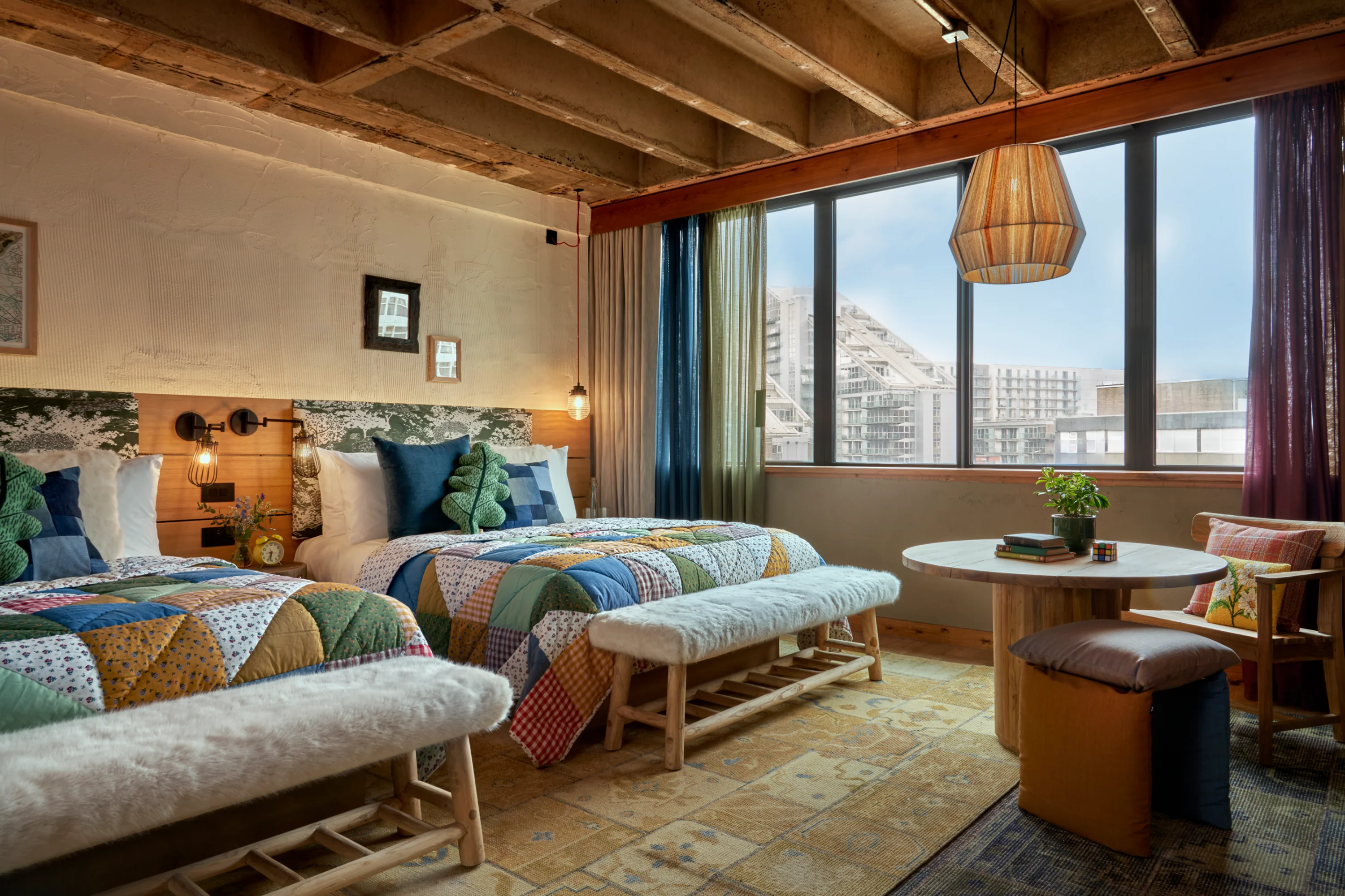
Treehouse Hotel
Imaginative interiors for a Manchester hotel to spark a sense of wonder
Interior
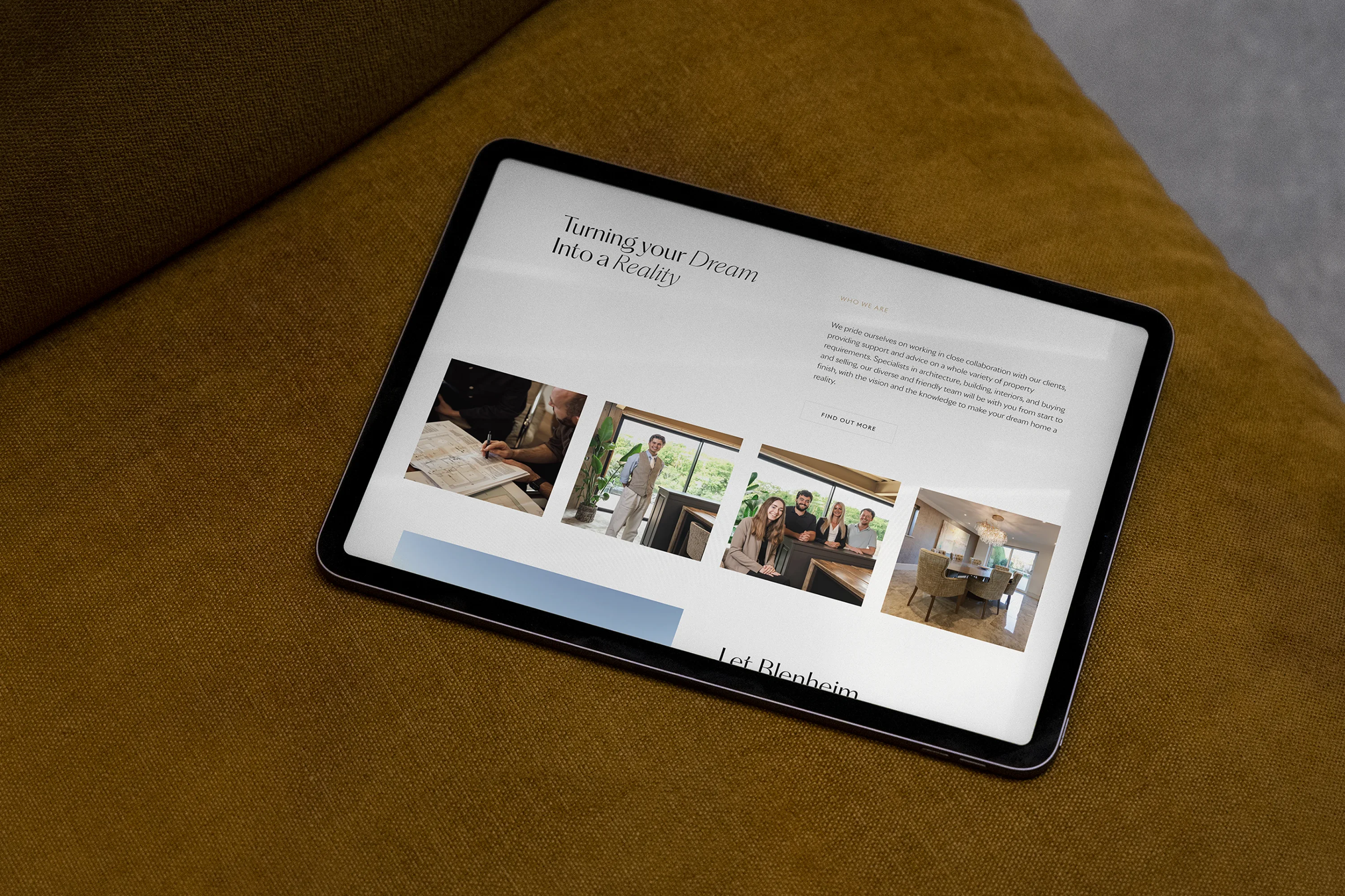
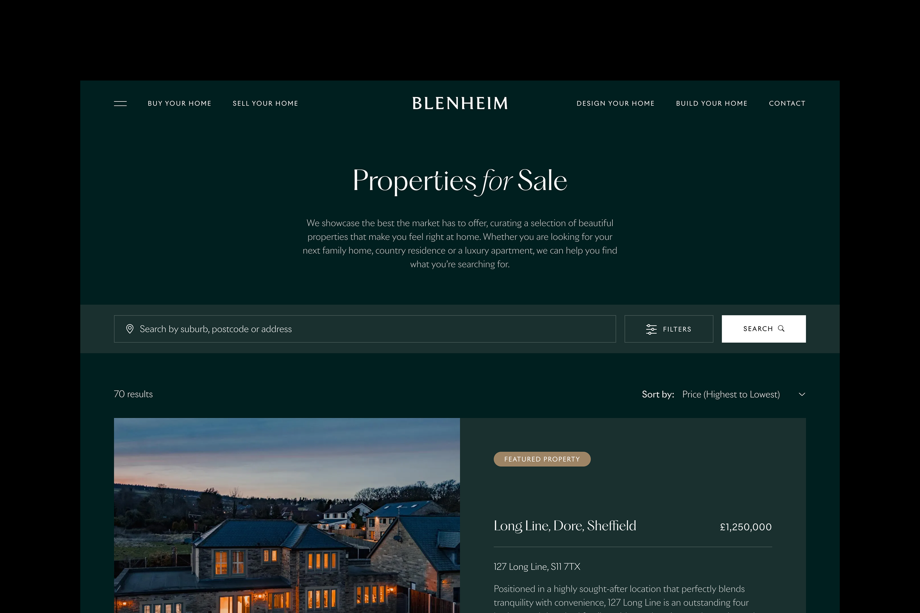
Blenheim
Cohesive brand identity and website for high-end property developer and boutique estate agents
Brand
Digital
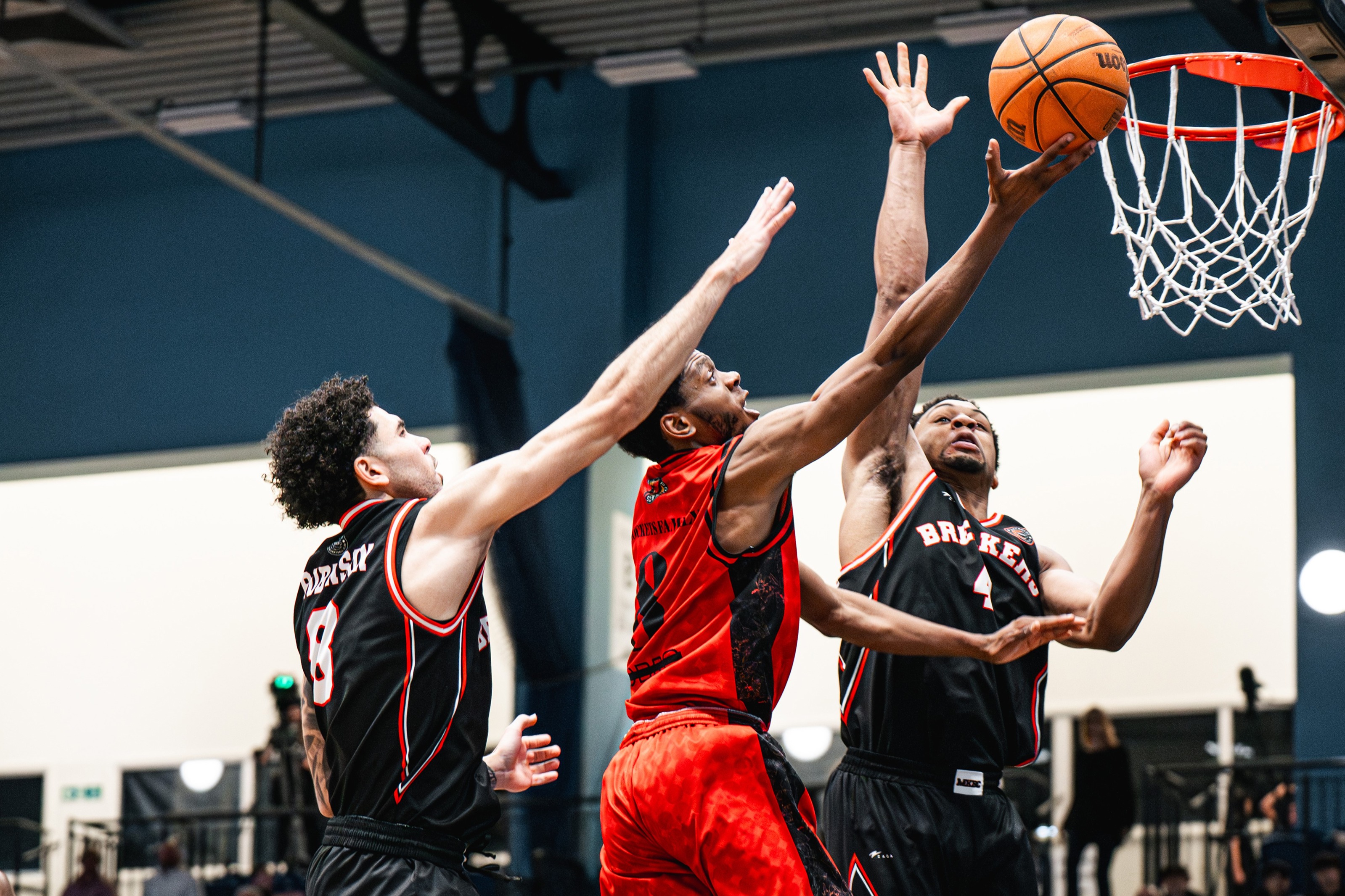
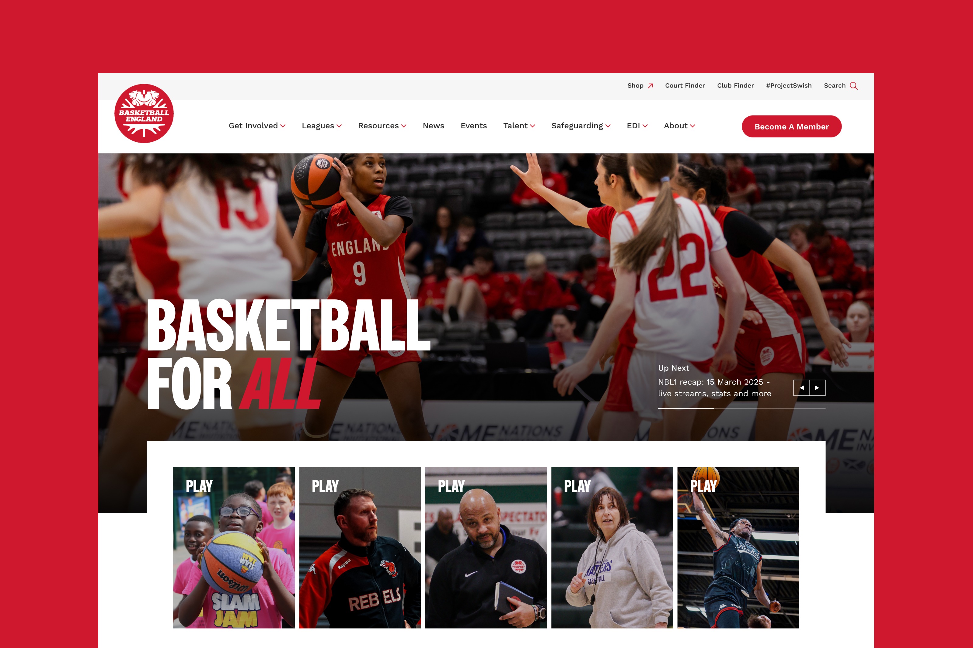
Basketball England
Complete website rebuild with integrated fixtures and results to capture the dynamism of basketball
Digital
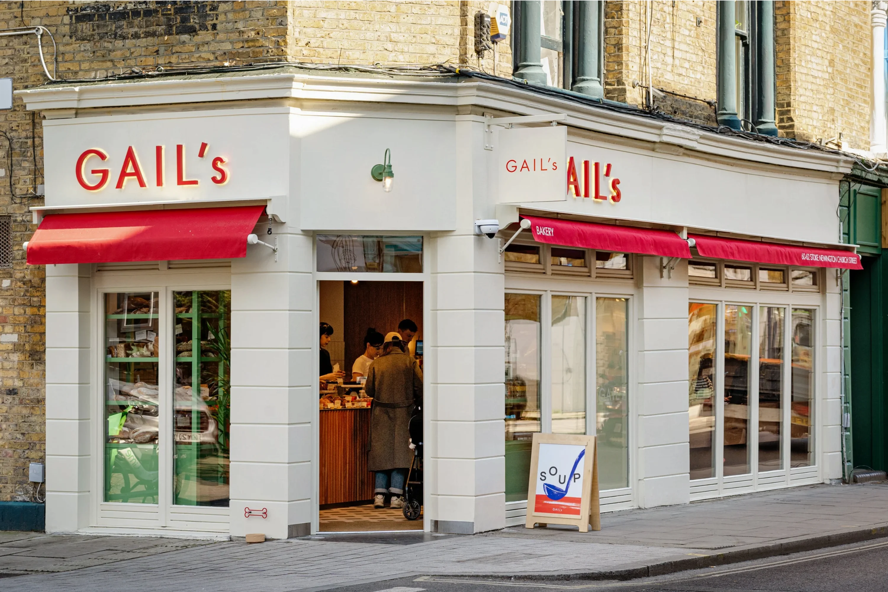
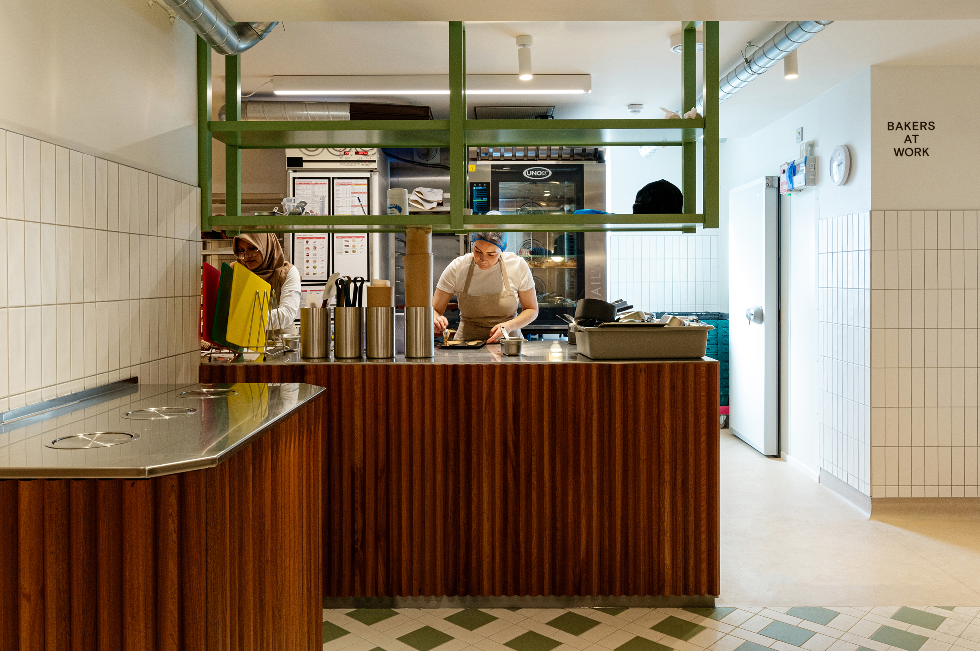
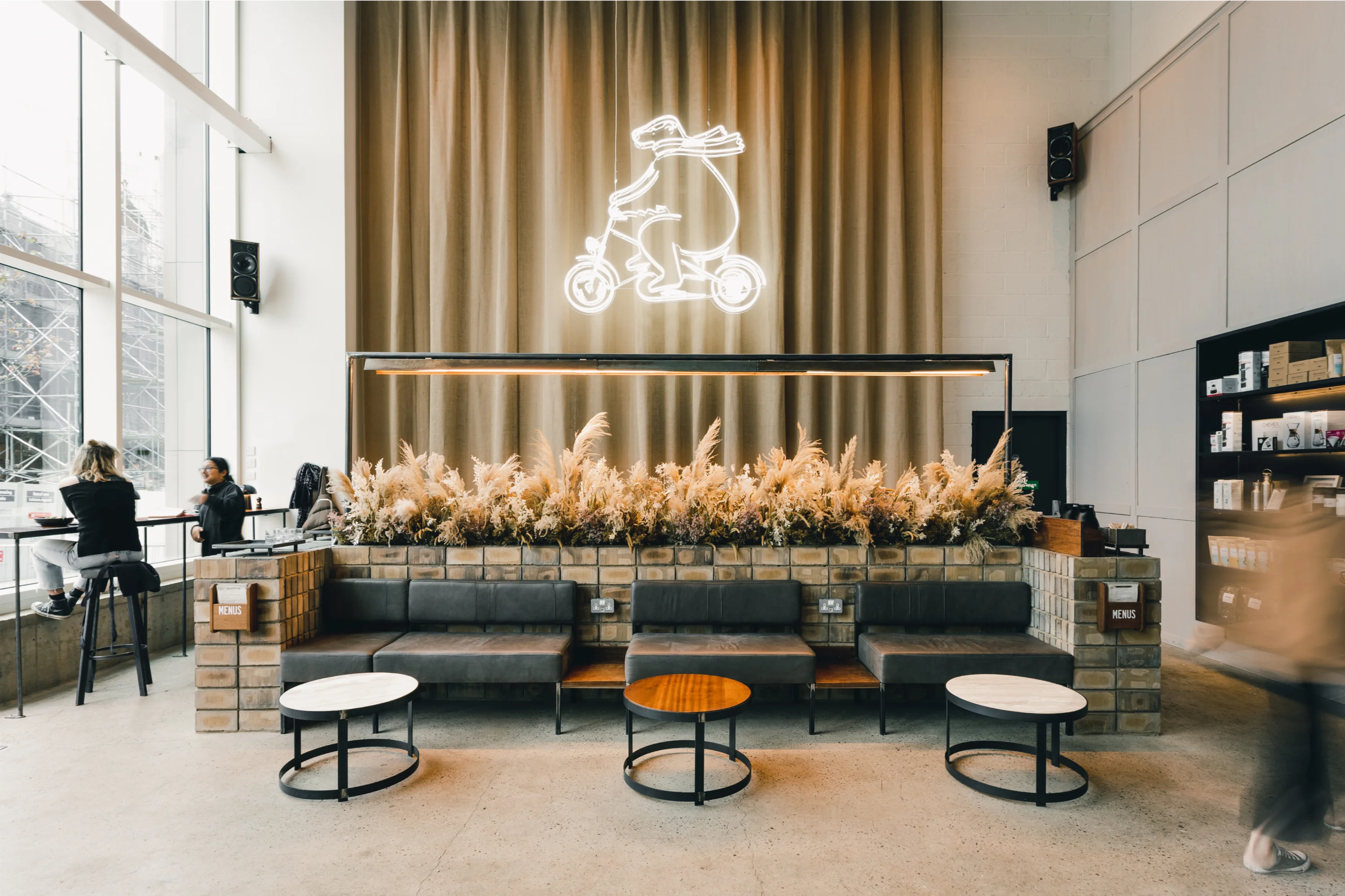
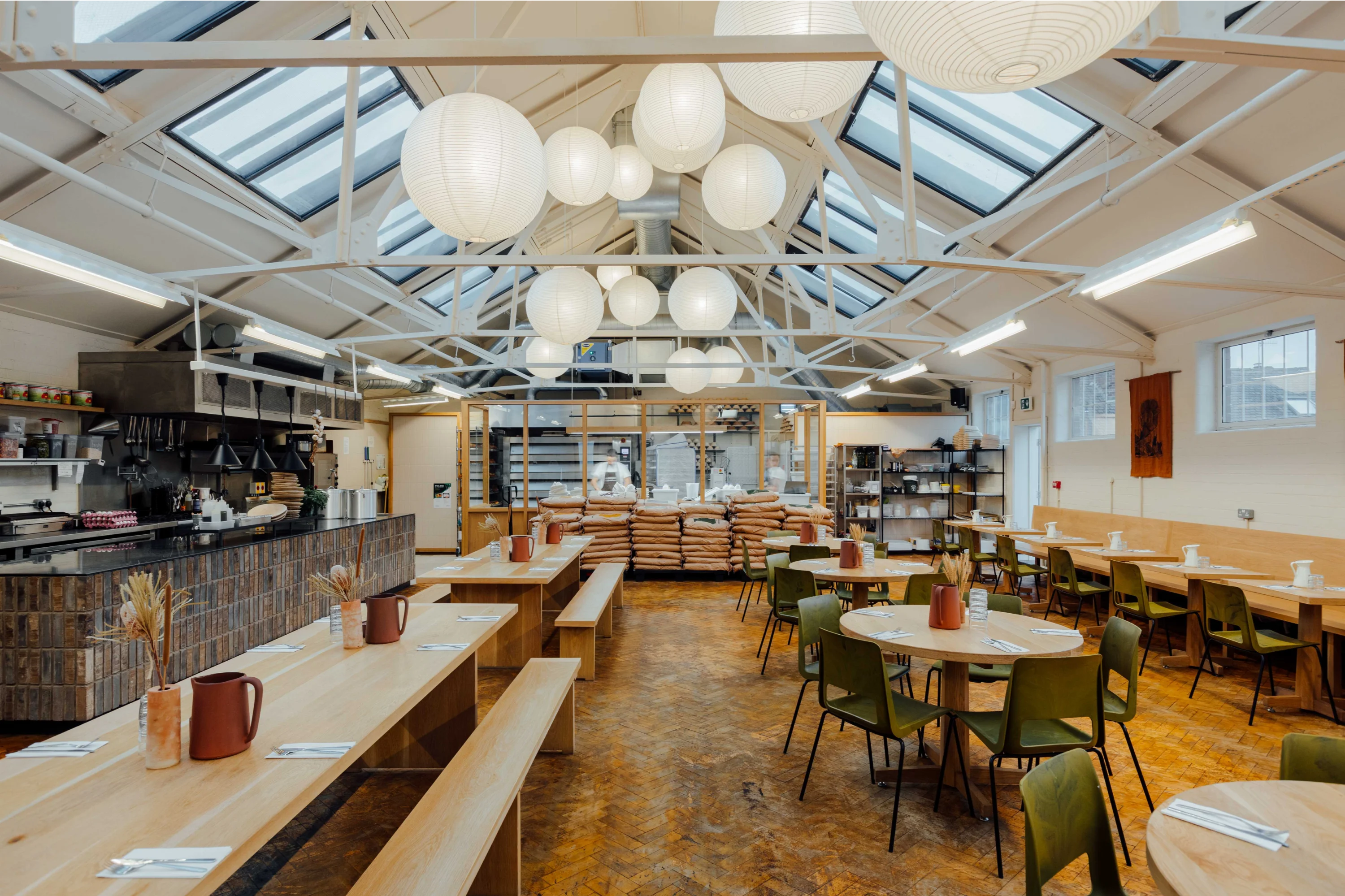
Gail's Bakery
Retail interior design concepts supporting the nationwide expansion of GAIL’s bakeries
Interior
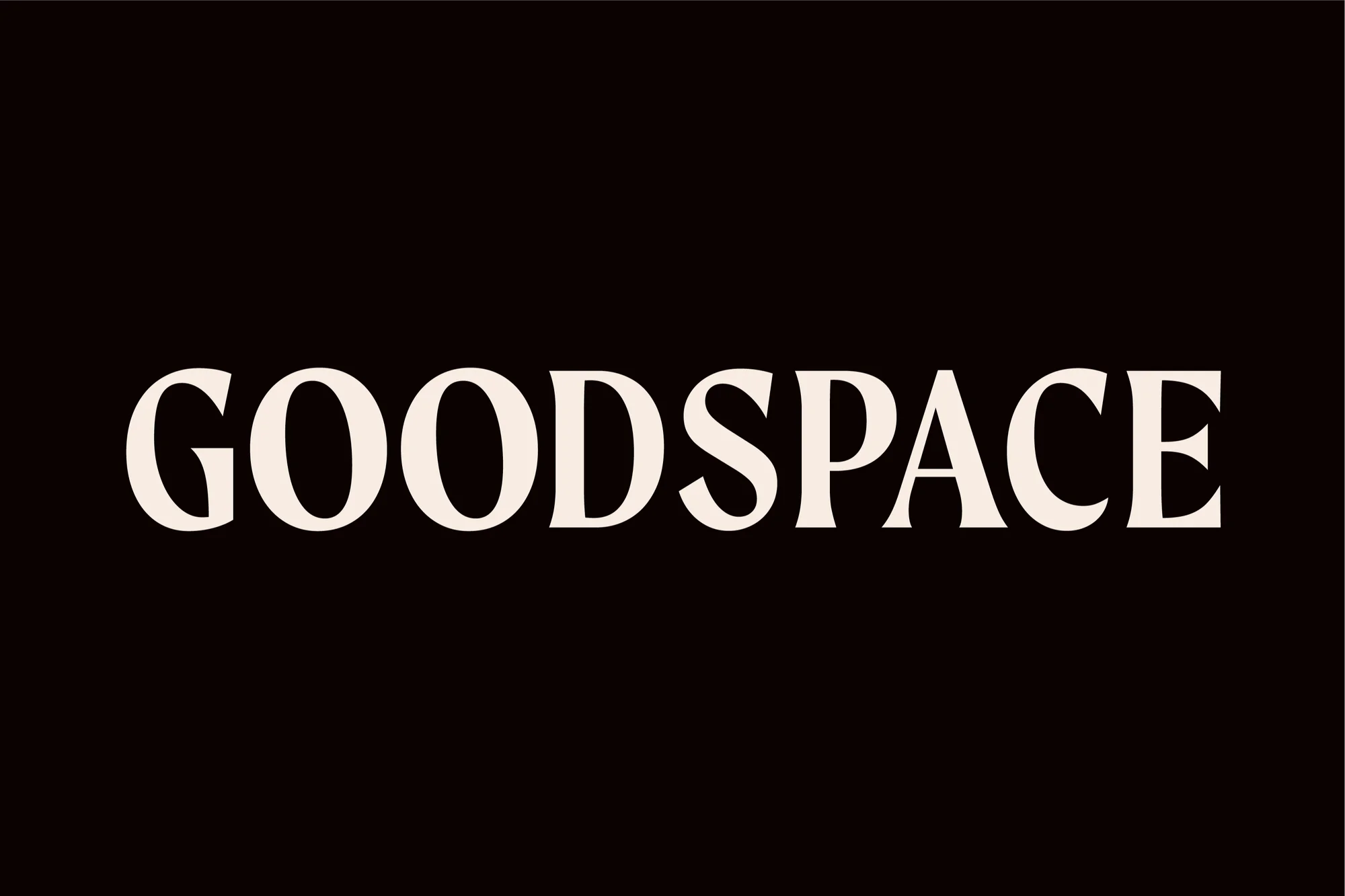
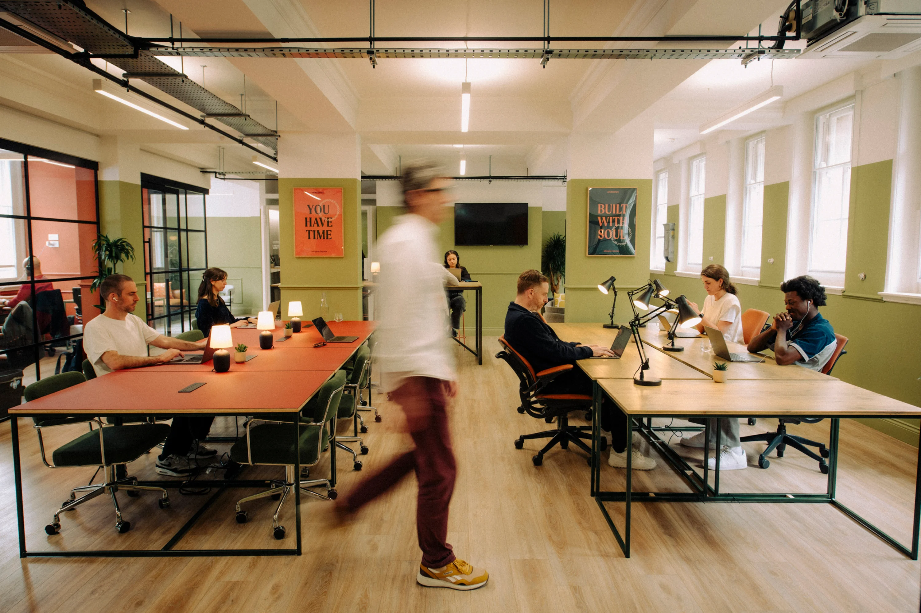
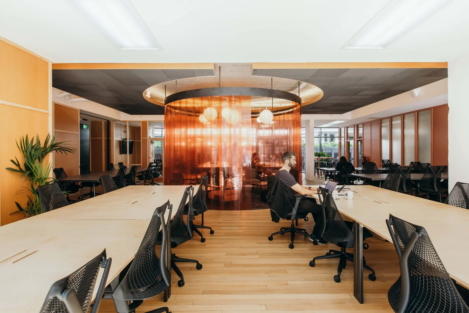
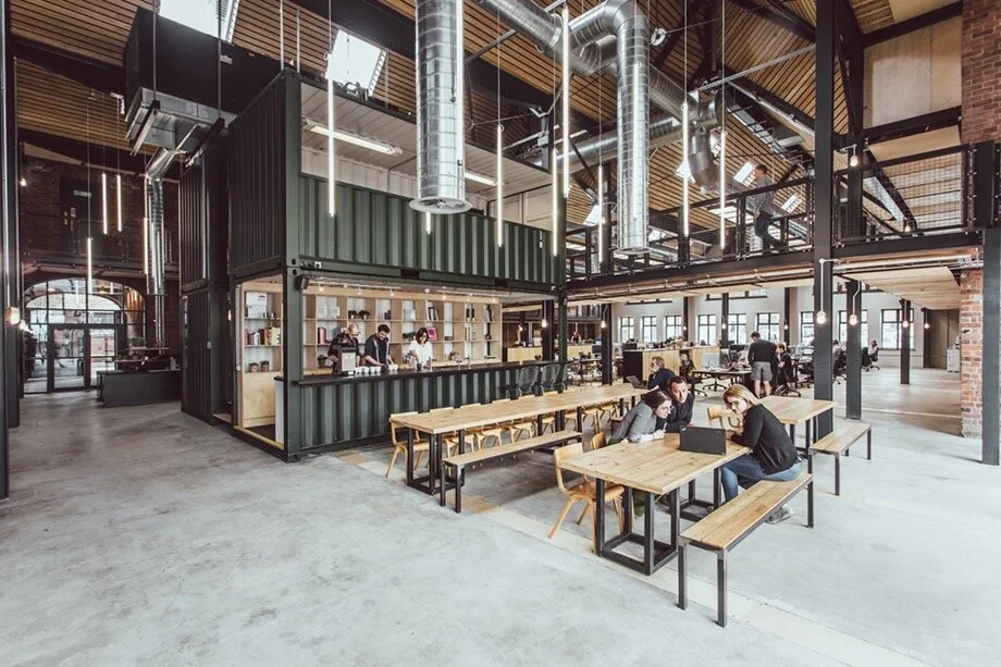
Goodspace
Adaptability and cohesion for a co-working brand, interiors and website refresh
Brand
Interior
Digital
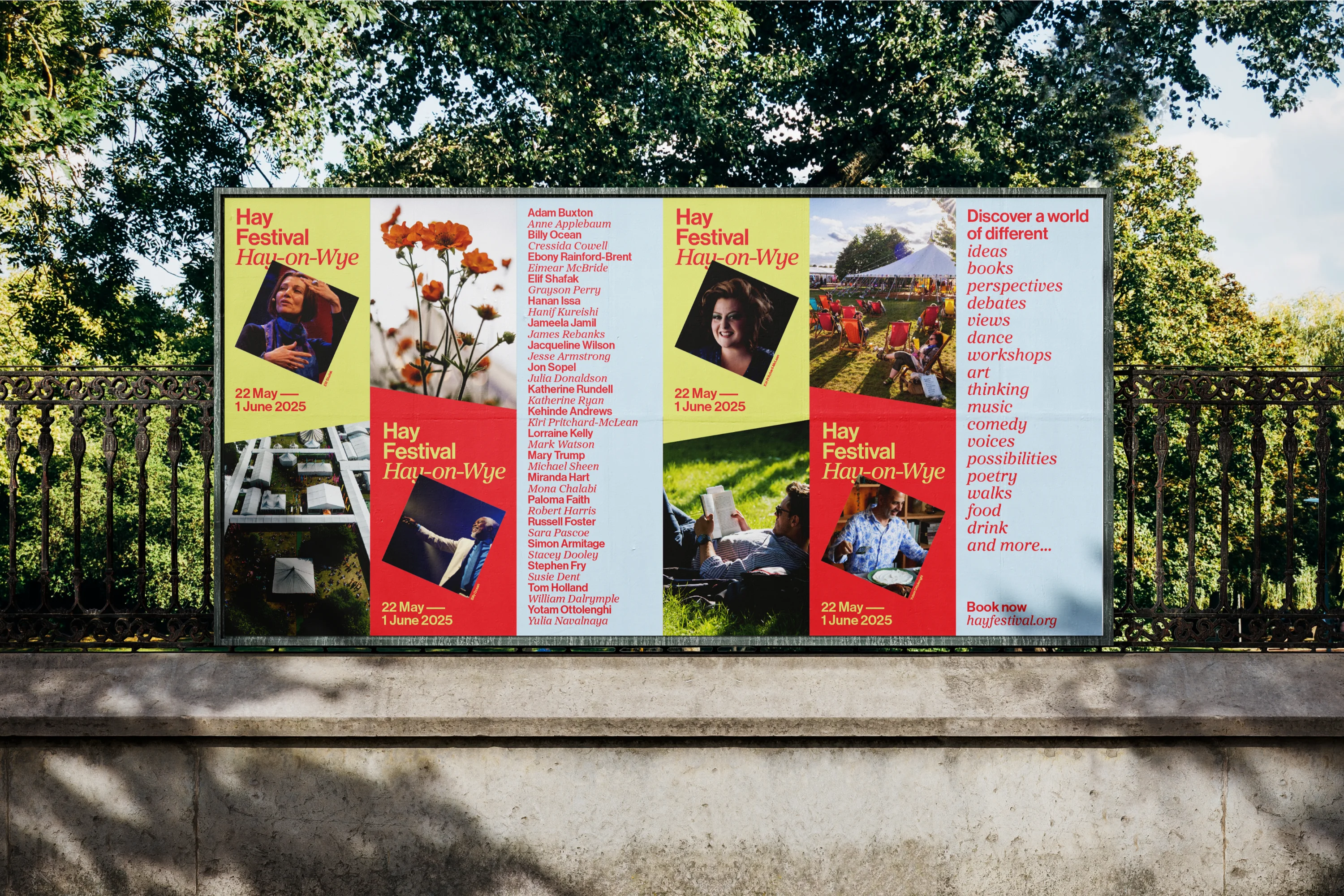
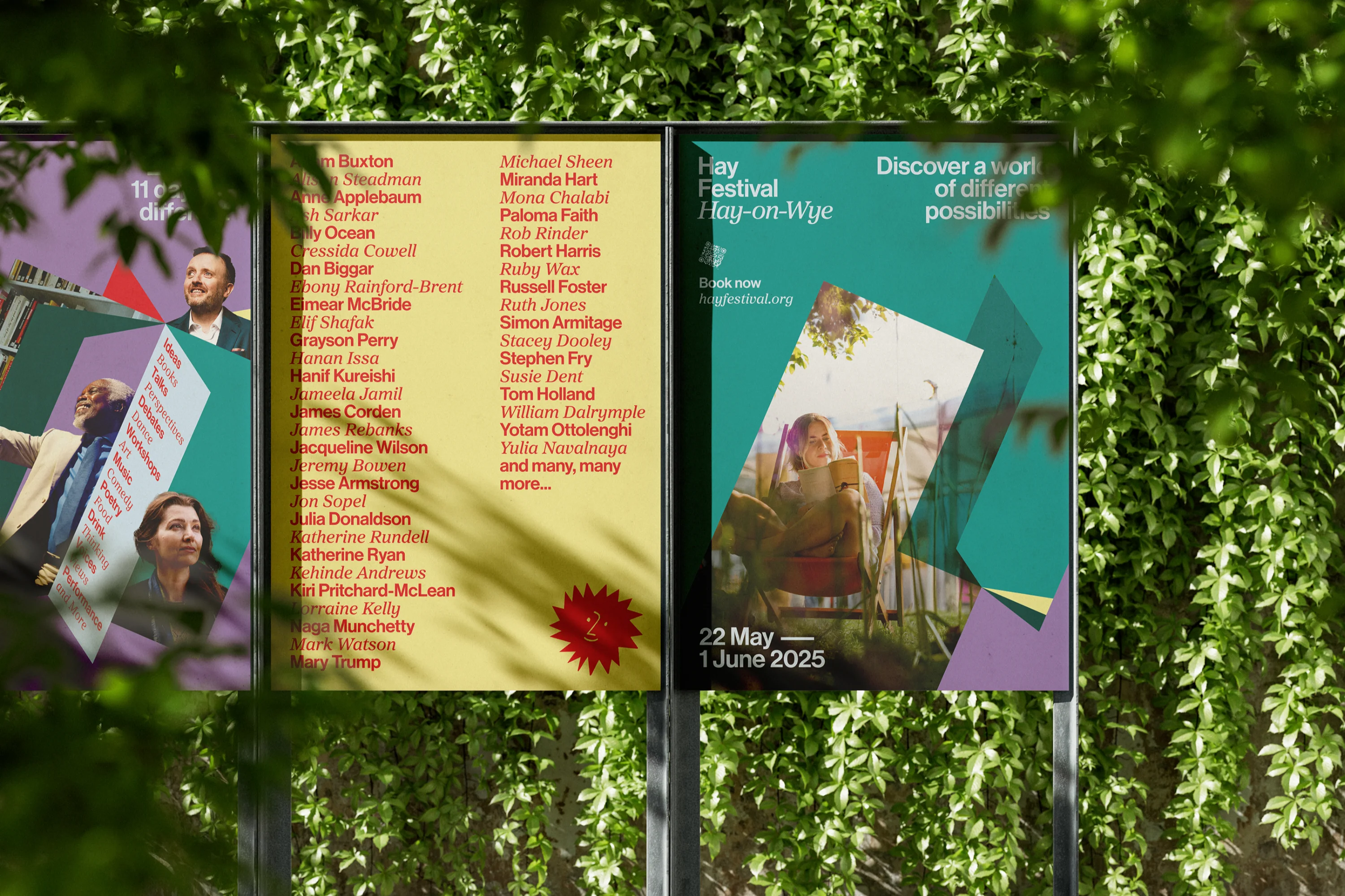
Hay Festival
Accessible and playful design for an internationally recognised literary festival
Brand
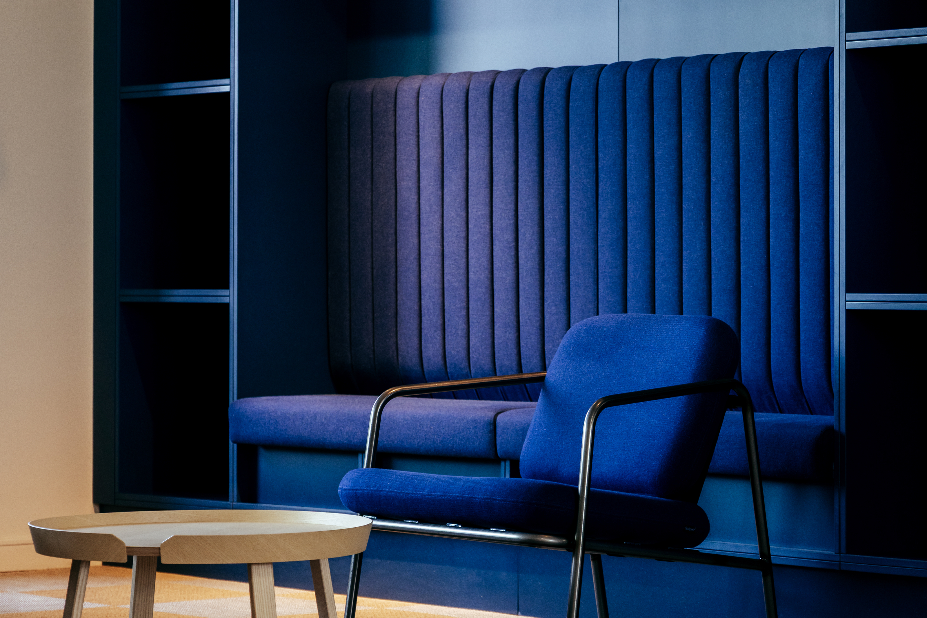
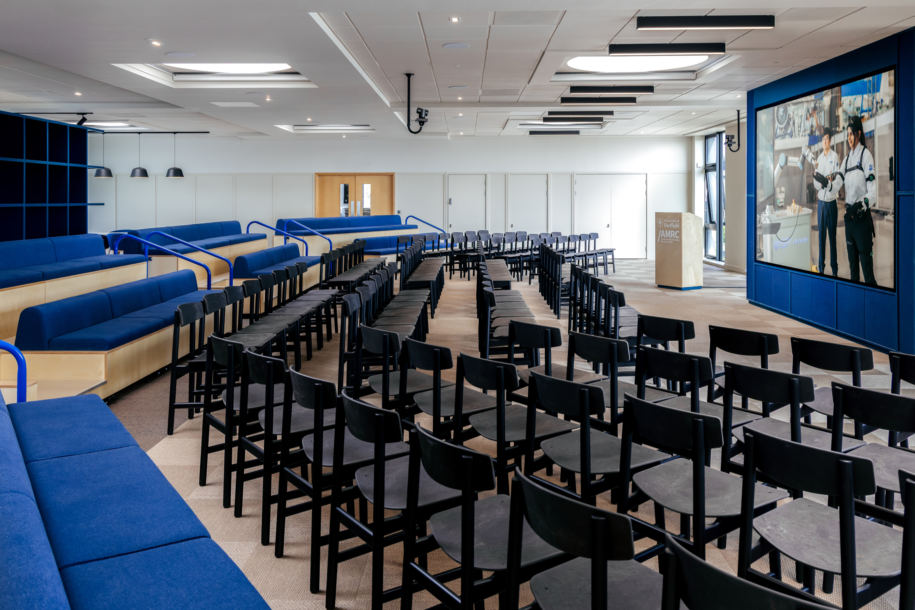
The University of Sheffield AMRC
Innovation and sustainability collide in a conference centre that showcases world class research
Interior
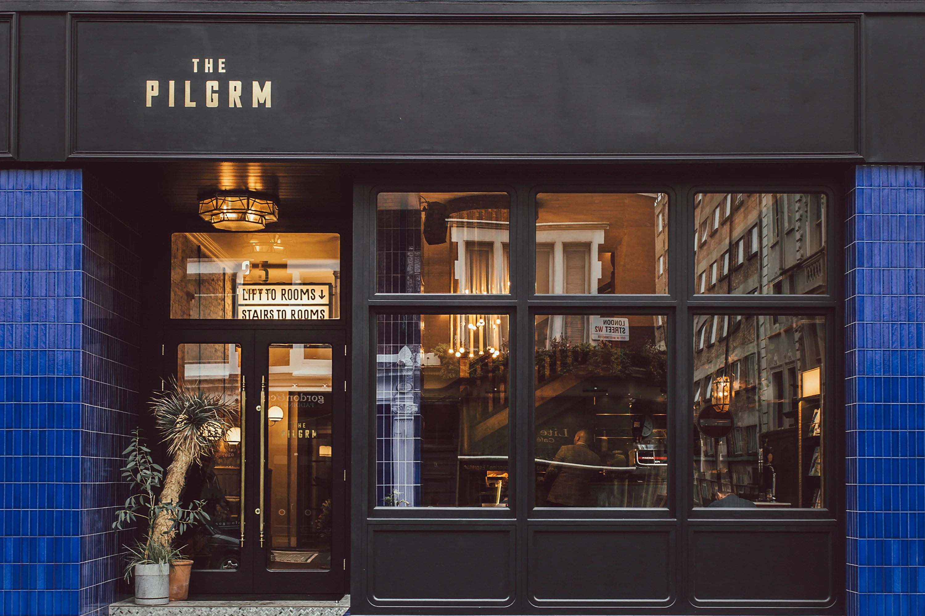
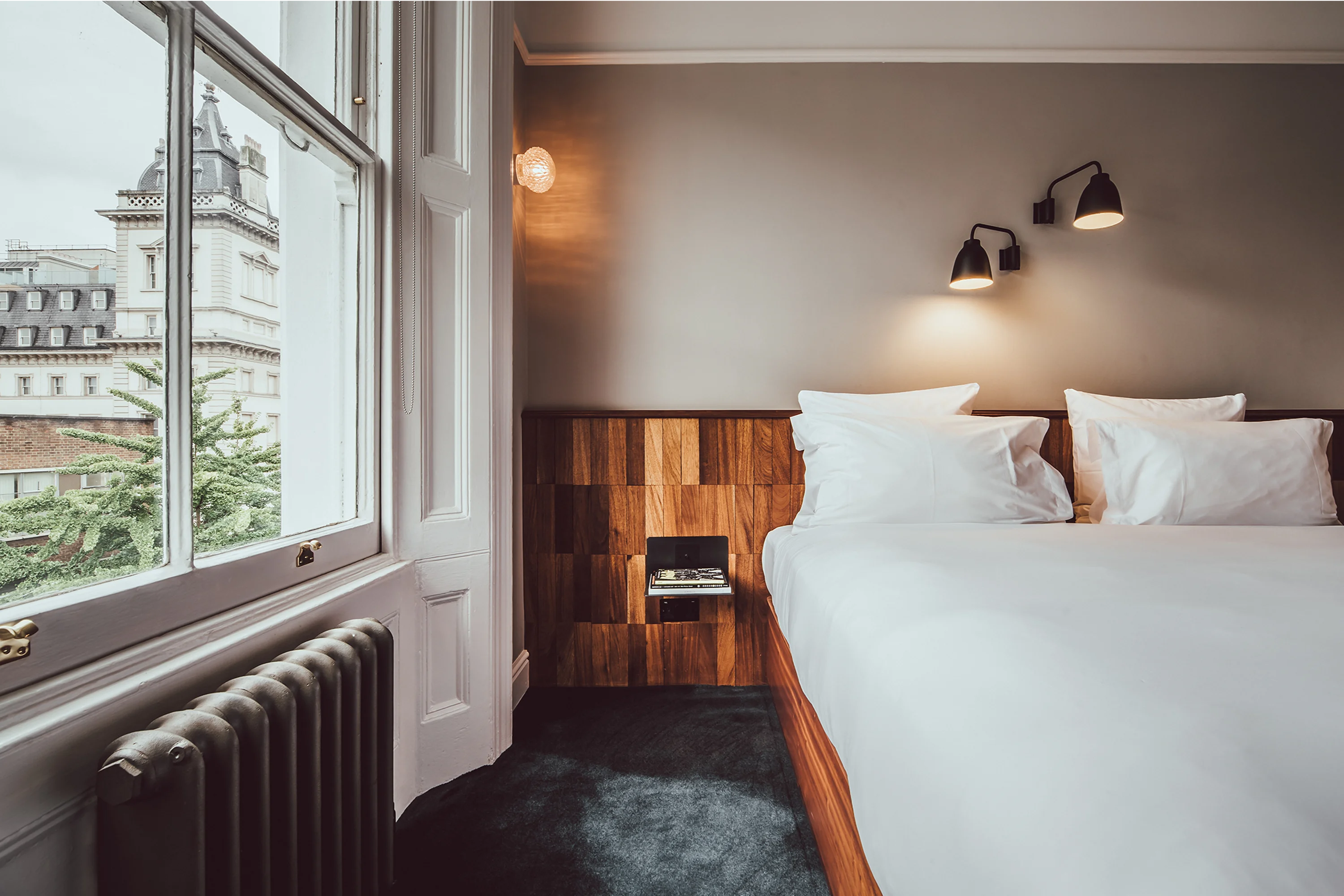
The Pilgrm
Hotel design tipped sideways to create The Pilgrm, London
Brand
Interior
Digital
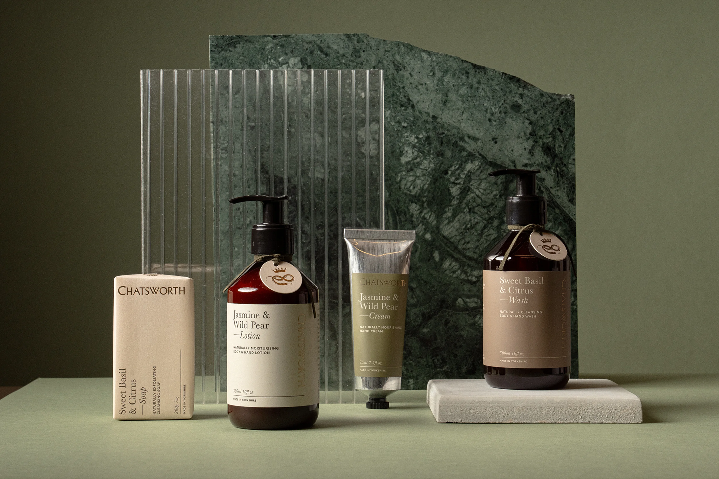
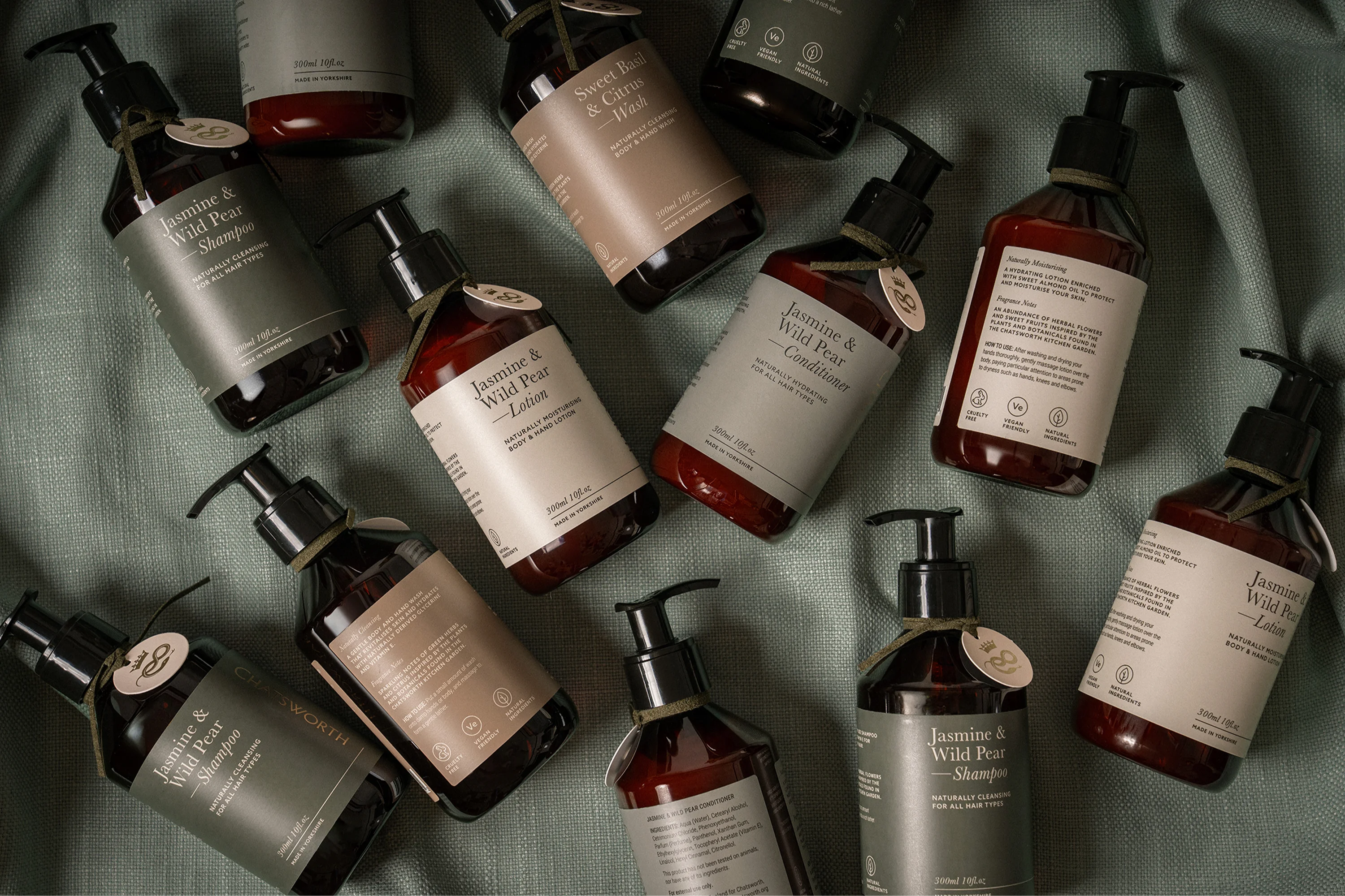
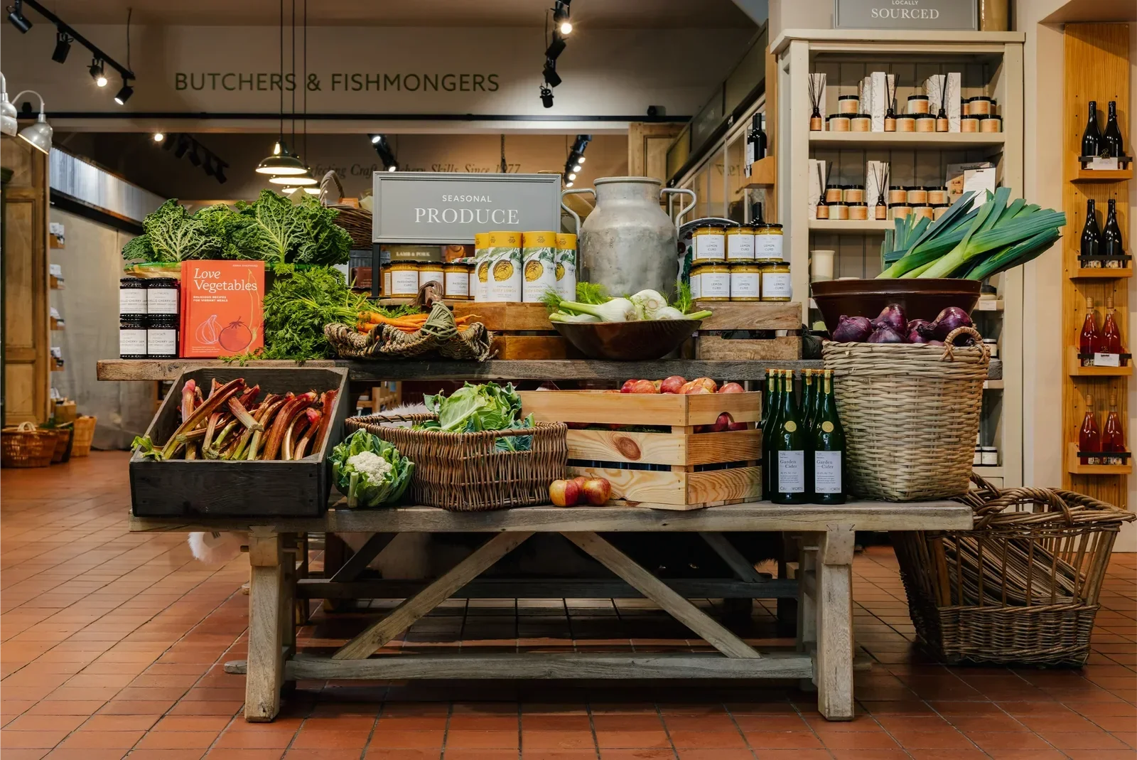
Chatsworth Farm Shop
Elevating an established rural business through a vitalised brand experience
Brand
Interior
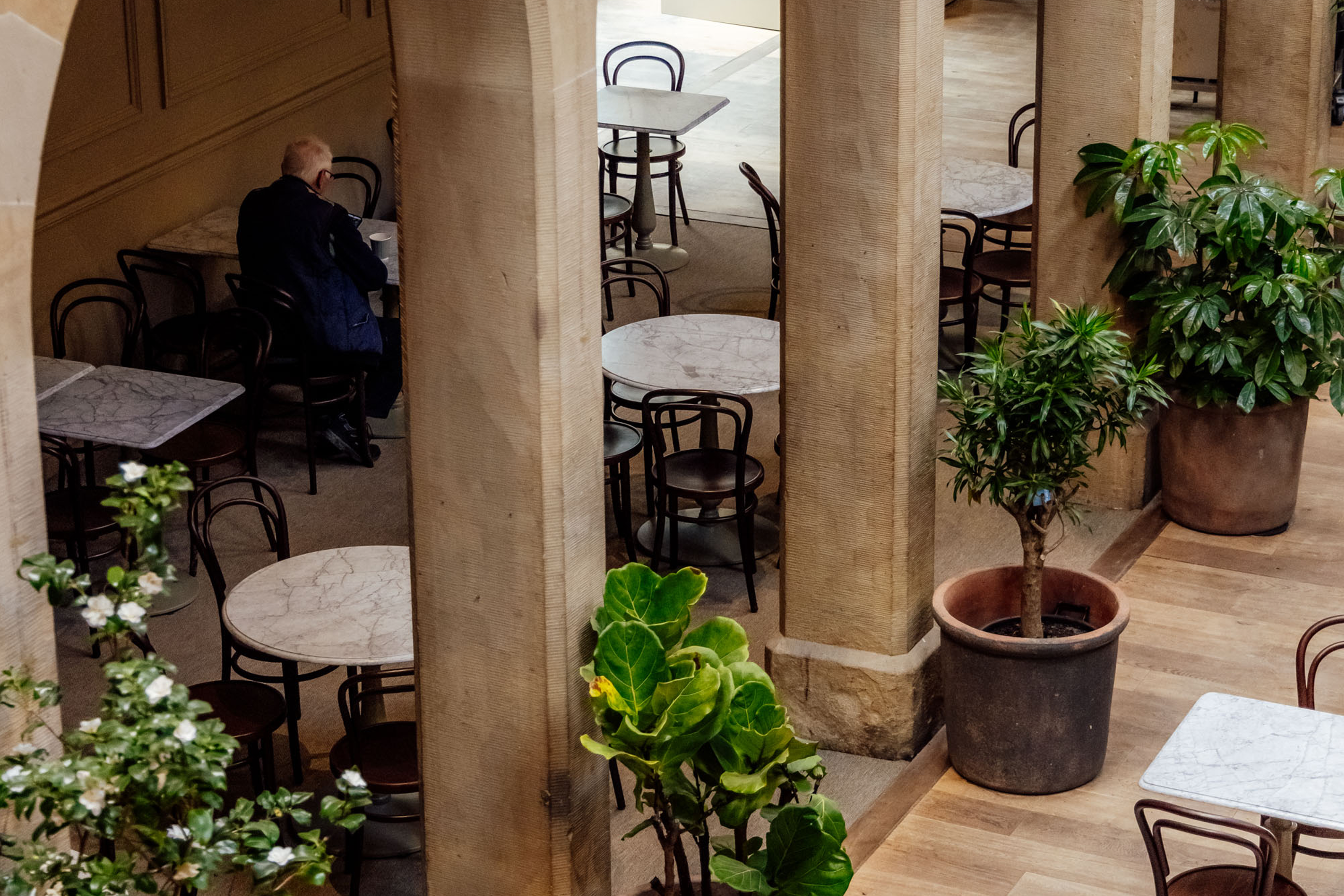
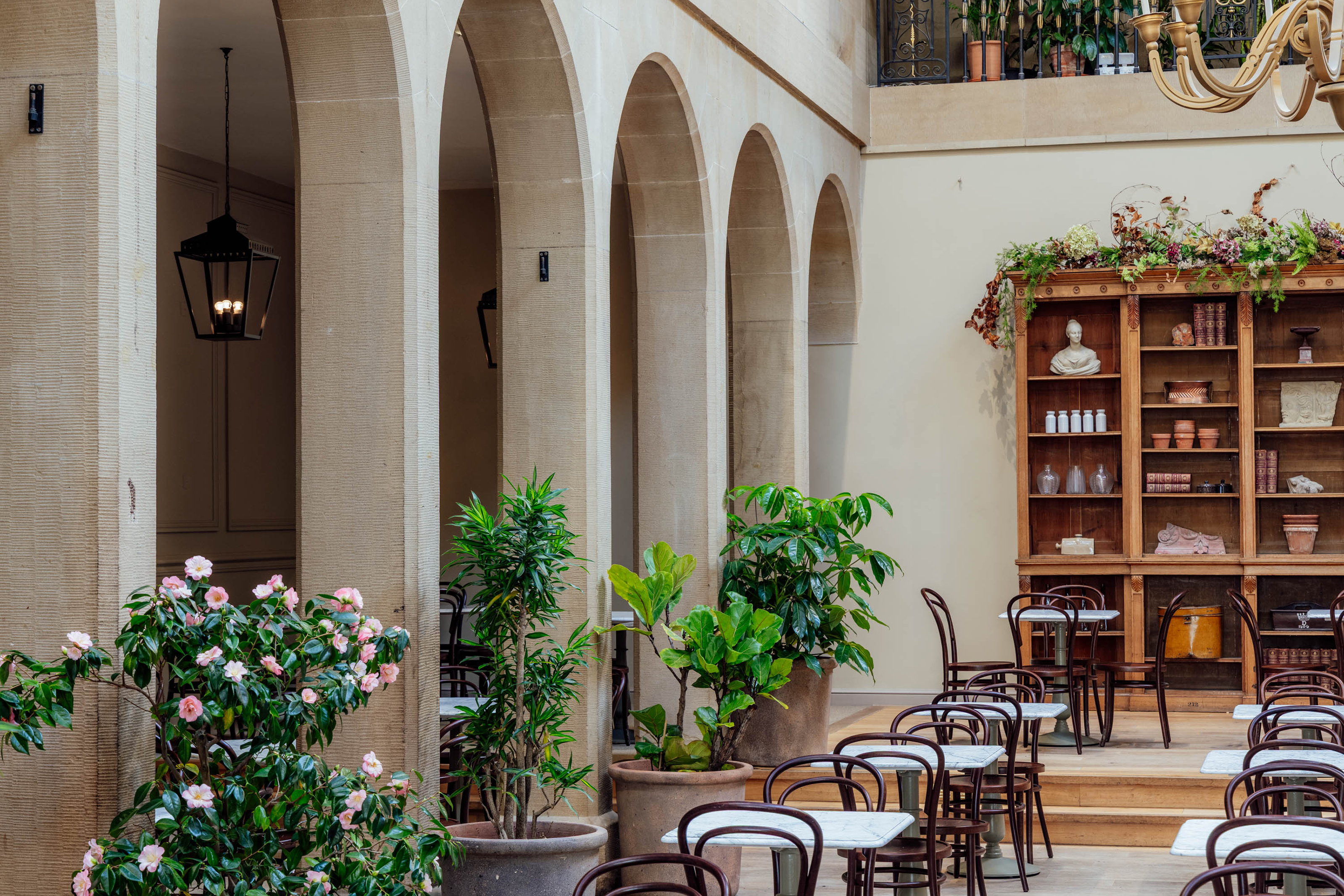
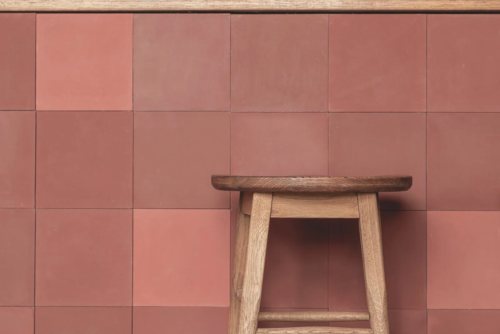
Devonshire Group - Carriage House Café
Heritage and architecture meet in a café that honours Chatsworth’s past
Interior
Le Swine
Building on London's café culture to create a contemporary space full of character
Brand
Interior
Digital
Flipper's Roller Boogie Palace
Recreating an iconic LA roller-skating rink beloved by Prince, Cher and David Bowie
Interior
Kangaroo Works
Turning Sheffield's industrial past into a brand and interior for a community of rental residents
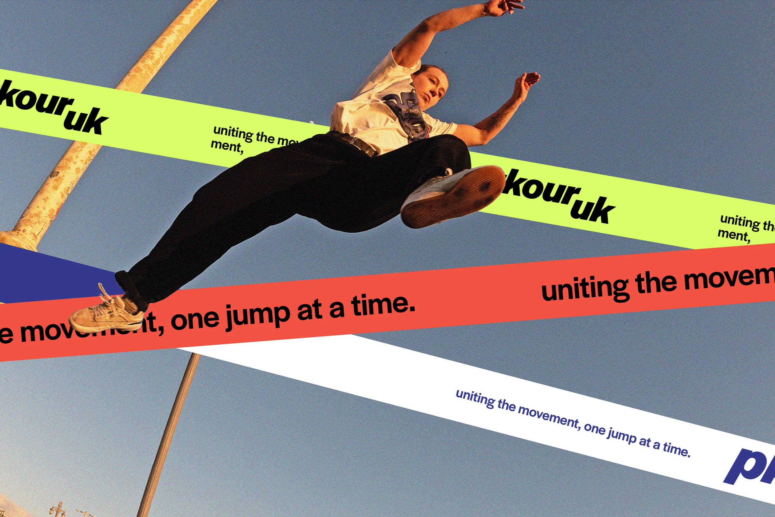
Brand
Interior
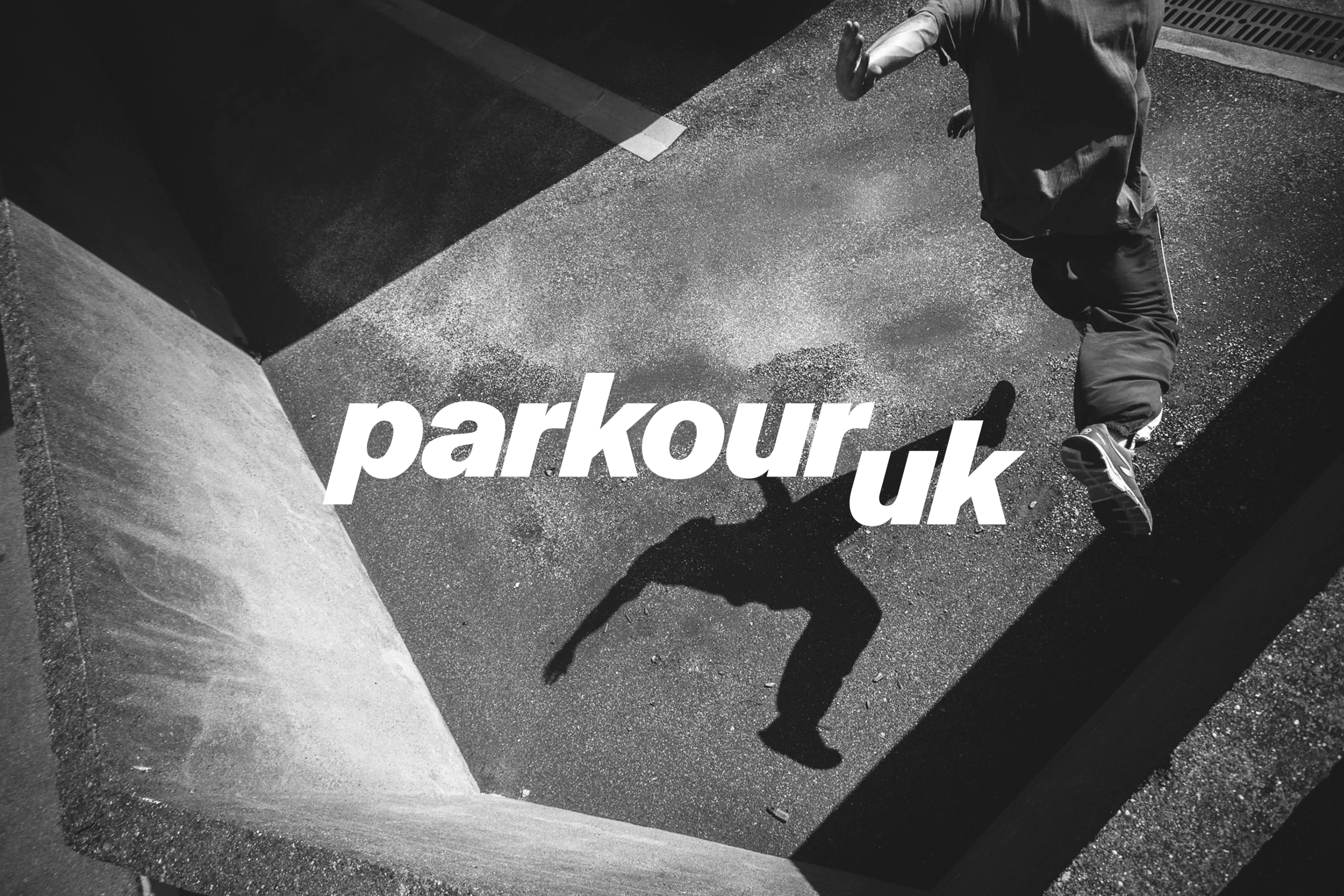
Parkour UK
A brand and digital transformation that reflects the contemporary ethos of parkour
Brand
Digital
YHA
Showcasing a selection of YHA accommodation offerings through vibrant poster design
Brand
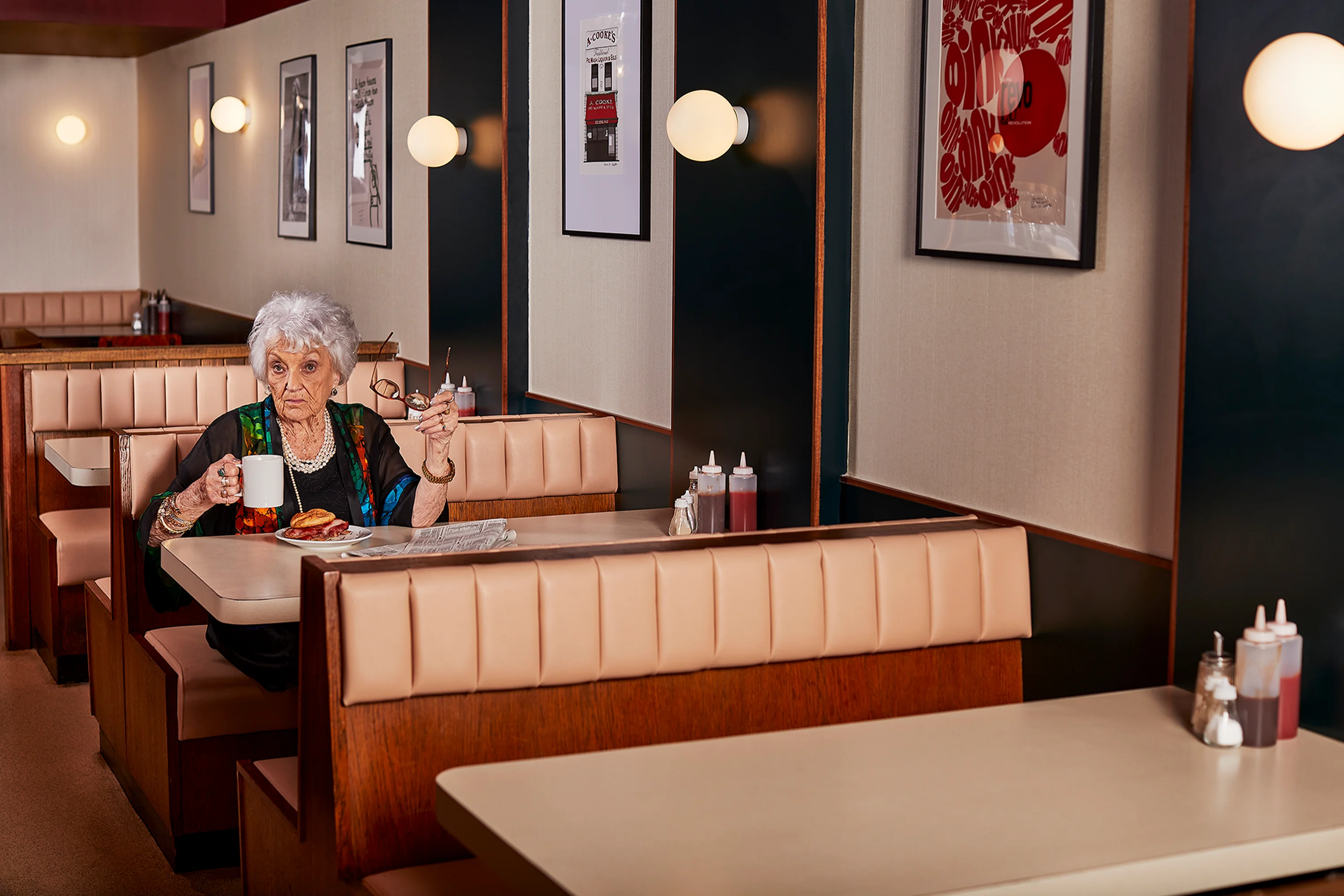
Hallamshire Hotel
An integral pub in Sheffield’s music scene revived as a 1970s-inspired music hall
Interior
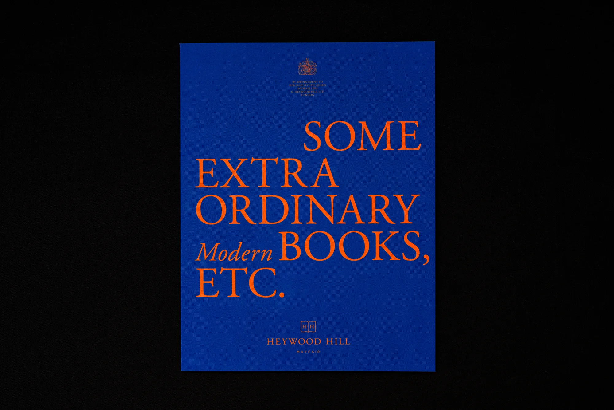
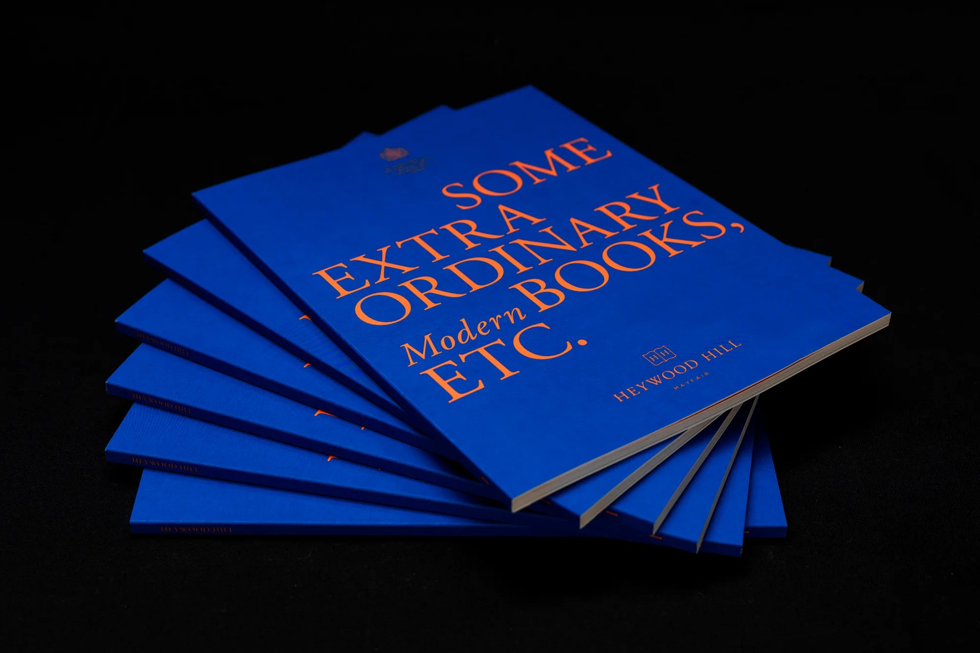
Heywood Hill
Harnessing the power of design, luxury print and direct marketing for this beloved bookseller
Brand
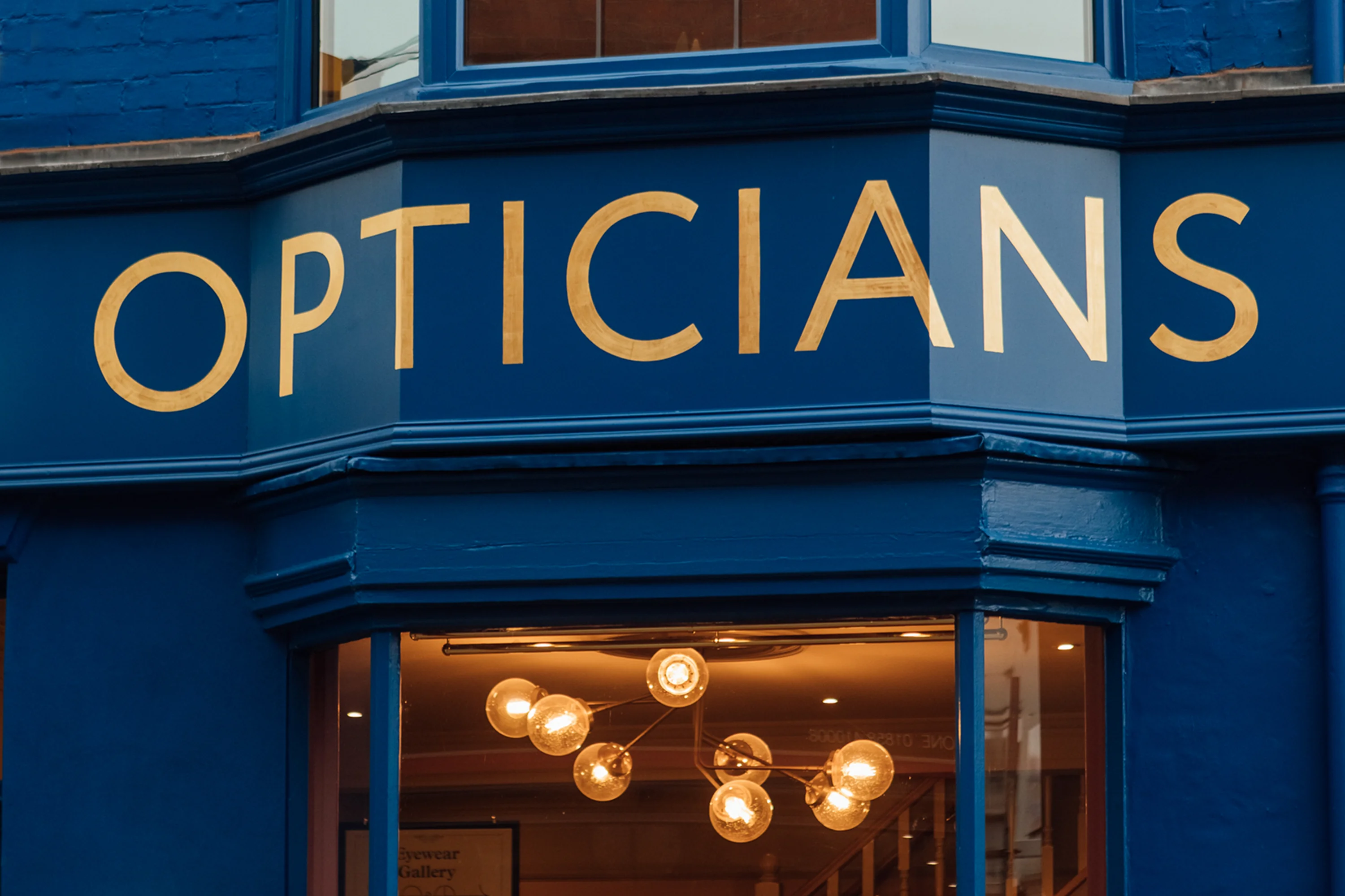
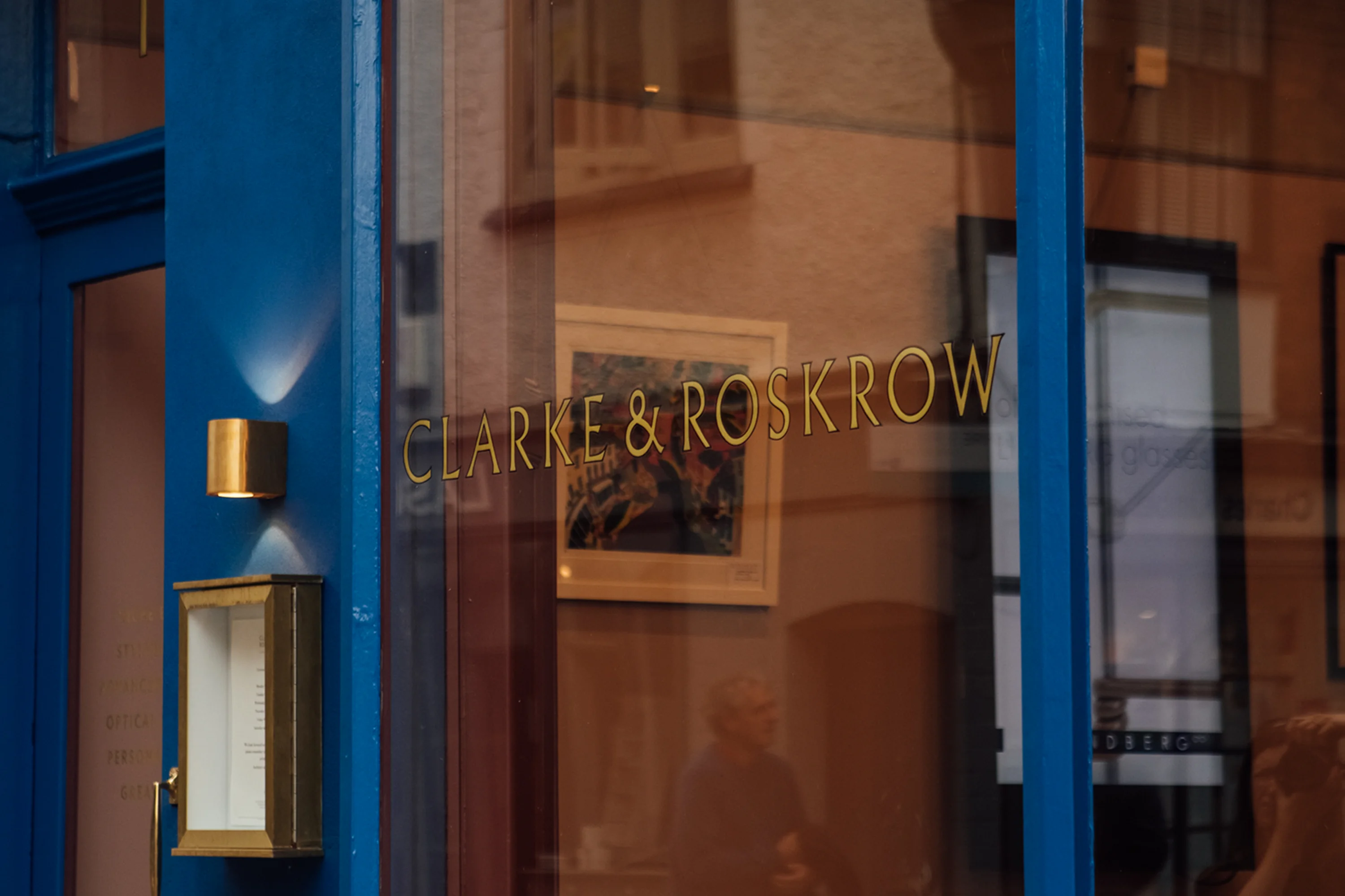
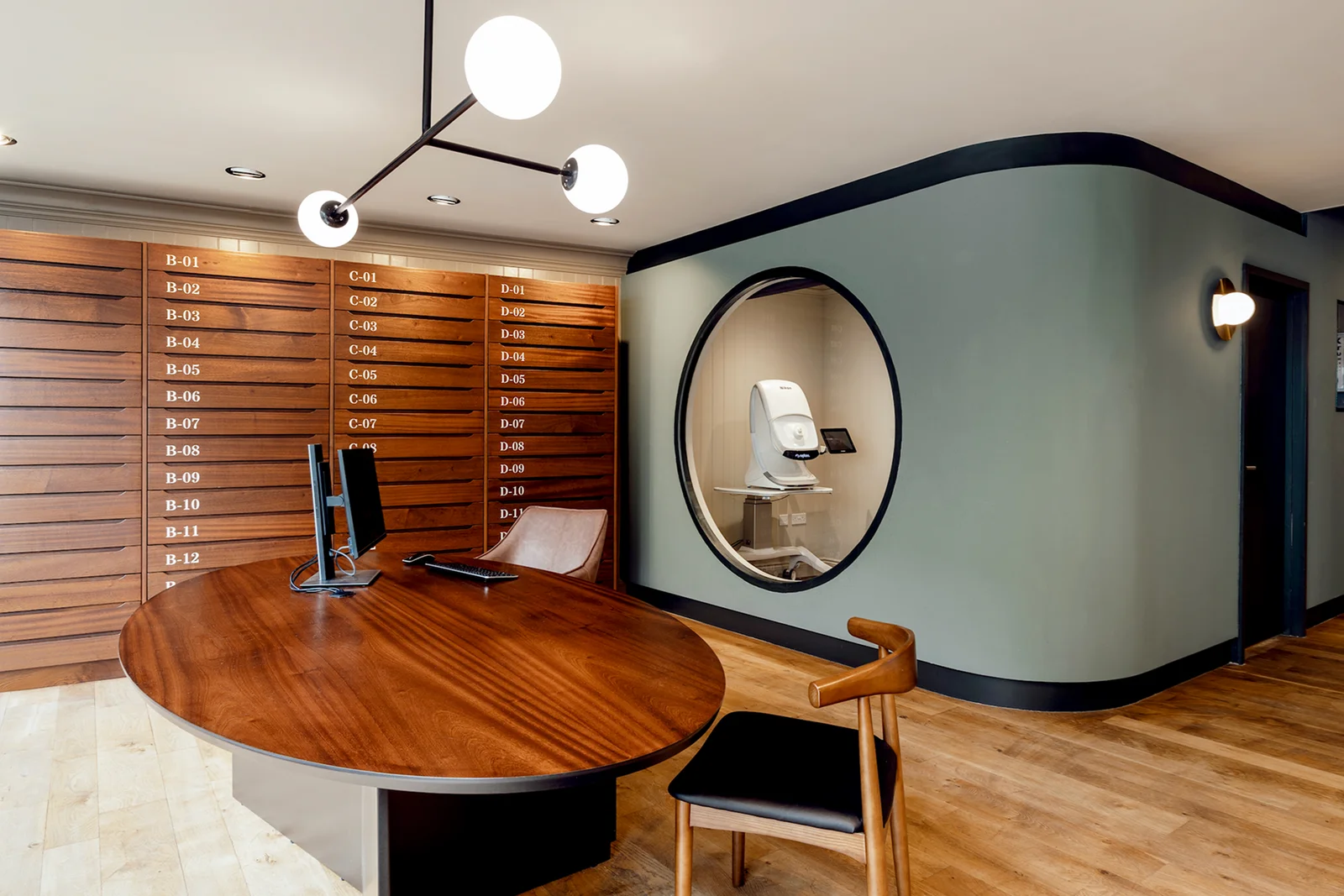
Clarke & Roskrow Opticians
Balancing tradition with a modern style for a bold shopfront, identity and interior
Brand
Interior
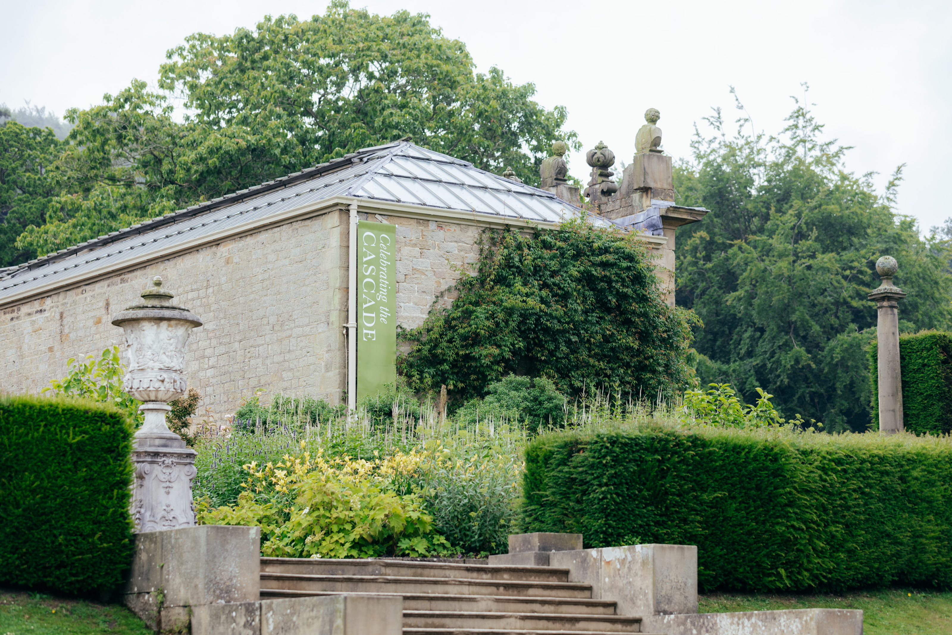
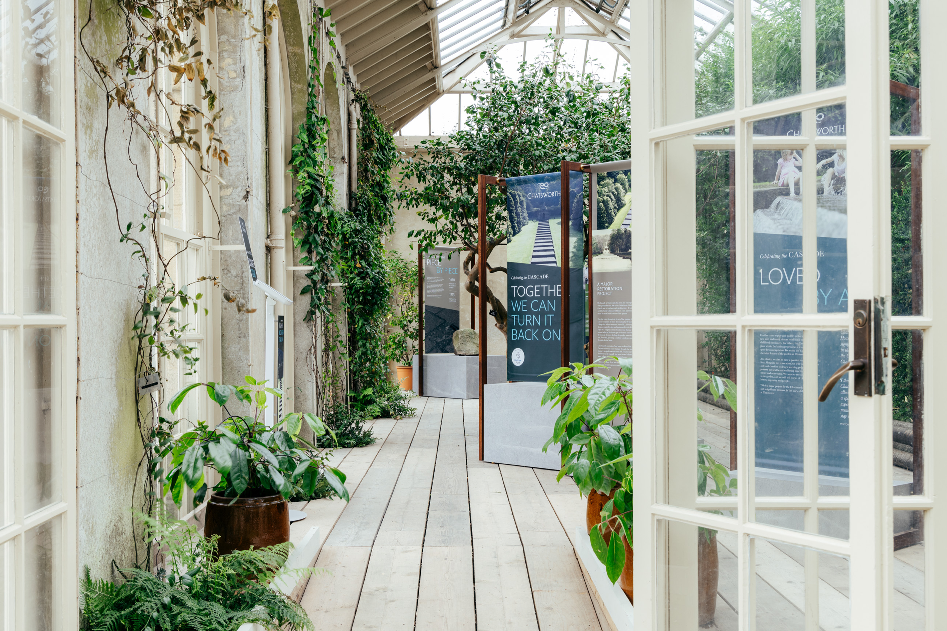
Chatsworth Cascade
Campaign strategy, digital and design assets to turn Chatsworth’s Cascade back on
Brand
Interior
Digital
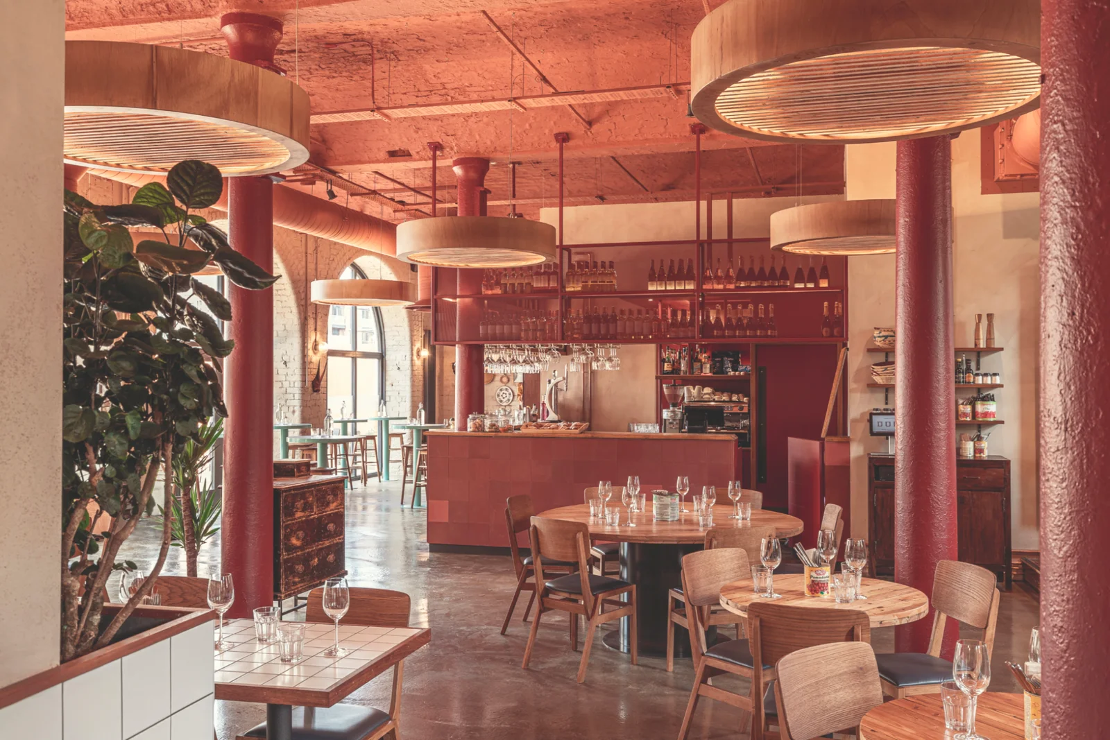
Domo
Blending Sardinian culture with Sheffield’s history to create a welcoming restaurant
Interior
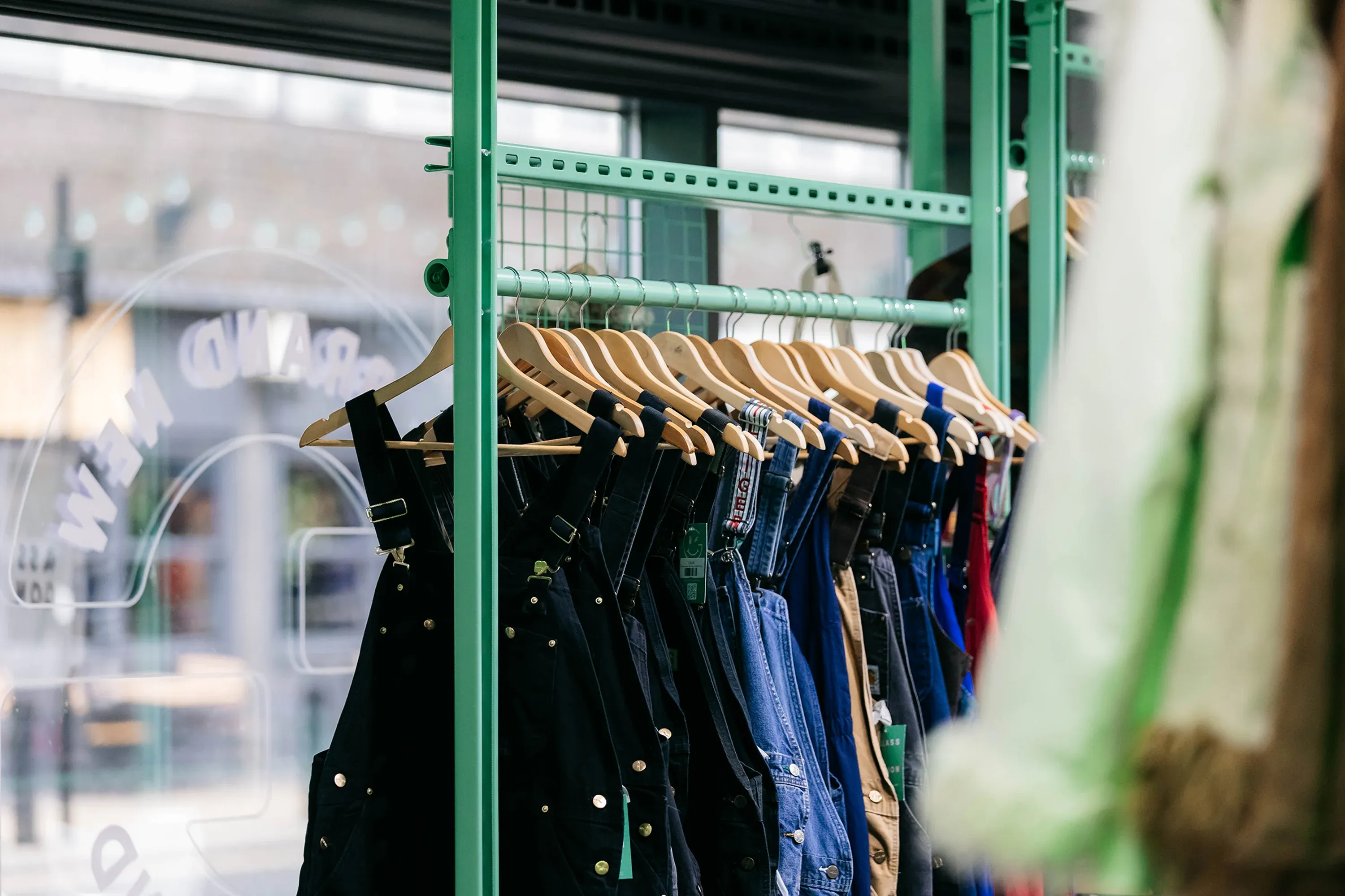
Glass Onion
Launching the future of sustainable fashion online and in-store with graphic and interior design
Brand
Interior
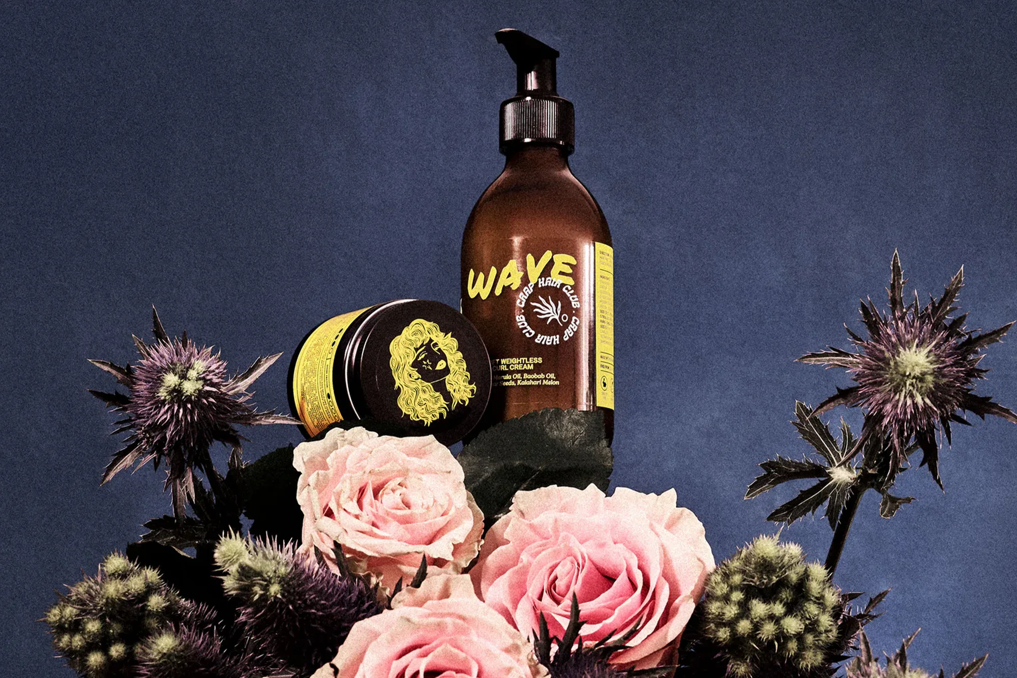
Crap Hair Club
Developing punchy packaging and a Shopify website bursting with personality
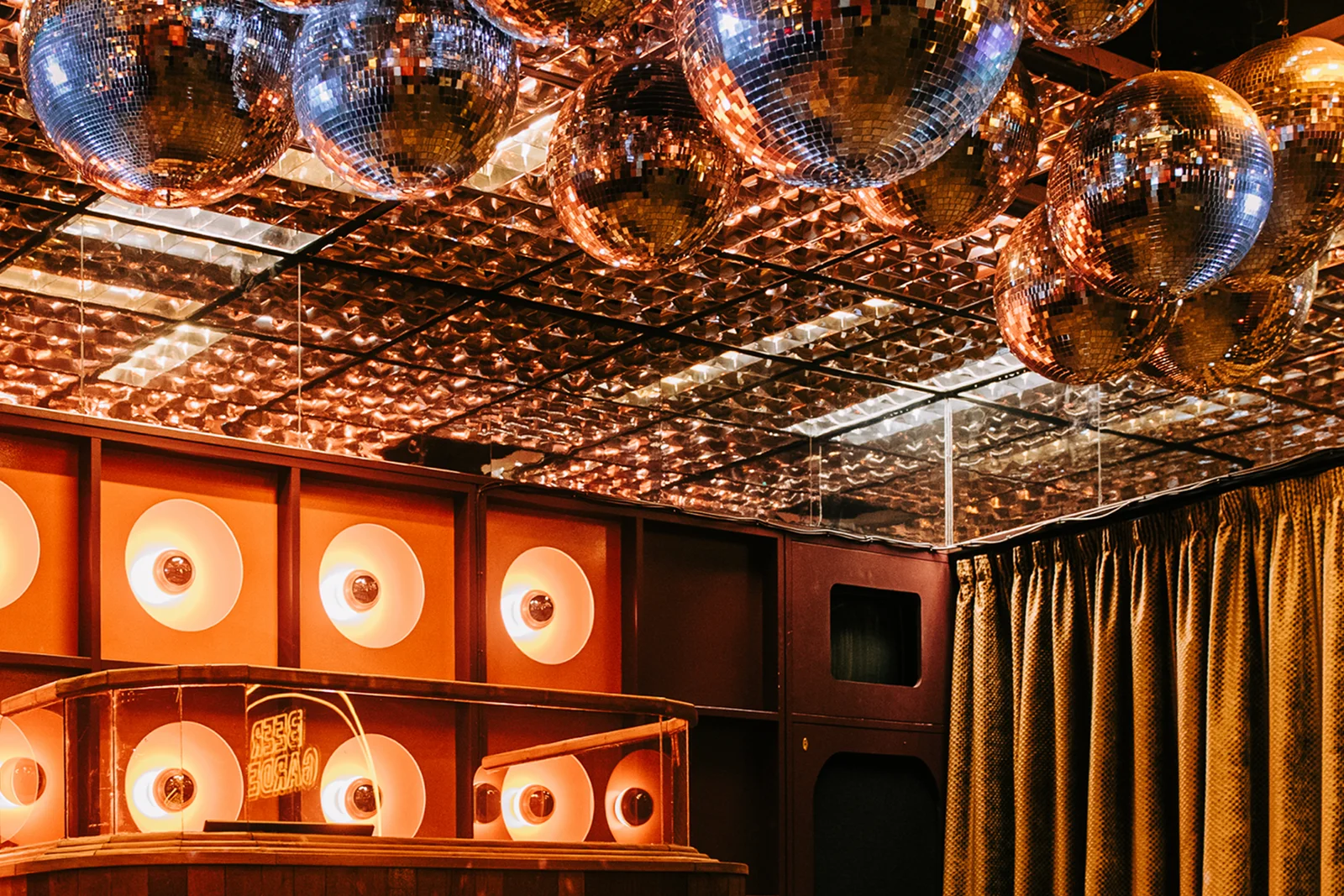
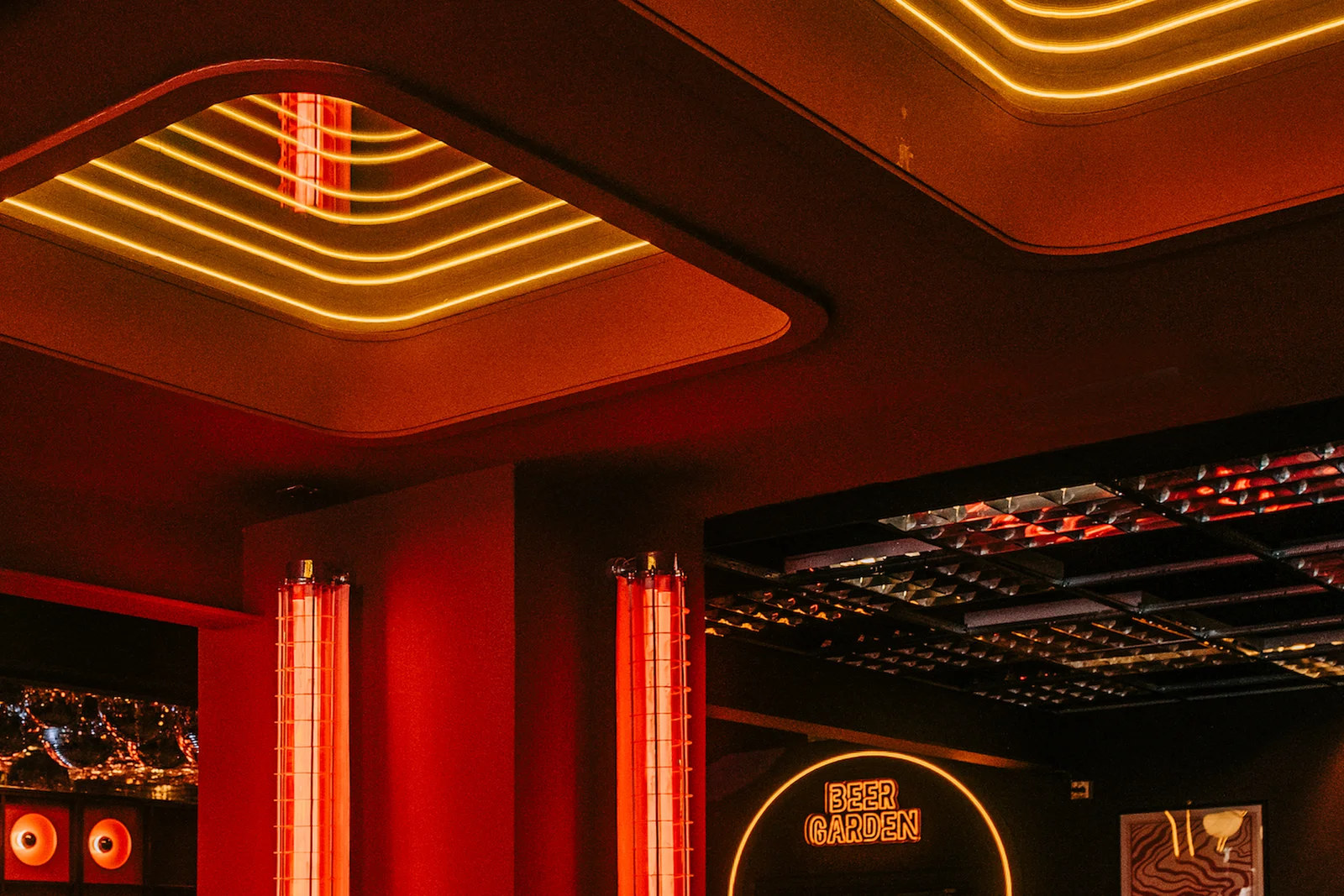
Brand
Digital
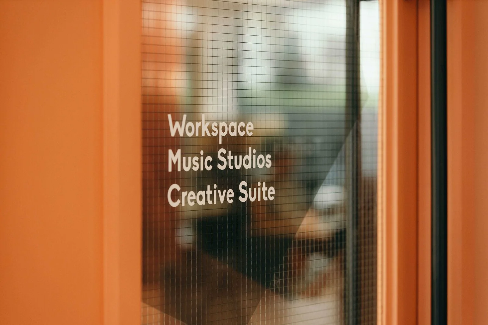
The Halley
Establishing a brand and interior rooted in place for a media workspace in London
Brand
Interior
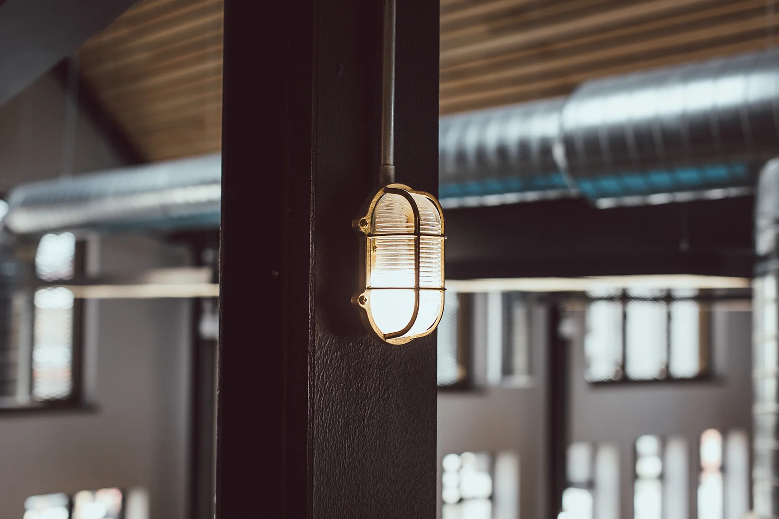
Jaywing
Cutlery factory to creative factory, designing Jaywing's headquarters
Interior
Marmadukes
Refinement of a long loved family cafe brand with a new store concept and logo
Brand
Interior
Ingrid Bridal
Creating a contemporary Shopify website for a bespoke, made to order wedding dress designer
Digital
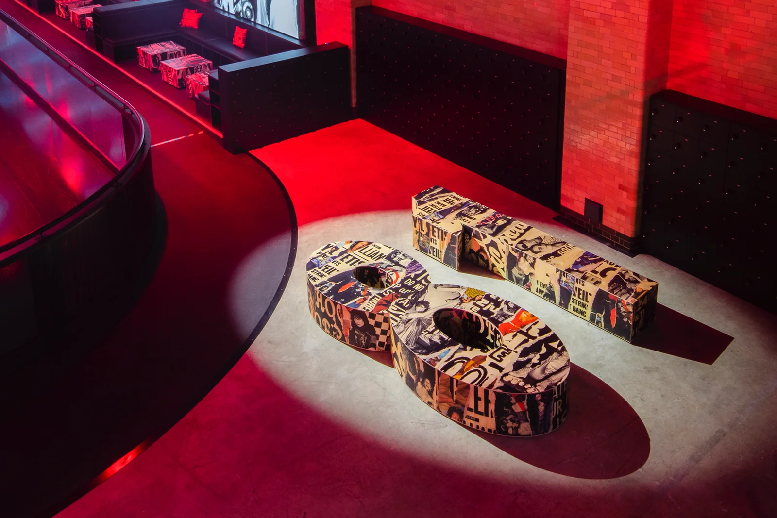
Two Thirds Beer Co.
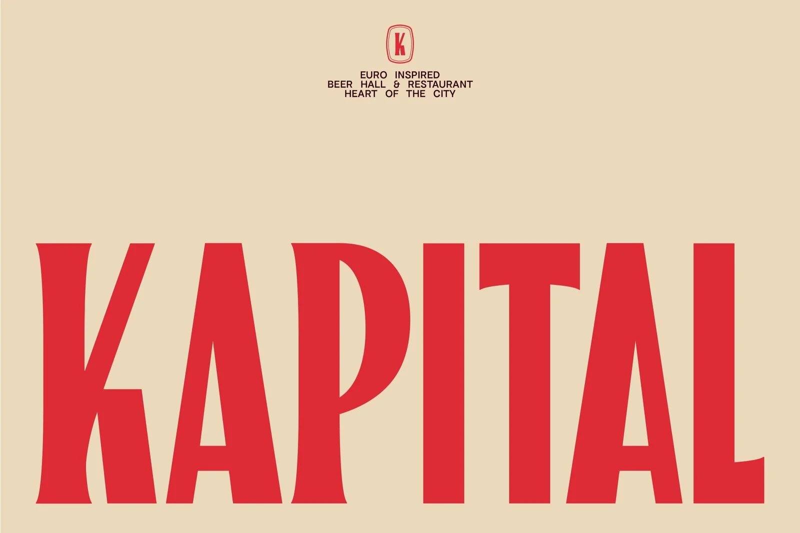
A confident identity for Sheffield’s newest and biggest Euro-inspired destination beer hall
Brand
Interior
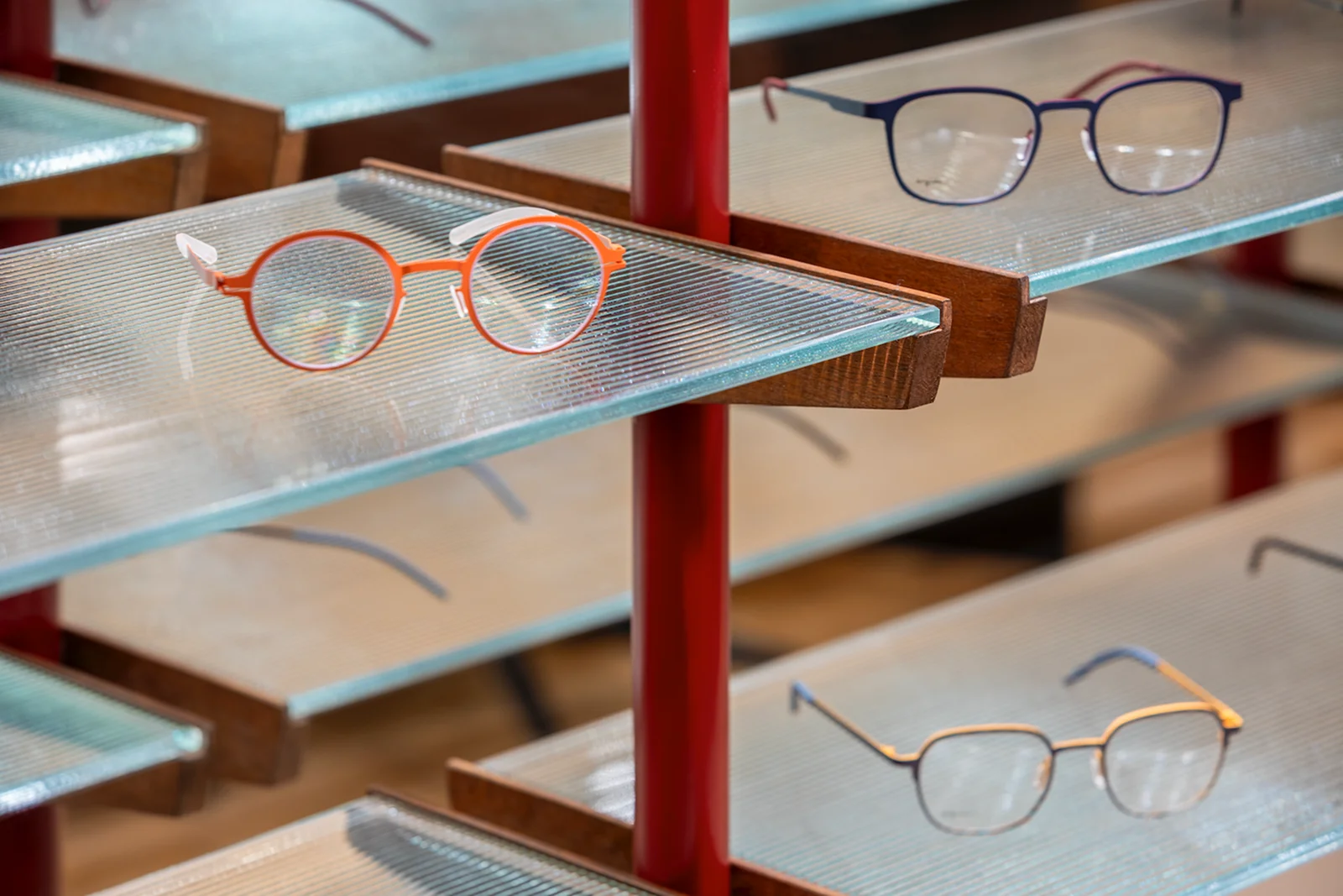
The Eye Place
Custom-made solutions and branding instil an innovative opticians with a relaxed luxury
Brand
Interior
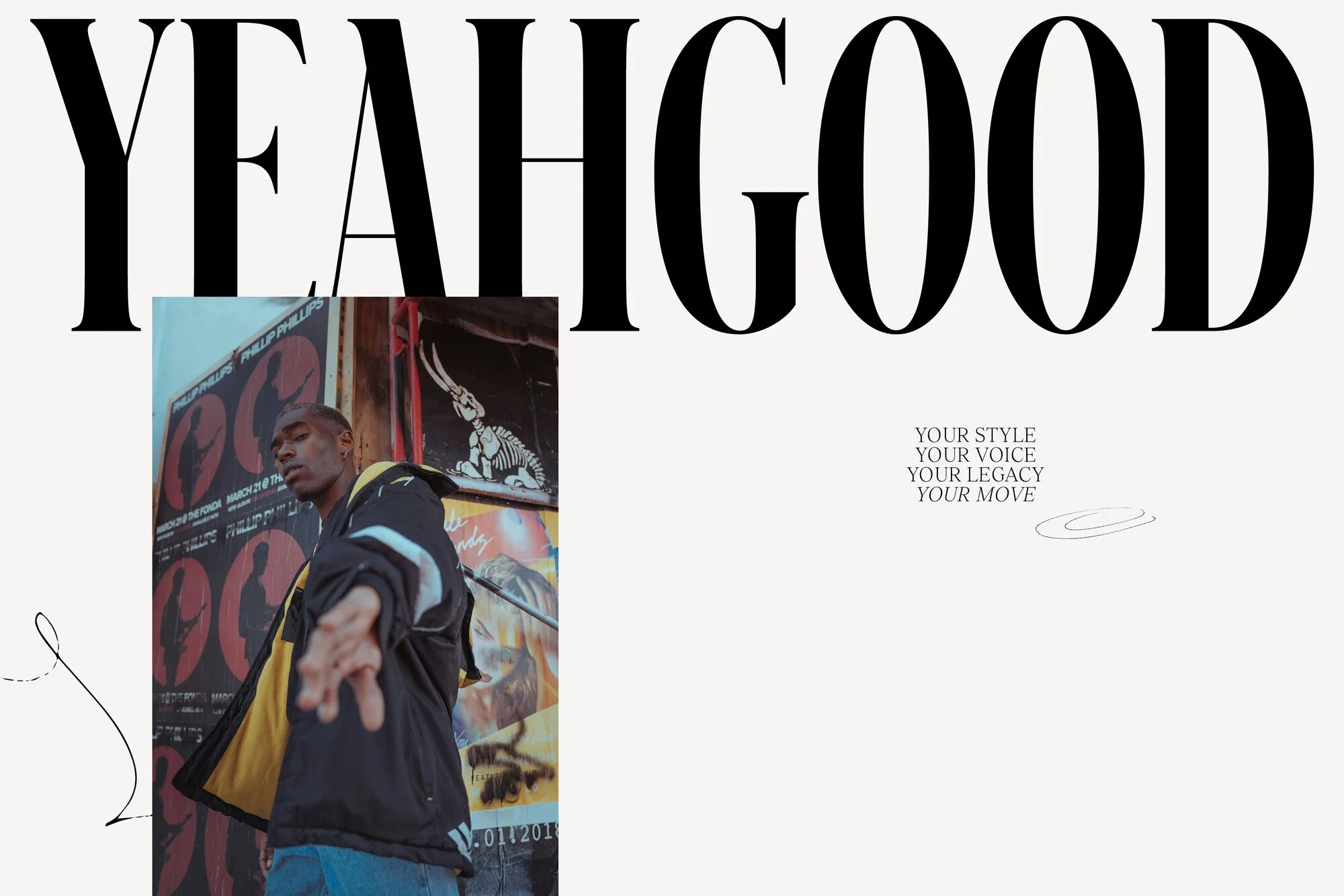
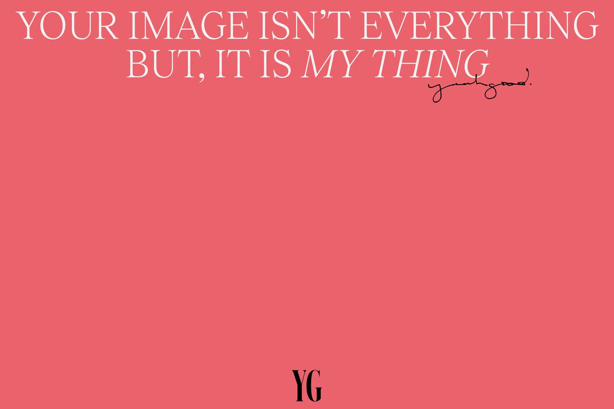
YEAH GOOD
Producing a strong brand identity and website that champions self-expression
Brand