Sport:80 creates innovative sports management software that’s trusted by sports brands across the globe.
“From day one we had confidence in 93ft to deliver a first class website for our business. Every aspect of the project was considered and well thought out, from creating a brief and carrying out a content and SEO audit, through to design, copywriting, development and applying the finishing touches. We now have a web presence that we are truly proud of and represents the innovative nature of our business.”
93ft has been privileged to know and work with Sport:80 for many years now, and we’re proud to partner with another incredible “Made in Sheffield” company who connects with a global audience.
As Sport:80’s preferred partner, we’ve worked alongside them for National Governing Bodies of Sport (NGBs) around the world, including USA Archery, British Archery, British Weightlifting and Inclusive Skating; developing sites to meet each organisation’s specific requirements - as well as the needs of their members.
Sport:80’s industry leading sports business management technology combined with 93ft’s expertise and years of experience in web design and development, result in sites that take sports NGBs in the UK, USA, Europe and Canada to the next level, increasing membership and revenue and better meeting the needs of their members, coaches and athletes.
Sport:80’s innovative and unique sports management software has revolutionised management systems for NGBs, clubs and organisations in the UK and worldwide.
Sport:80 approached 93ft for a whole new website for their own sites, both UK and US versions. Here’s what we did.
Our SEO experts began by compiling an in-depth SEO report into the Sport:80 site, and the sites of their main competitors, as identified by the company themselves and by our own market research.
Market research is a big part of what we do for our clients, checking out the competition, gaps in the market and potential revenue streams.
Our SEO analysis looked at the keywords that Sport:80 was already ranking for as well as areas for improvement and drew up a strategy, including content plan, to reach the coveted page 1 positions.
It’s not enough to have a website that looks great, we make sure that our sites deliver the full package - technically brilliant and visually stunning, underpinned by robust marketing and SEO strategies.
Next our web design team analysed the existing sitemap. This had grown unwieldy as new pages had been added without a good overview of the site as a whole - something we see often.
We based the sitemap on the SEO report, identifying the crucial core pages and slimming down the rest, removing unnecessary pages and amalgamating others. We created a prioritised map with a good link structure which ensures a logical progression through the site.
The user is guided on a journey from homepage through to discovery of the Sport:80 Platform, towards the site’s main call to action (CTA) - to book a demonstration with Sport:80.
The sitemap then formed the foundation for the rest of the website, both design and copy, to be built on.
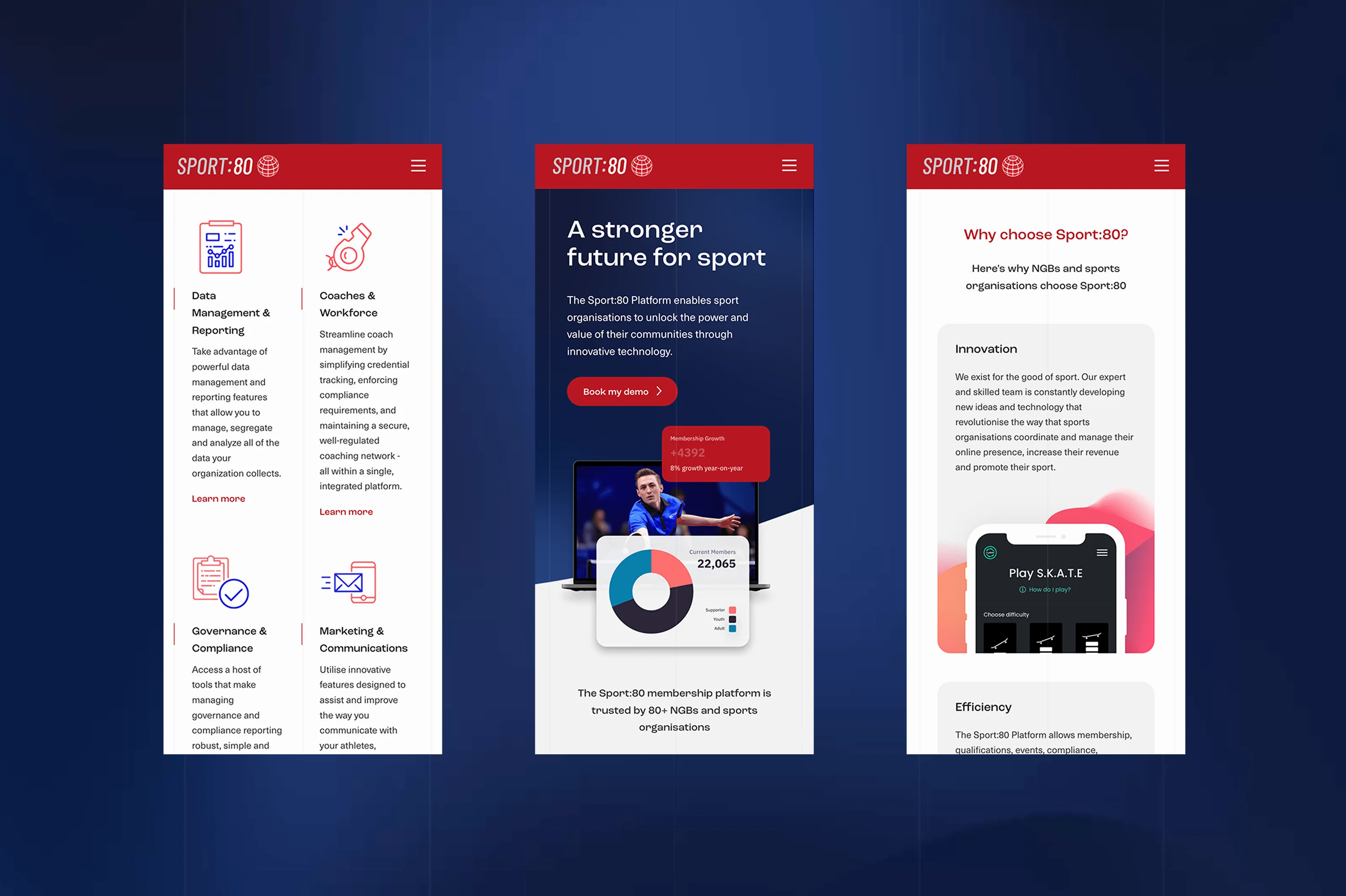
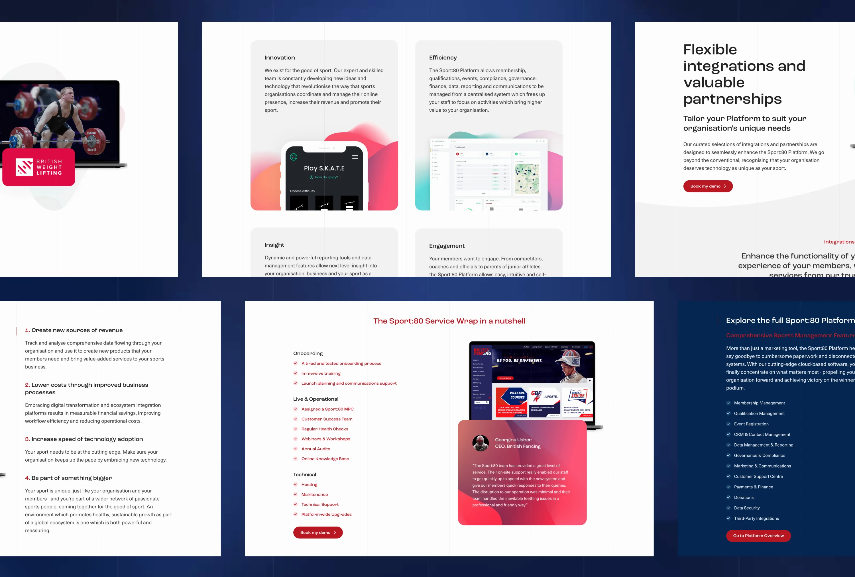
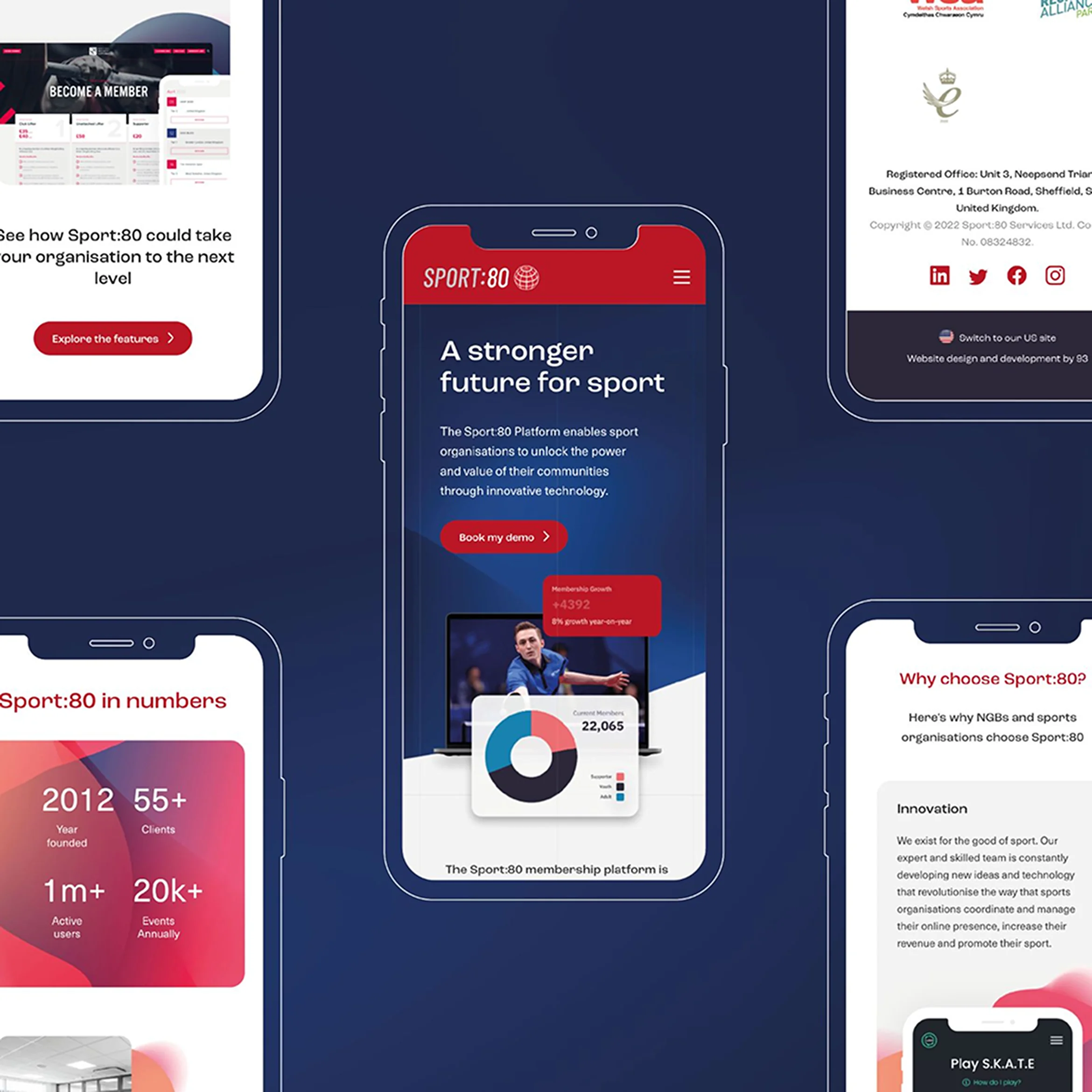
Sport:80 needed a fresh, clean design that worked for its main audiences in the UK, USA, Canada and Europe. While there were to be 2 different sites for the UK and US - to take into account differences in legislation and ways of working - the look and feel needed to be consistent across both.
Functionality lies at the heart of 93ft website design. A site that looks great but is technically unsound won’t help our clients meet their goals.
Working from our sitemap we built a slimmed down site that’s easy for our client to manage with a customisable content management system (CMS) to enable their team to add or remove content as needed.
We created intuitive navigation to lead the viewer on a logical and focused journey through the site. We added dynamic visuals in the form of images and graphics designed by our in-house design team, and we kept the Sport:80 branding strong and consistent throughout.
Our branding team applied the Sport:80 brand which includes a strong and energetic colour palette to appeal across the board of sports organisations, and chose a confident new typeface.
The logo conveys the brand’s international appeal and reach, with an uncomplicated look and feel to the stylised globe symbol.
We focused on the tone of voice to help solidify the brand online. Tone of voice refers to the way a brand gets their message across - it’s not just what they say, but how they say it.
While the overall appearance of the site is the first thing that a viewer sees, the copy is crucial for keeping them on the site, engaging them and presenting a compelling case for the product or service.
It can be tempting to become overly techy and use jargon when writing for a B2B (business to business) audience but this is often counter productive. However expert your audience is, they're still human, and personality counts. Cutting through the jargon and tech speak can actually make your site stand out as the human face of the industry.
Sport:80’s target audience may not be techy themselves - which is why they’re taking on an outside expert - so it would be a mistake to spend too long on the details. The key was to demonstrate Sport:80’s expertise without using language that was overly complex.
The Sport:80 Platform isn’t simply a download, it’s about forming a partnership with Sport:80 to support the organisation on an ongoing basis, so they also needed to come across as approachable, friendly and there to help.
We also created a news section where the Sport:80 team could post their own blogs and news to keep their clients informed and help hit those SEO targets.
When building a website that aims to present different content based on a user's location, and in particular the location of the search engine that is being used to find the website, it’s critical to ensure that there is a main ‘lang’ specified within the html, meta tags and the sitemap.
Each different language can then be referenced as an additional alternative link, this is vital to ensure that a search engine knows which version of a web page you’d like to display to people in each specific country.
Secondly, the use of canonical tags ensures that search engines know that there is a ‘master’ version of each web page, this helps when you may have very similar content across two different language versions, or even the same content but on two different URLs - you won't be penalised by search engines for having duplicate content.
Getting the messaging right is a crucial part of what we do for our clients here at 93ft.
During our initial meetings we workshop the key values and principles underpinning the business - their “Why”. We distil these ideas, refining them into messaging that we can weave into the fabric of the brand, clearly communicating what the business stands for and offers, the problems it solves and the benefits it brings.
Sport:80 is an innovative and forward thinking brand that’s rooted in combined decades of sporting experience. They stand for optimism,vision and success, taking an organisation that may not have fully realised its own potential and placing it on the national or international stage.
They focus on making NGBs more self-sufficient, creating diverse revenue streams that will help them thrive and forming strong channels of communication with all members, from volunteers and spectators to pro athletes and judges.
At the heart of the business though, alongside a deep love and respect for sport, Sport:80 is about the human qualities that make them such a fantastic company to work with.
As always, working with Sport:80 has been a pleasure and we look forward to continuing to work together in the future.
When it comes to brand experience, it’s not always about starting from scratch. If the heritage and advocacy is already in place, it’s a simple case of elevating, not fixing. The refreshed look and feel for Chatsworth Farm Shop celebrates its connection to the wider Chatsworth Estate, and renews its relevance for loyal customers for many years to come. Find out more
93ft recently completed an interior design and brand identity project to refresh the look and feel of Hathersage Pool Cafe, helping to positively impact the overall experience of the picturesque Peak District swimming spot for its many visitors throughout the year. Find out more
93ft worked on the interior design and brand identity for Kangaroo Works, a mixed-used, residential development forming part of Sheffield city centre Heart of the City II regeneration. With a rich history and cultural heritage to explore, the 93ft team created an experience for residents that felt grounded in place and culture. Find out more
Image isn’t everything, but it is Laura Simons’ thing. 93ft was tasked with executing a confident brand identity that enabled YEAH GOOD to make an ambitious statement of intent. Find out more