When independent optician Clarke & Roskrow wanted to elevate their high street store identity and fascia to make more impact, they invited us to answer their design challenge.
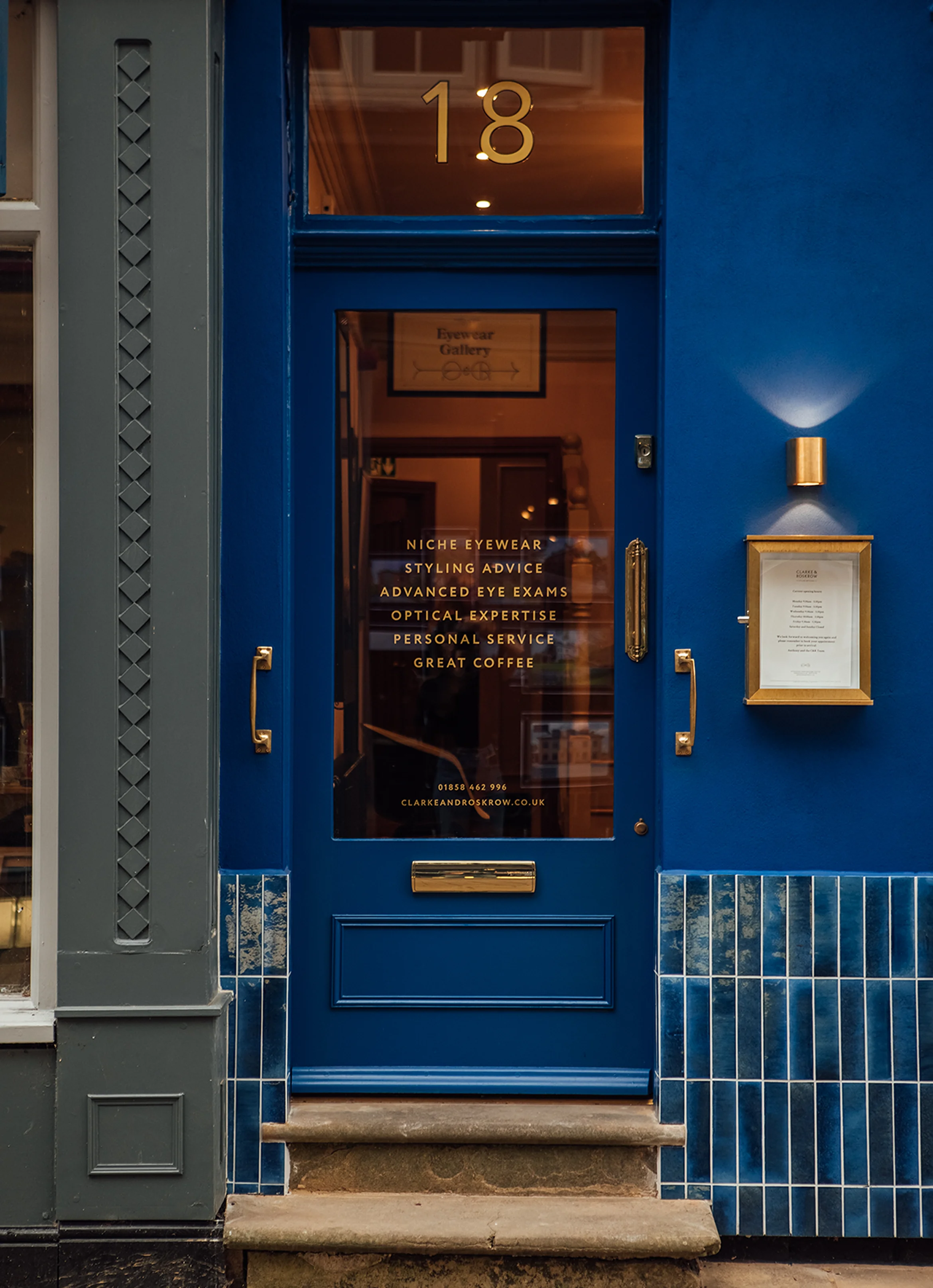
Founded in 1974, Clarke & Roskrow is an award winning opticians advising customers on the necessary lens and the style of frame when it comes to choosing a pair of glasses. Based on the historic Church Street in Market Harborough, Leicestershire, the styling opticians is known for personal service when selecting unique eyewear from some of the most exclusive designer glasses.
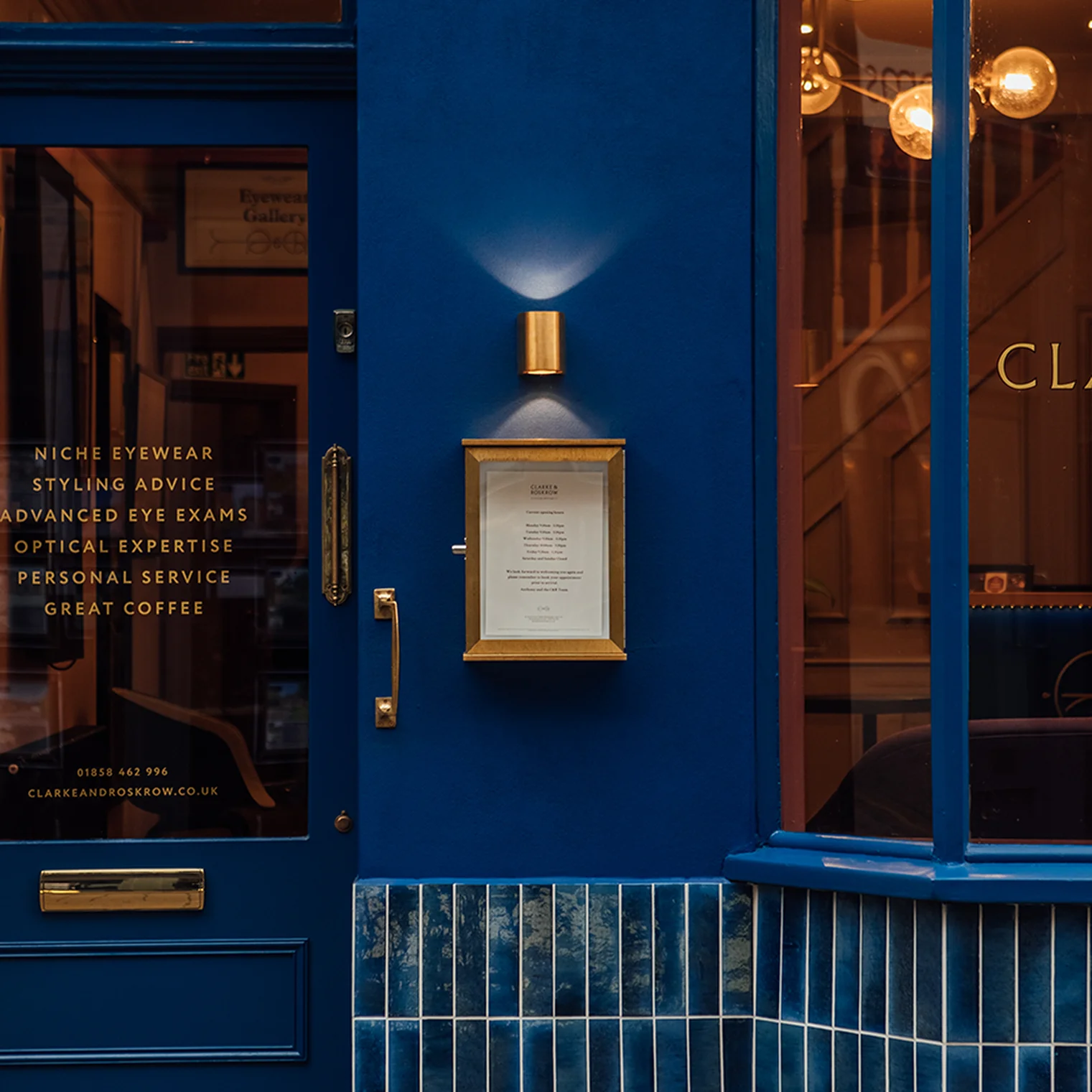
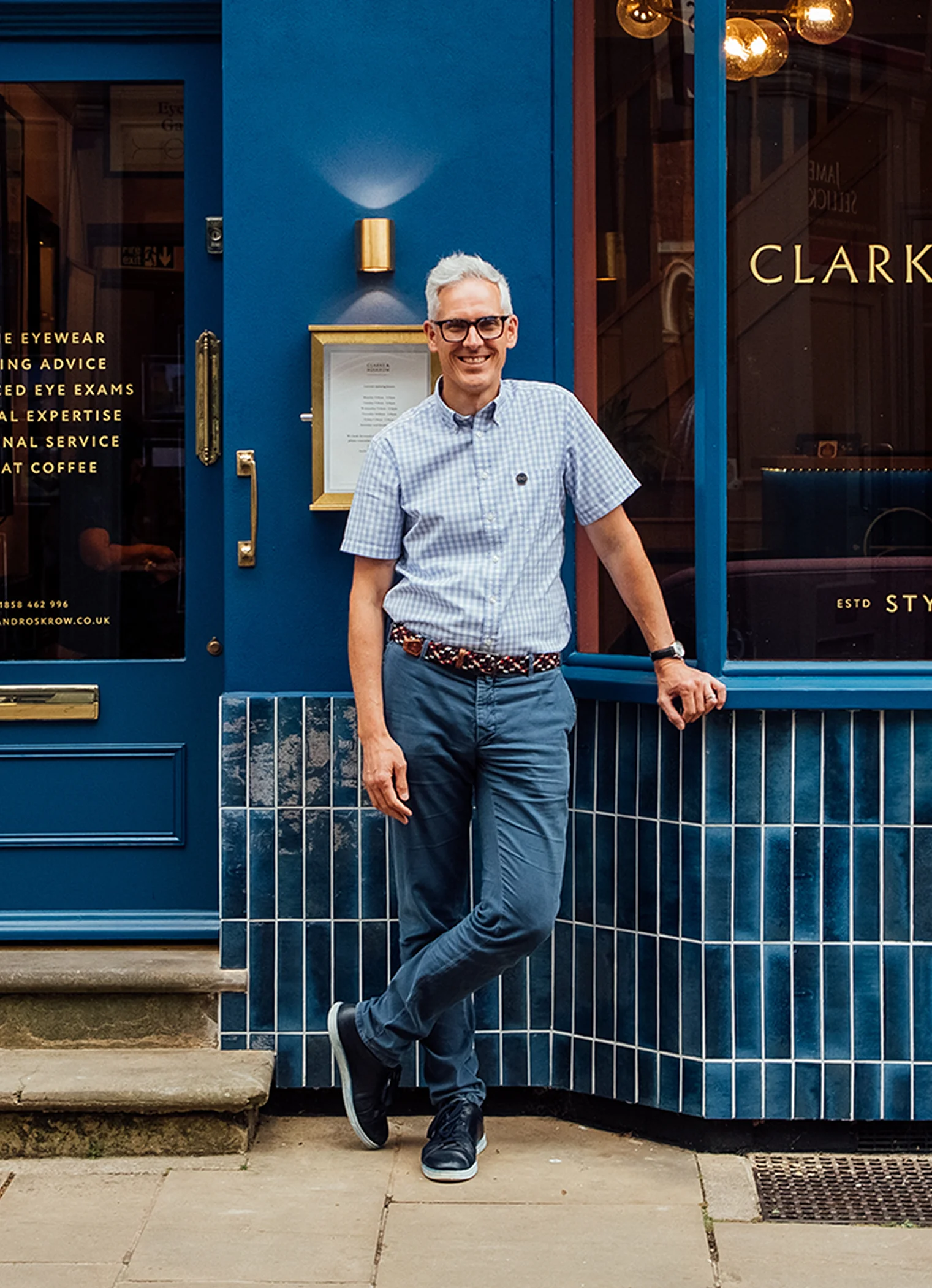
We have worked alongside Clarke & Roskrow for several years, designing the brand identity, fitting out the interior of their high street shop and updating the storefront. To attract more customers and to clarify their proposition, our branding and interiors teams worked together to establish a modern heritage feel that was consistent from the signage to the shelving.
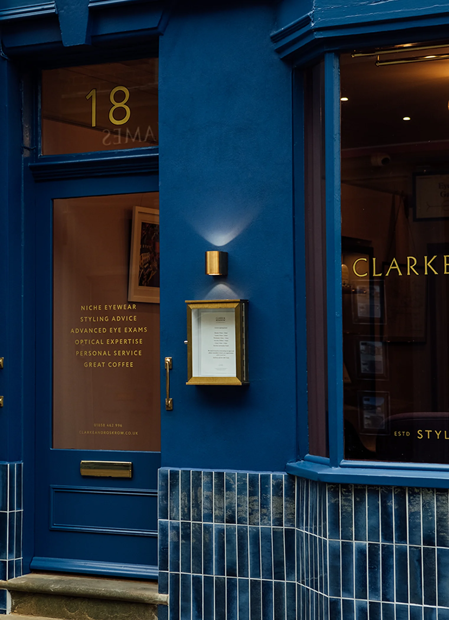
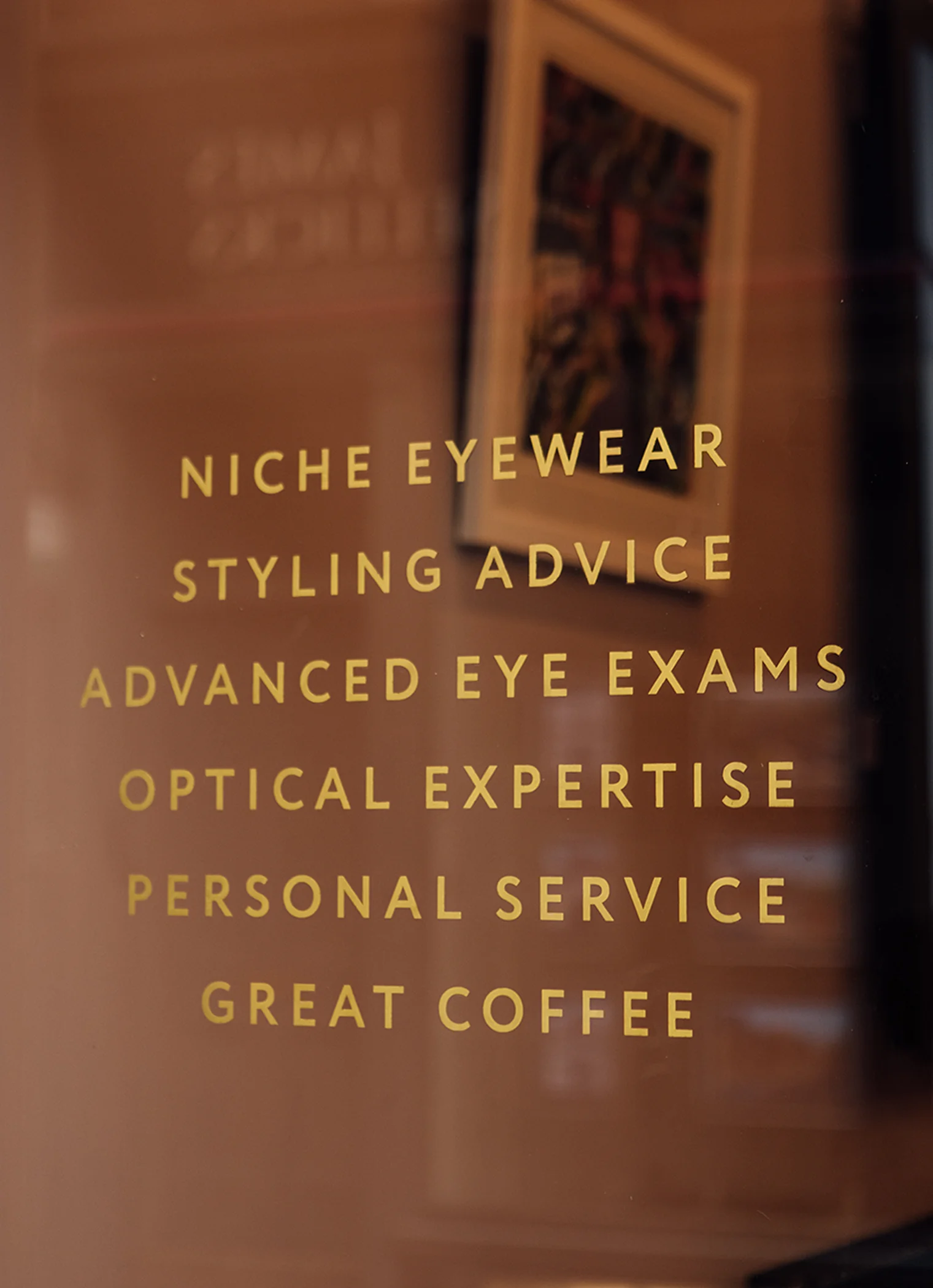
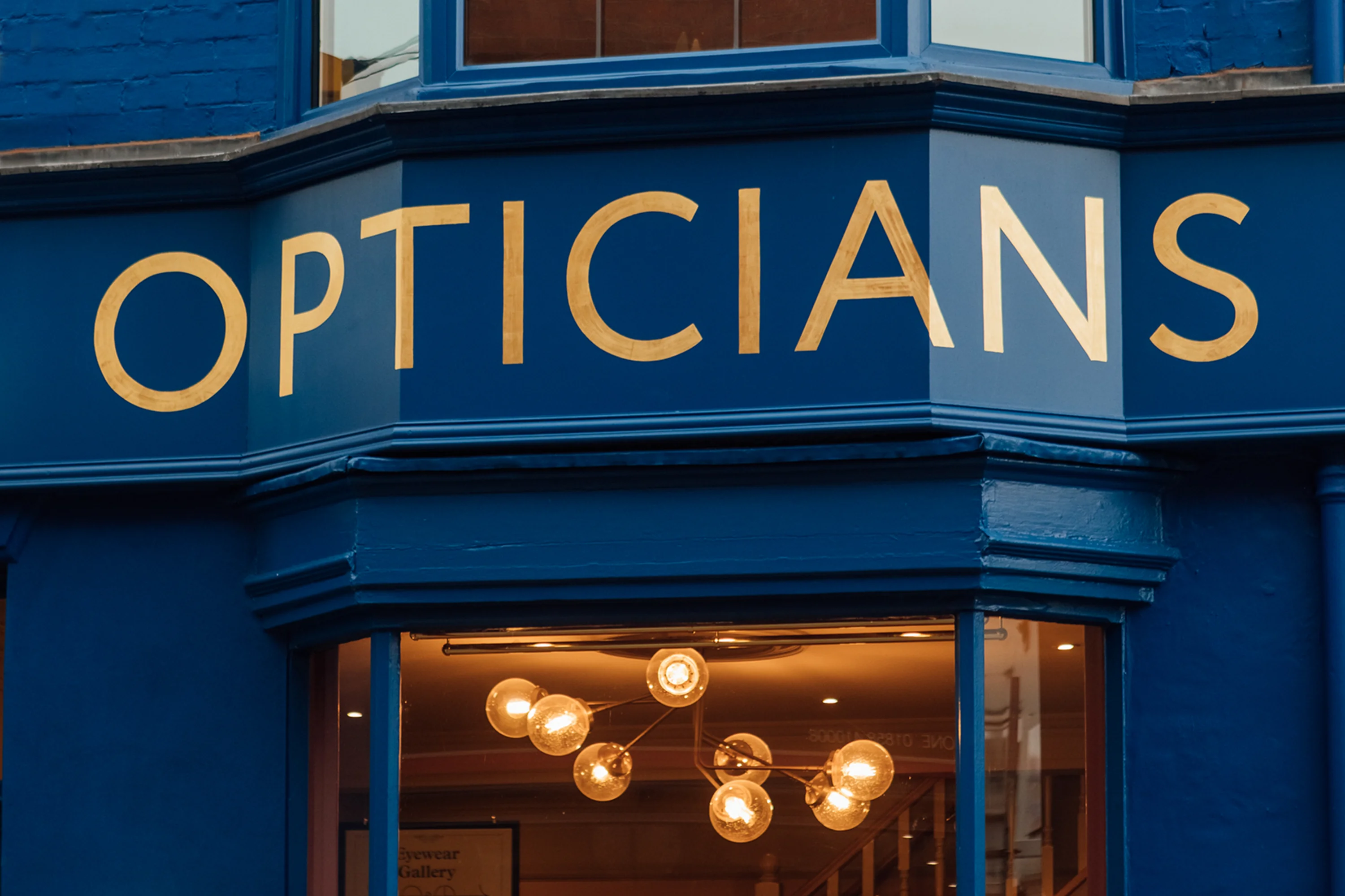
The existing storefront was repainted, retiled and updated with fixtures and fittings designed and manufactured in our workshop. A deep blue was selected for the entire elevation allowing the business to stand out while maintaining a sense of luxury. All of the graphics and wording were hand painted onto the store front, applying real gold leaf and burnish effects to create authenticity.
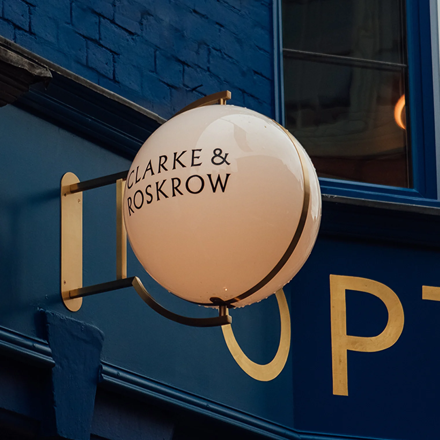
Our brand team created a dynamic concept that maximised the word ‘opticians’ which was painted in large typeface across the fascia of the shop. This was an untraditional decision – usually the business name sits on the fascia – but we felt that this eye-catching move would immediately elevate the store. The high street is crowded and space is tight meaning that a business name can easily lose impact. Now, it’s instantly obvious what Clarke & Roskrow offers – no-one can miss it – and opportunities for passing trade have increased.