Utilising cutting edge technology, The Eye Place provides a ‘different level of eyecare’. Operated by third generation optometrist, Alex Kemp, The Eye Place has spent the past two decades developing The Eye Lab, which pairs specialist eye health technology with highly experienced and knowledgeable optometrists.
Initially working with The Eye Place to establish a clear brand and logo – that has evolved over the years but still maintains its original form – we have since developed the interiors of The Eye Place stores across the UK in prestigious locations.
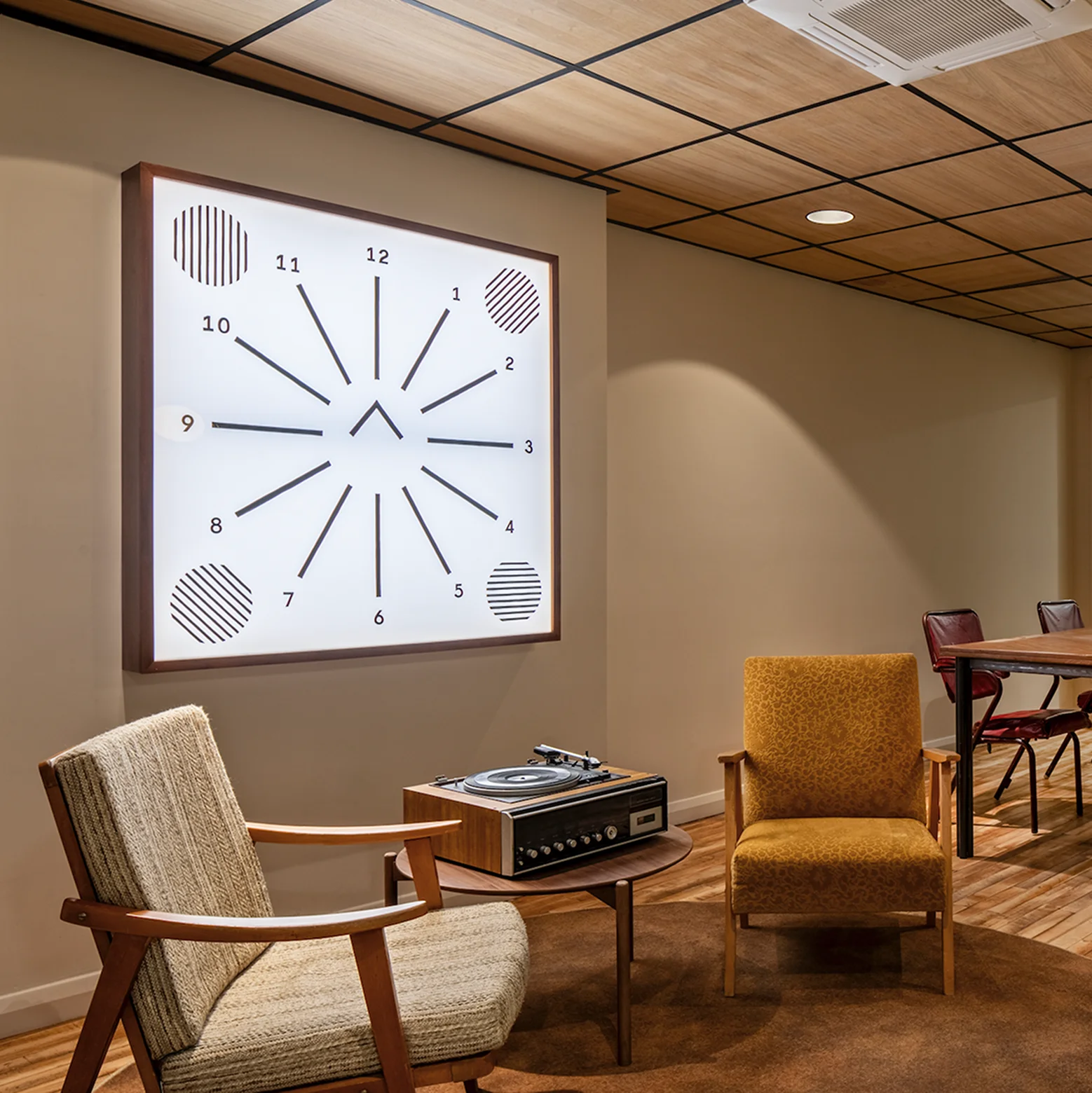
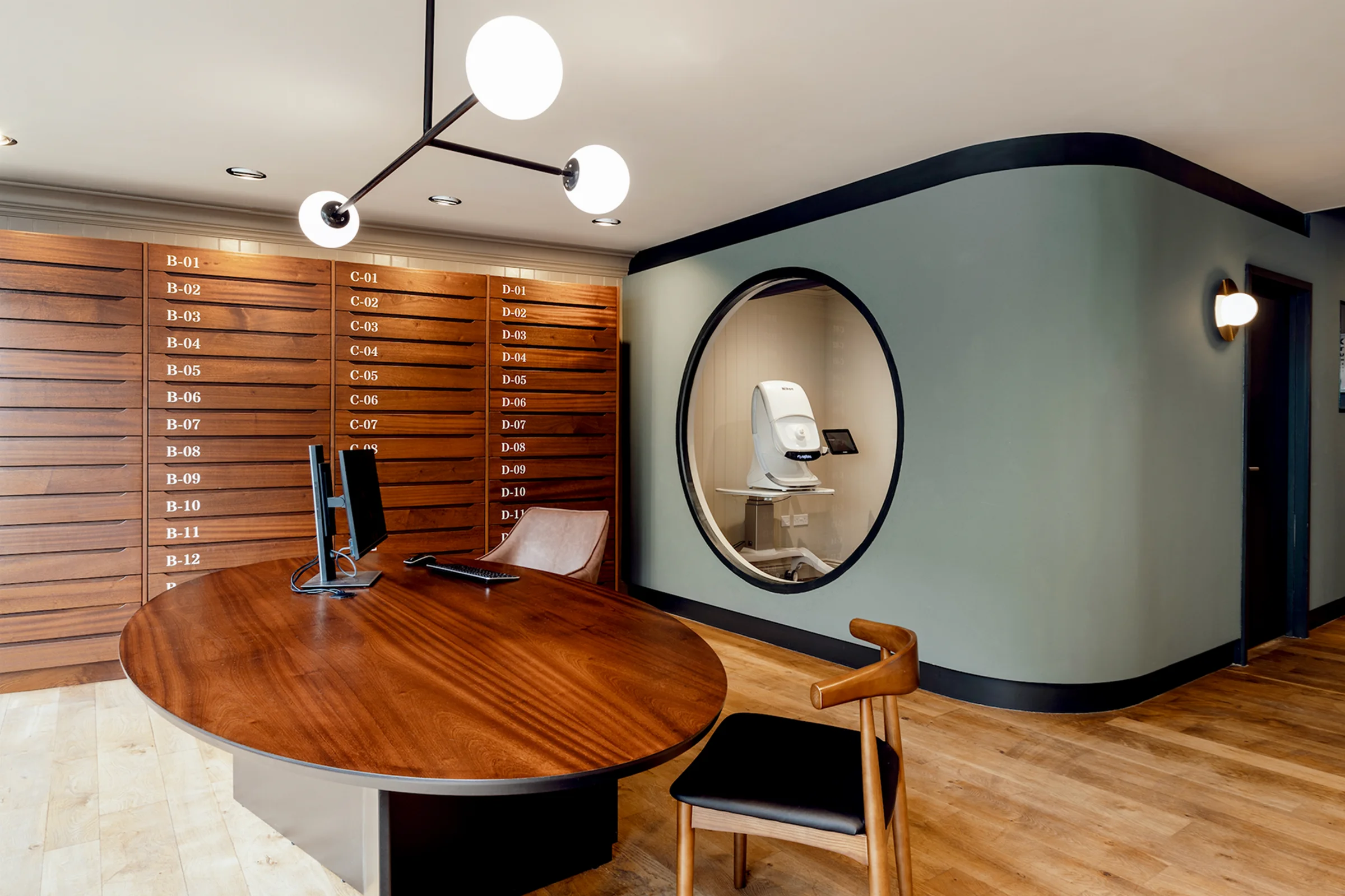
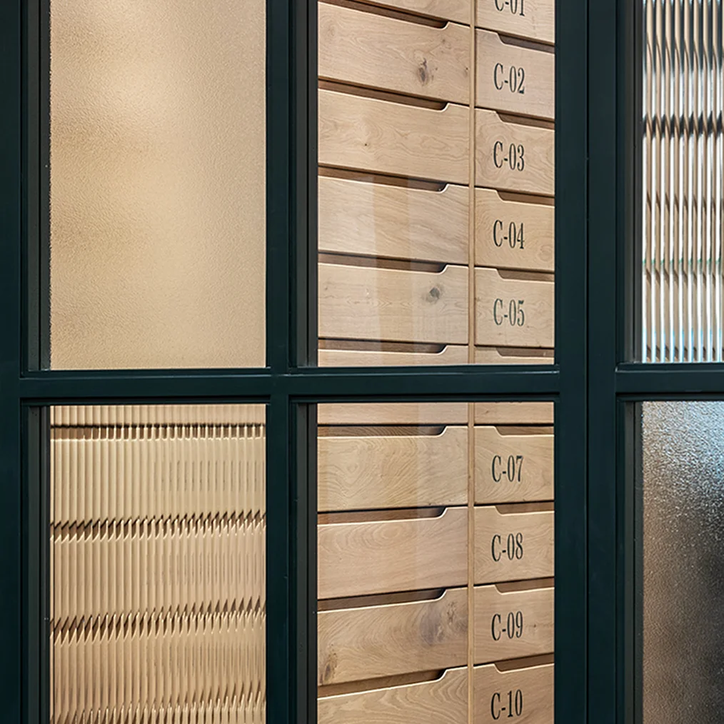
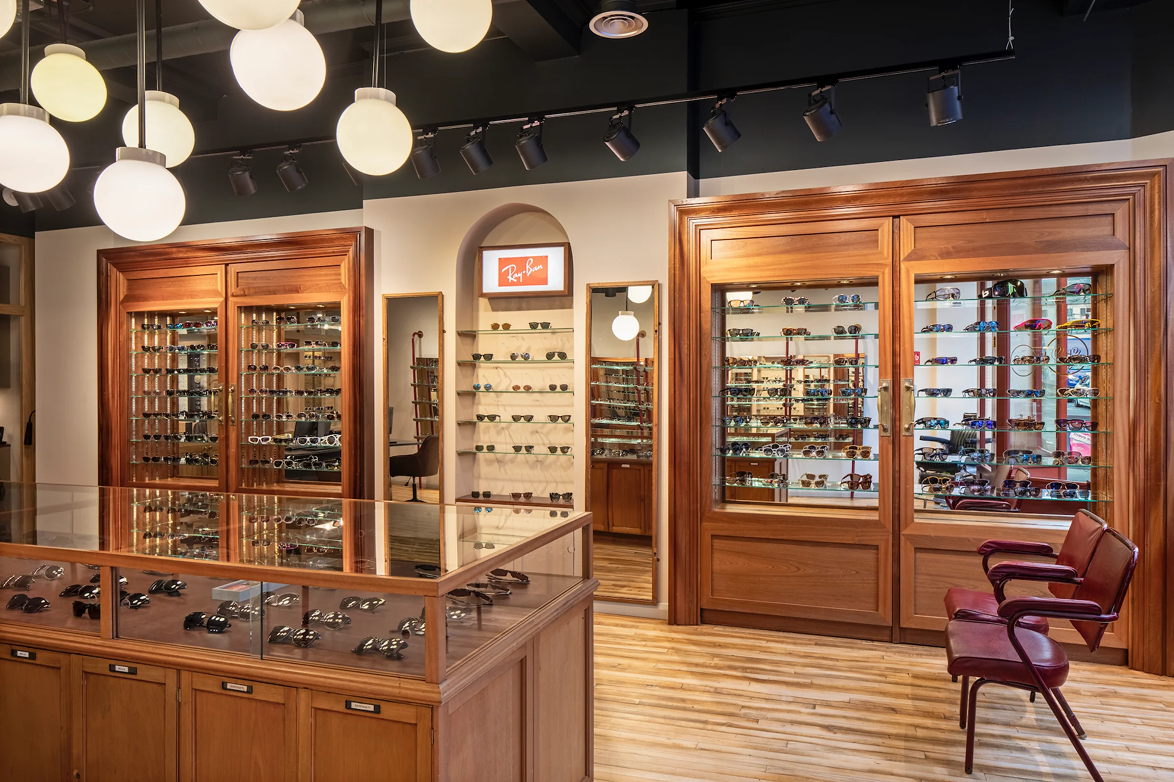
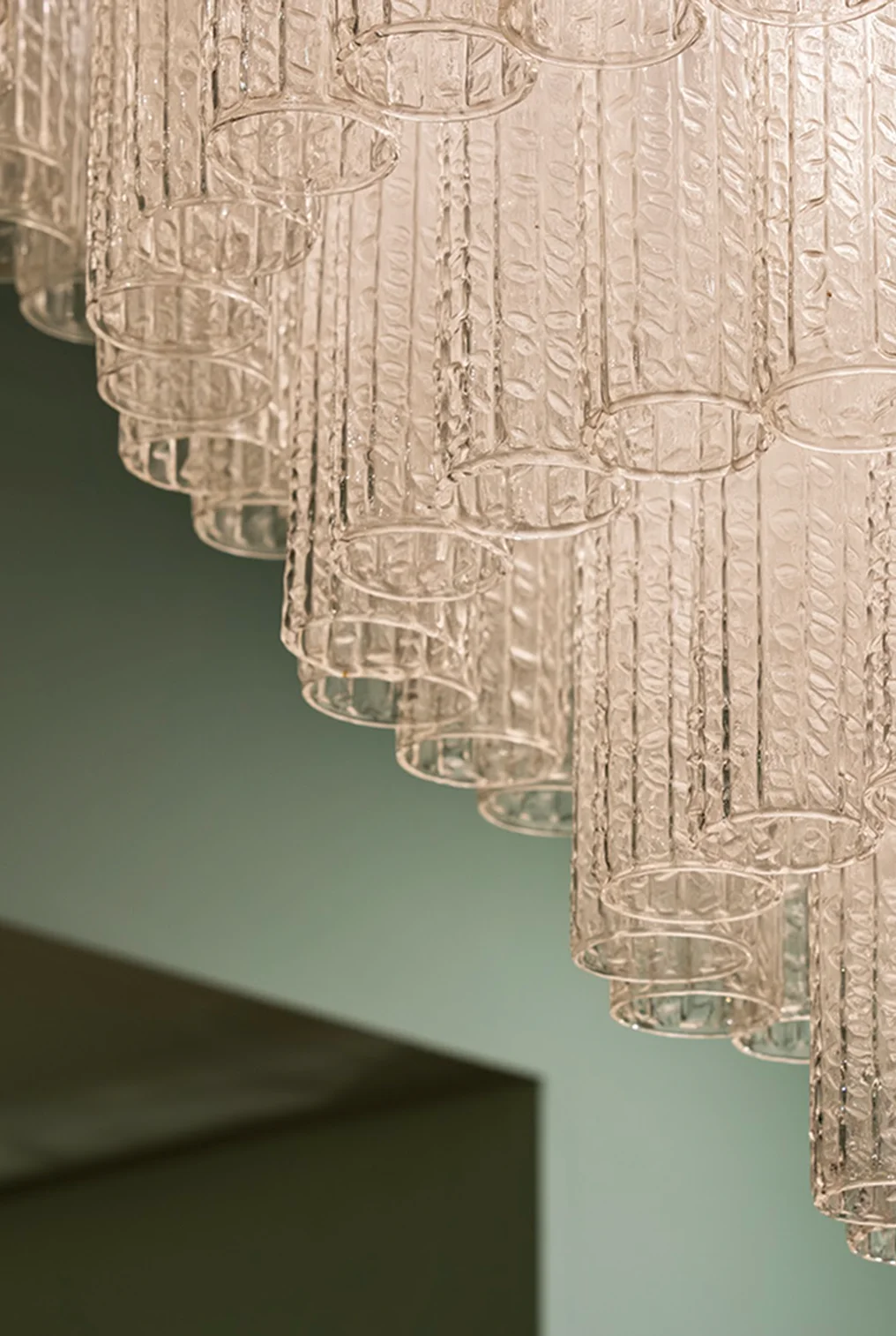
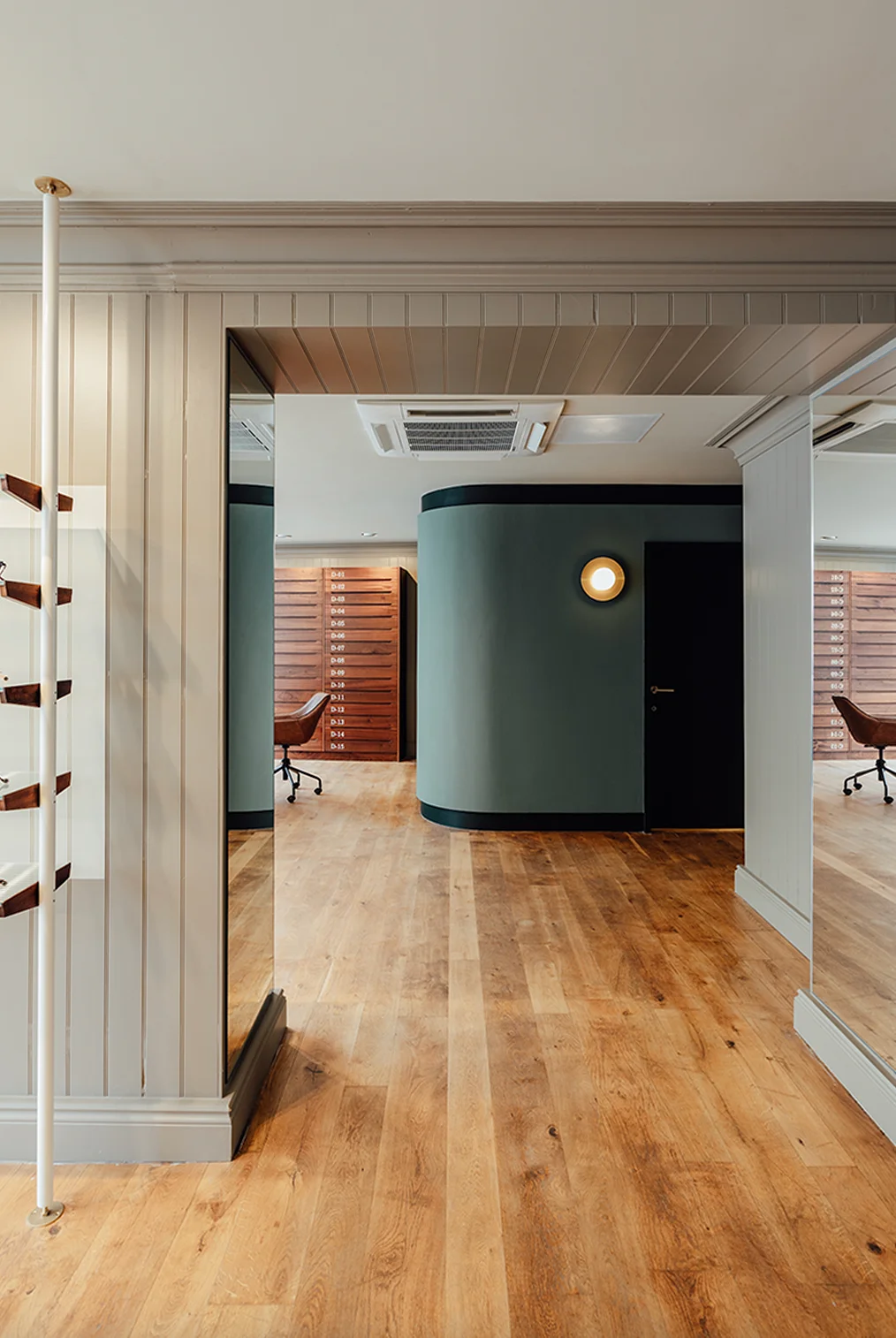
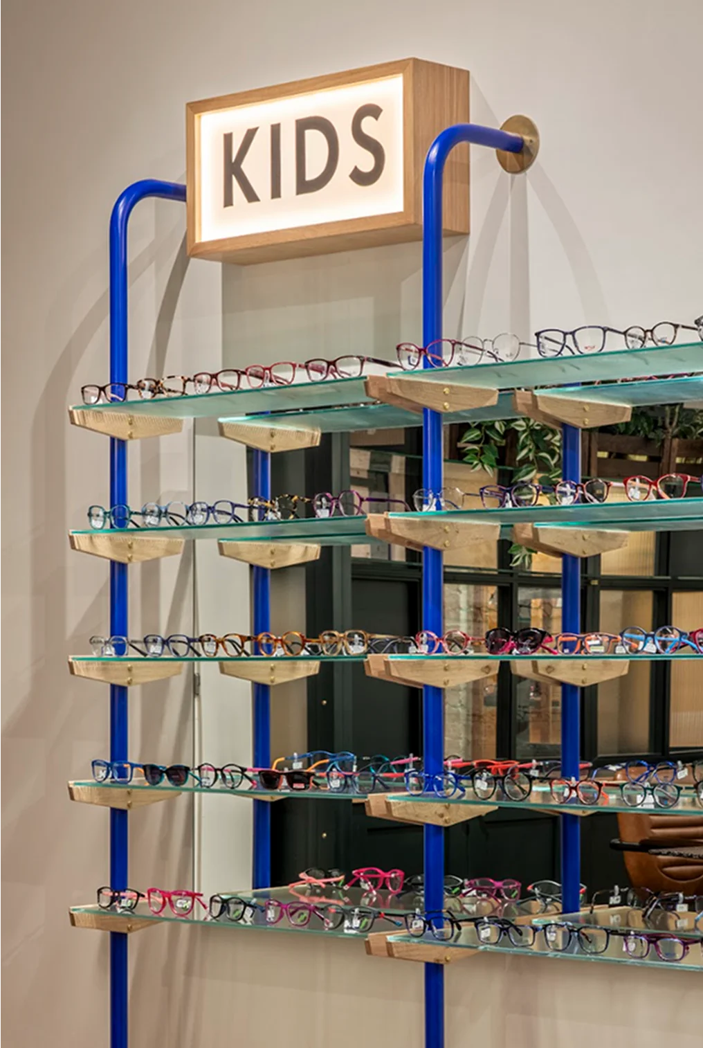
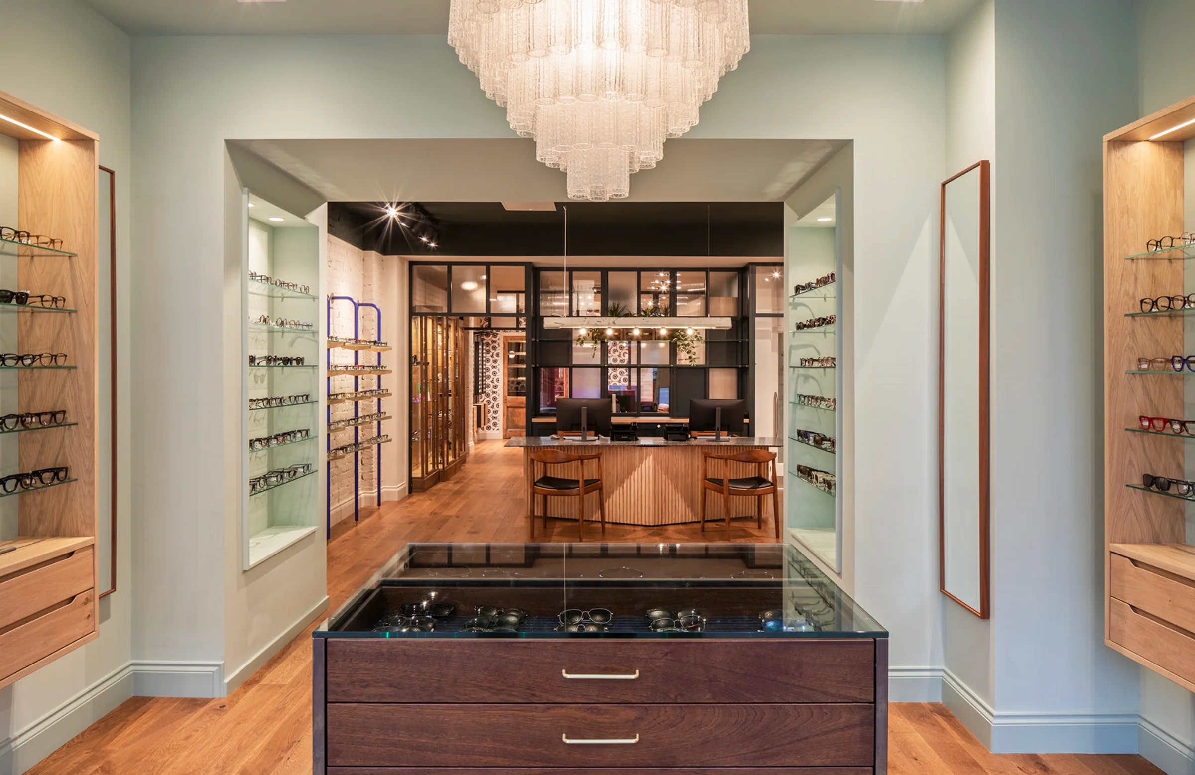
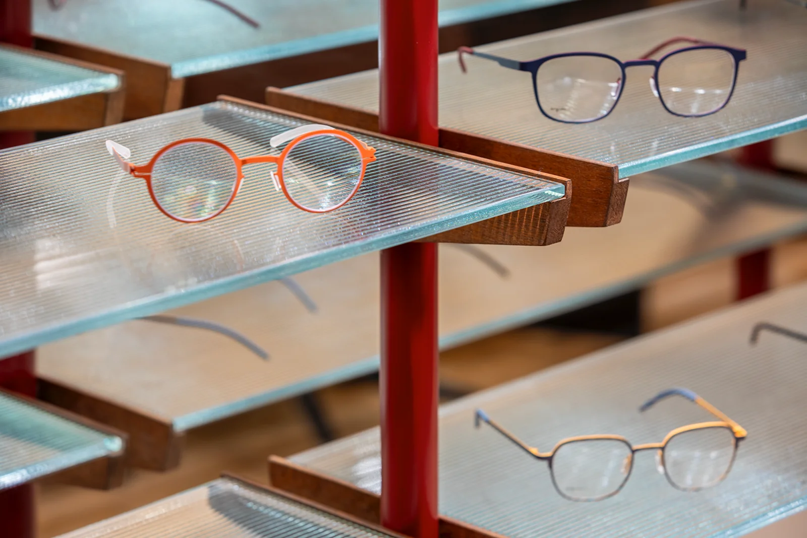
In order to transform a fast-paced retail environment into a deluxe lifestyle experience, our interiors team designed bespoke furniture and architectural lighting. We crafted signature Eye Place furniture and cabinetry from antique and reclaimed materials in our workshop, creating not only custom-made solutions for retail space management but luxurious legacy pieces that showcase glasses available to purchase. We also developed a custom ‘Eyeball’ wallpaper graphic to use as a brand identifier throughout the stores.
A rapidly transforming brand with a dynamic entrepreneur at its helm has meant as the business grows so does the need for new brand assets. We’ve evolved and developed the brand with iconography, sub-brands and illustrations to showcase a burgeoning range of services but also to create personality, warmth and to capture a sense of belonging and loyalty within a broad customer base.
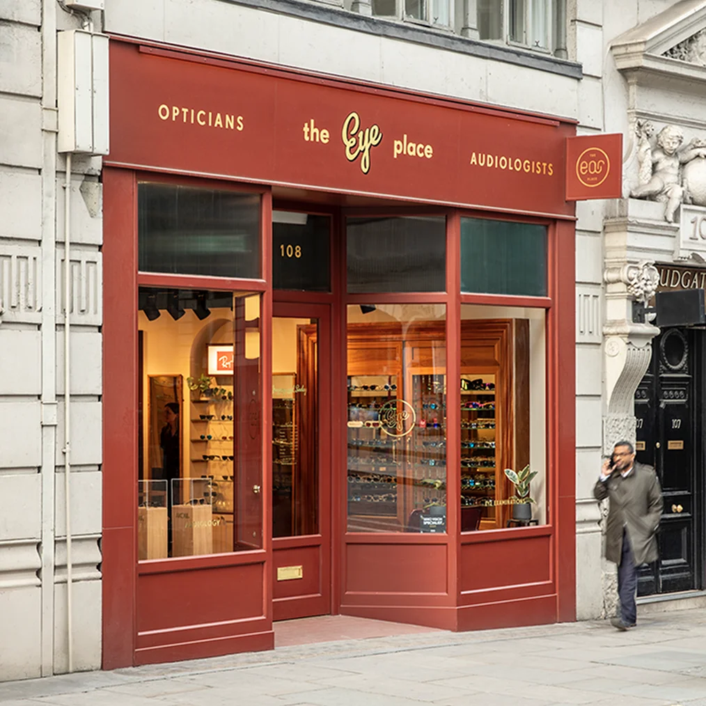
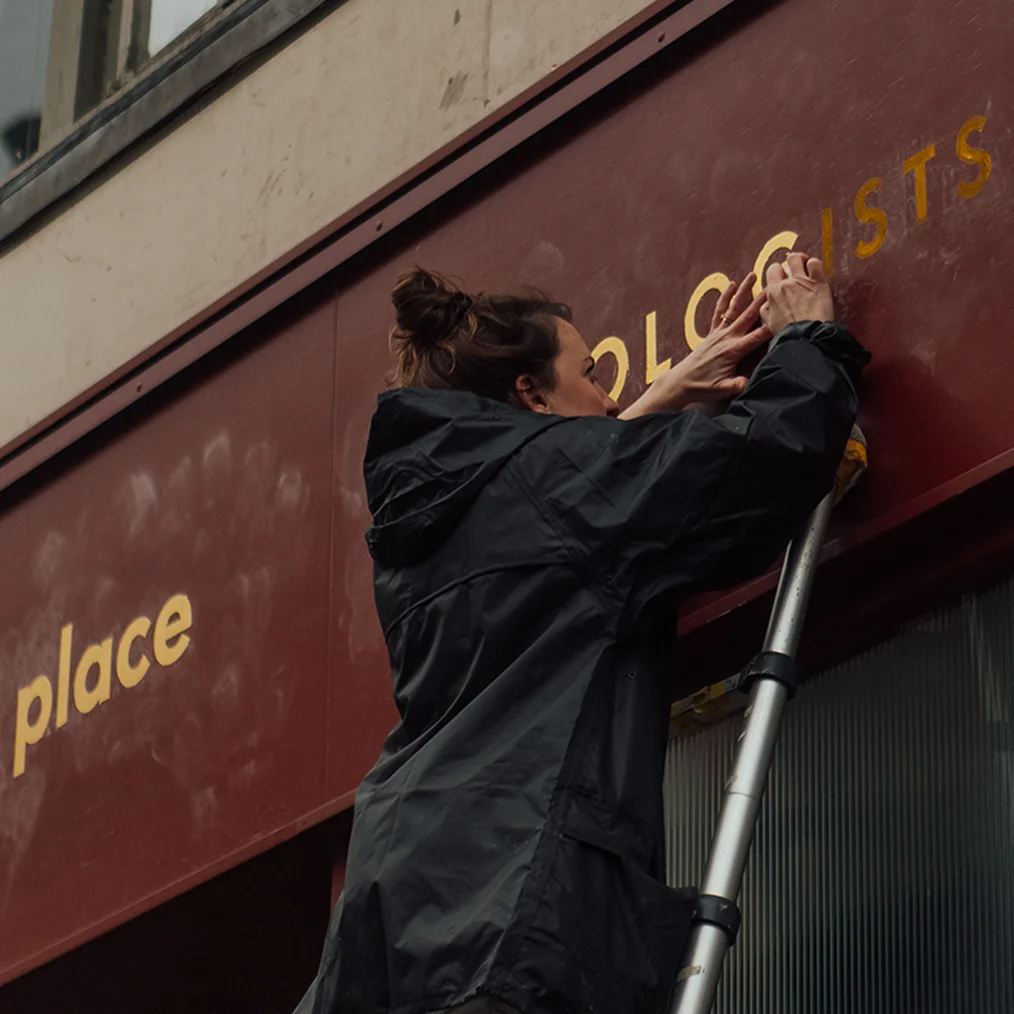
The Eye Place logo has been applied to shop fronts, signage and in print and digital formats across multiple locations.