


Sherborne Place - Creating a sense of place for a canal-side community, inspired by philanthropic tales, down by the Birmingham Old Line Canal
Naming Ridgeback’s Sherborne Place – researching the site's history to inform and create a narrative for Birmingham’s new canal side apartments.
Using historical and archive material, local history and language to create considered brand moments
93ft were approached by Ridgeback group, a UK developer creating a new neighbourhood of apartments in Birmingham’s Ladywood suburb. Ridgeback wanted to link this new development with Birmingham’s rich cultural history, constructing a narrative that resonated deeply with the new inhabitants, building a sense of place and of putting down roots.
Birmingham, or “Brum” as it’s affectionately known, is a vibrant city right in the heart of the UK, with a rich culture of history, music, nightlife and food. Brum hosts over 50 festivals each year, of jazz, opera, comedy and poetry, and boasts the most Michelin starred restaurants of anywhere in the UK outside of London.
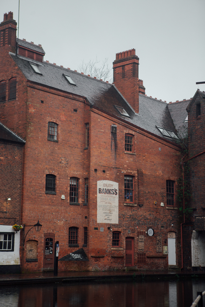
As well as a thriving cafe culture and opportunities for retail therapy, Birmingham has over 100 miles of waterways (more than Venice) where nature and culture nestle side by side.
We wanted to bring these exciting, but often hidden, aspects of the city to the forefront, shining a light on them to show Birmingham as it really is—an attractive and dynamic place to live for everyone from students to families.
The research - Starting with the Middle Ages
We don’t do anything by halves at 93ft. Our brief was to give a snapshot of this small parcel of land in Birmingham city, to build a brand and apply a warmer touch. Constructing a brand narrative means drawing out hidden details that may be overlooked, to create something with the fullness of history that truly stands the test of time.
Our research began with literally mapping the area. The site is located on Sherborne Street, with Edgbaston Conservation Area, Jewellery Quarter Conservation Area and Colmore Row and Environs Conservation Area all partially falling within a 1km radius of the site. We found historical maps of Ladywood — once an actual woodland — dating back to 1565, as well as more recent maps of the buildings themselves.
We found that the area has been home to notable historical people, including American novelist Washington Irving, Alfred Joseph Knight, recipient of World War I Victoria Cross, and J.R.R. Tolkien who may have been inspired by the towers of Perrott’s Folly and Edgbaston Waterworks.
Louisa Anne Ryland - benefactor of Birmingham
Sherborne Street, where Sherborne Place is now situated, was first shown on a map in 1851, although it was then misspelt Suerborne Street! A map from 1864 first shows the street with the spelling we use today. The street was likely named after Sherborne Park, which was owned by the local Ryland family, and is still owned by the Smith-Ryland family now.
The Ryland family is perhaps one of the most interesting aspects of our historical research into the area, and we found ourselves particularly fascinated with Louisa Anne Ryland, the only child of Anne Pemberton and Samuel Ryland. In three generations, the Rylands grew from a family of makers of buttons, pins, and toys into one of the largest land-owning entities in Birmingham, through a series of astute investments and business decisions.
Louisa Ryland inherited the family’s fortunes aged 29, and would become known as “Generous Mother of Birmingham”, making philanthropy and the improvement of the lives of Birmingham’s inhabitants, her life’s work. Despite her prolific altruism, Louisa was a humble and private person, making many of her donations anonymously.
Louisa was also a brilliant businesswoman, leaving a far greater inheritance than she herself was handed down. While Louisa chose not to have her own children, she passed her wealth to others under the proviso that they would adopt the Ryland name. The Smith-Rylands still live in Sherborne Park and many roads in the area are named for family members.
We named Ryland House for Louisa, finally giving this benevolent lady the appreciation she’s truly entitled to.
Naming the apartment buildings of Sherborne Place was one of the most pressing aspects of the brief, and to do this, we explored the lives of the people who walked these streets across the centuries.
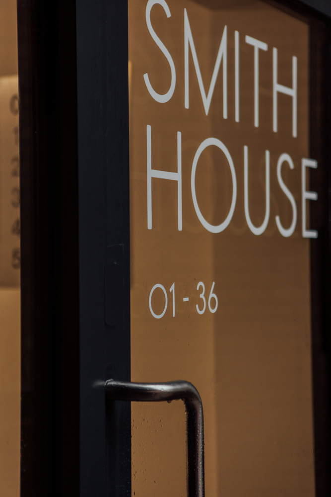
Smith House - commemorating Louisa’s lost love
When Henry Smith asked for the hand of Louisa Ryland her father, having plans for her to marry into the aristocracy, refused. Denied her love, Louisa decided never to marry and instead dedicated her life to the Birmingham people.
After her death, Louisa provided generously for her community through hospitals, churches, and schools, and for numerous friends and relatives. Heirs must add “Ryland” to their surname, or forfeit their inheritance.
Henry Smith went on to marry another woman. Their eldest son, William Charles Henry Alston Smith became known as Charles Smith-Ryland when he inherited a large portion of Louisa’s fortune, and the Smith-Ryland family still own much of the estate today.
Smith House commemorates the strength of Louisa’s affection in bequeathing her estate to the child of the man she loved and lost.
Pemberton House - recognising the women whose names were lost
Louisa’s mother, Anne Pemberton, died when Louisa was just a baby, leaving her to be raised by her father and a governess. Louisa, in keeping with her humble nature, requested that she be buried in the church cemetery, next to her governess, Charlotte Randle - clearly a beloved figure in her life. Her pallbearers were her servants, and labourers from the community.
The Pemberton family were also a wealthy and influential family in the area, however, like many women of the time, Anne Pemberton gave up her name and much of her history when she married Samuel Ryland.
Pemberton house gives Louisa’s mother Anne the recognition she deserves.
Patron House - celebrating philanthropy and inspiring community
Patron House is named in celebration of the generous spirit of philanthropy that inspires the community as much today as it did then. It’s the largest of the seven houses of Sherborne Place, so can be looked on as the loving guardian of the family of homes - just as Louisa Ryland was patron and guardian of the city she loved.
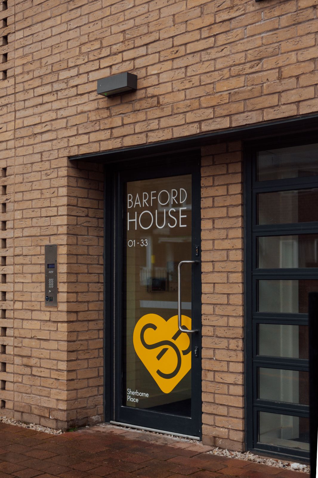
Barford House - Louisa’s childhood home
The Ryland family moved away from Birmingham when Louisa was a child, resettling in Barford, Warwickshire. While they lived happily here, and the Smith-Ryland’s still own property in Barford today, Louisa’s heart clearly belonged to Birmingham as the bulk of her philanthropy was directed to her first home.
Nonetheless, we wanted to remember Louisa's childhood home in Barford House.

Phoenix House - Taking Psonex House back to its roots
Phoenix House is the only original building on the site. First home to Phoenix Galvanising Works, Phoenix House later became known as Psonex House - possibly due to a simple misspelling of Phoenix.
Honouring the building’s industrial past as well as the fact that, we decided to revert to the initial name, Phoenix House. We also suggested referencing the former galvanising works by incorporating galvanised street furniture, wayfinding or large industrial planters around the site.

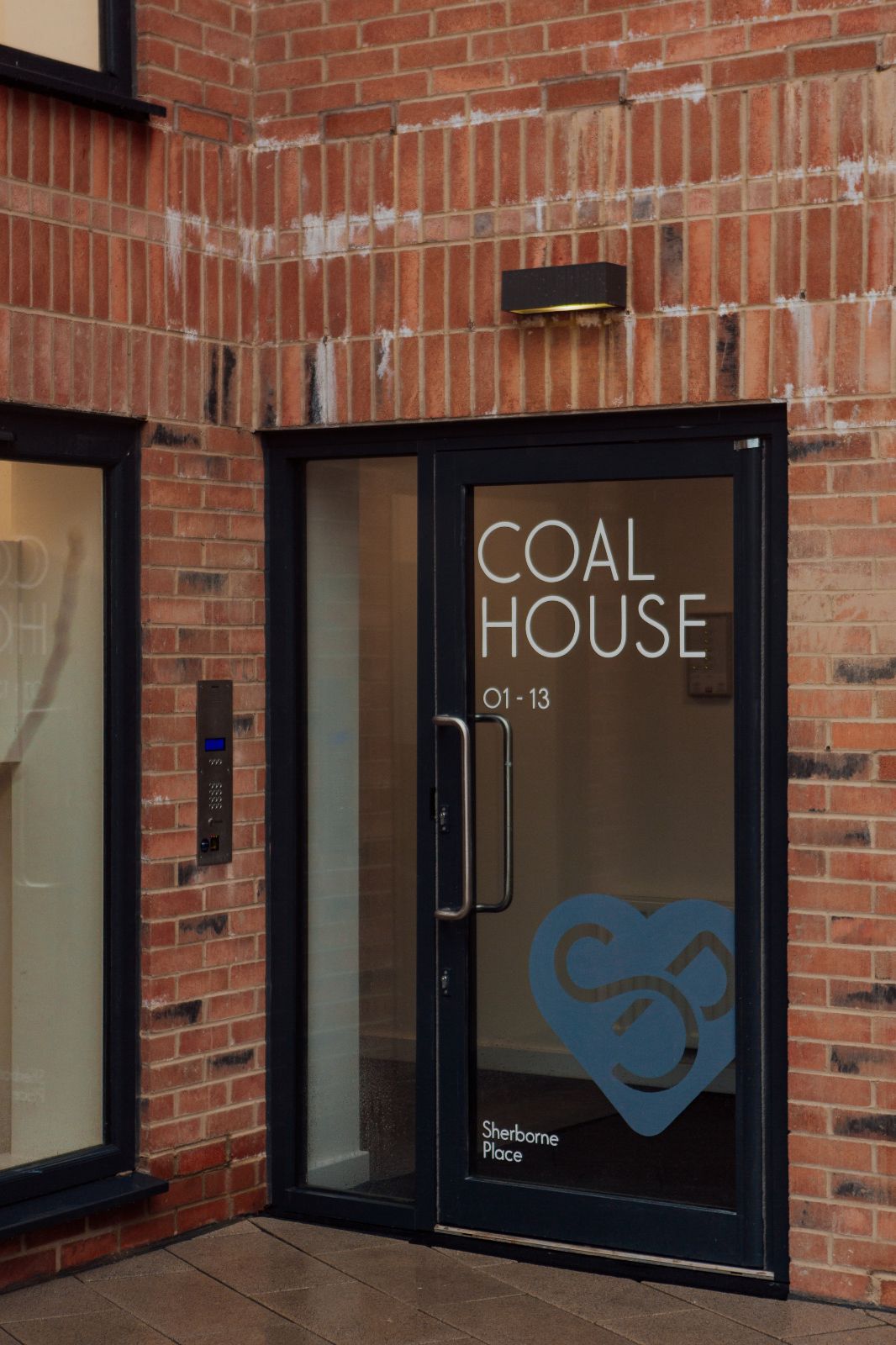
Coal House - paying tribute to Birmingham’s industrial past
While we are now working to move away from coal and other fossil fuels, in the 1700s coal was an industrial and economic driver that provided opportunities for employment, progress and wealth. The canal brought the price of coal down significantly which allowed Birmingham’s factories and industries to thrive.
We named the last, and smallest, of the buildings at Sherborne Place Coal House, giving a nod to the importance this “black gold” played in helping to build the city we know today. We suggested using coal sack planters as an eye-catching and effective way of connecting the name, the history and the day to day living of the residents.
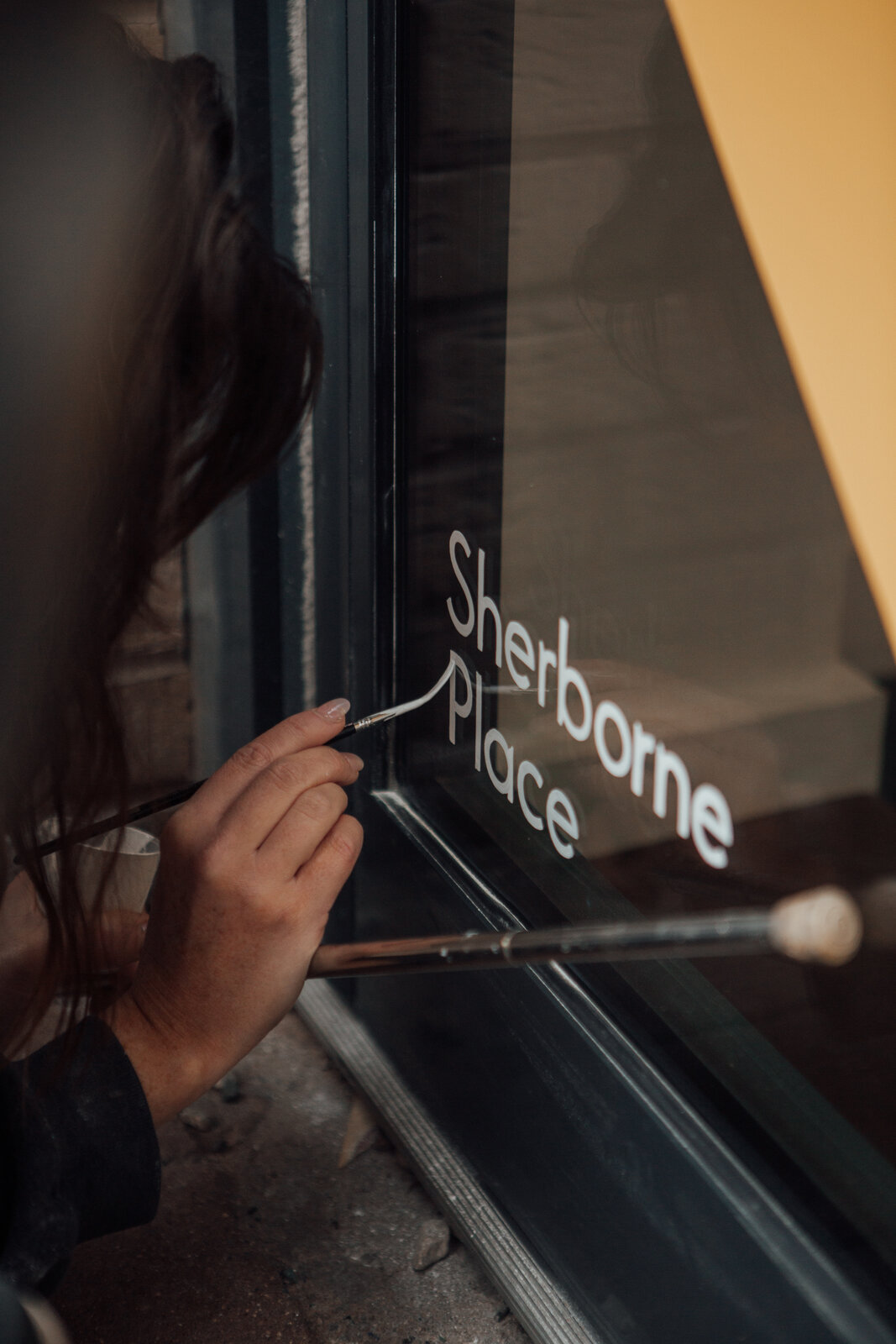
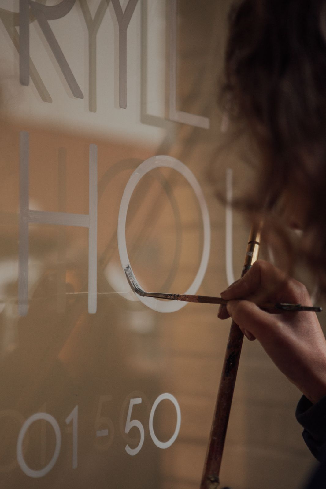
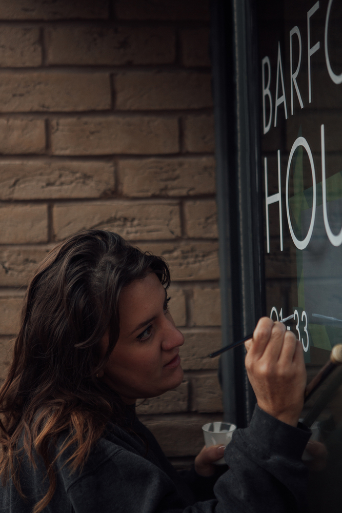
Hand painted door signs by a fully female team
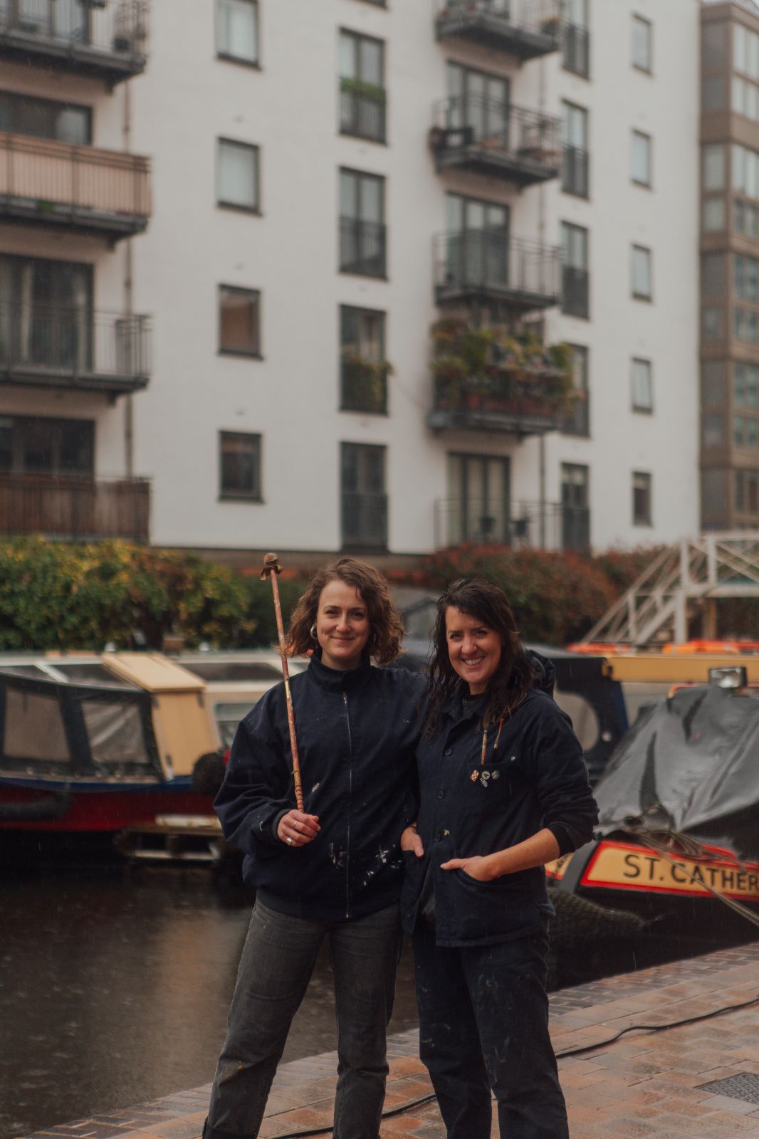
We wanted to carry on the theme of the strong female lead that began with Louisa Anne Ryland and which we have placed front and centre in the creation of the Sherborne Place brand. Our favourite hand lettering and sign painting expert, Mia Warner, went to Glasgow to meet with an all-women sign writing team to create hand painted door signs for all the buildings at Sherborne Place.
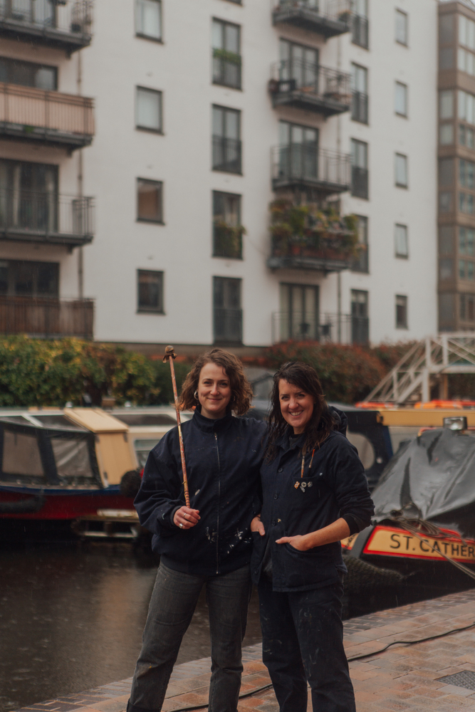
Mia and Hana Sunny are signwriters who met around 7 years ago and have been painting ever since, teaming up whenever they need a boost and painting larger projects as part of the Alphabetics Anonymous collective.
Alphabetics Anonymous came about when a core group of signwriters in London who met through pub hangouts and letterhead meets (getting together to paint for fun, swap tips and have a drink) realised they kept turning to each other for collaboration on projects, sharing the passion for hand lettering, similar ways of working and the same attitude towards hard graft. After painting a few larger murals and full building wayfinding projects, Alphabetics Anonymous became an official and legal partnership a few years ago.
Being no strangers to active construction sites, Mia and Hana are used to the art of working around chippies and sparkies to get to their wall/window/door, so the Birmingham project didn’t phase them. And if the residents of Sherborne Place enjoy their clear, vibrant signage as much as they hope, then it was all worth it. Both described mixing the custom colours for each building and seeing how they stand out from a distance as extremely satisfying.
“We thought it was a brilliant idea to make this as much of a female-led project as possible, and we loved Louisa Anne Ryland’s backstory - what a wonderful force of nature she was! We hope we’ve done her proud with our contribution.”
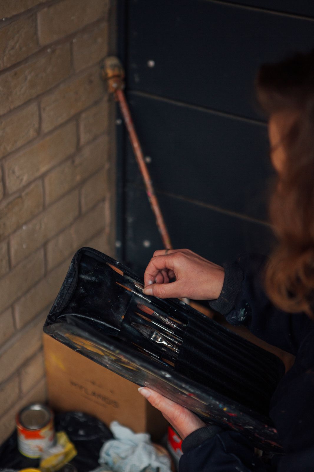
The main challenges to the project were the weather and water proofing. The imminent rain meant the team had to scrap their planned timeline, taking into consideration the fact that three of the doors had no cover and no way of constructing a makeshift cover, as well as considering drying times and multiple layers. This made the job a little more intense as there was a lot of running around making sure those doors were done before the rain came, whilst also making sure the other two had first coats (to allow for drying time).
This meant day one was a pretty full one, and longer than initially intended, but a huge part of the job is being able to adapt to situations like this. If that means working longer hours then that’s what they do.
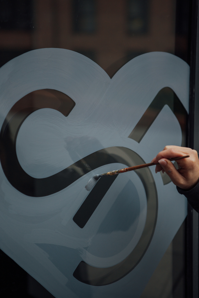
Mia and Hana always push for signwriting over vinyls or printed signage when it’s appropriate for the surface. Mia says, “There’s so much more soul in having humans who are passionate about their jobs paint your signs for you than there is in sending off for prints. We have backstories and passion and the ability to adapt, and we care about your building looking good as much as you do.”
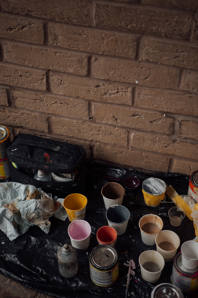
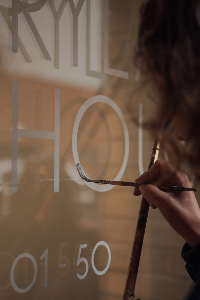


Colour-mixing is one of Mia’s specialties and she relishes any chance she gets to mix custom palettes. These colours were warm and earthy, and both painters appreciated the team at 93ft having solid and relevant reasons behind their choices. These colours relate back to the environment in which they’re painted, and they tie in with the surroundings and the story of the building, bringing it all together in a satisfying and cohesive way.
Professional signwriters have methods for replicating branding and applying it to different surfaces as accurately as possible, so although a hand-painted sign will never be completely perfect – that’s the charm of hand painted – they get it as close as it could be to a perfect print.
Mia and Hanna’s hand painted signs were photographed by Helena Dolby giving continuity of the female talent and strength that underpins the brand, grounding it in the roots of the narrative and carrying forward Louisa’s legacy from the 1800s.
To build your brand, just get in touch
Latest Projects

Heywood Hill - The power of design, print and direct marketing
Heywood Hill have been widely regarded as London’s Literary Lighthouse for curious bibliophiles all over the world. 93 helped Heywood Hill to elevate their brand and reach their target audience designing a sales catalogue promoting their extra ordinary modern books.
Find out more![]()

Colemans Deli - Building a website using the Square app
93 worked with Colemans Deli, an award winning café set in the heart of the Peak District, to create a website that integrated seamlessly into their existing system
Find out more![]()

Clarke & Roskrow Opticians - Creating a modern traditional British shopfront
When Market Harborough optician Clarke & Roskrow wanted to elevate their high street store fascia to get more impact and attract more customers, they invited 93 to answer their design challenge.
Find out more![]()

Hairpin House, Digbeth - BTR rental apartments and community living, to call your home
Explore how our design team, turned the fortunes of Birmingham's former hairpin factory into a new build-to-rent development in the heart of Digbeth.
Find out more![]()
Special Recognition


